Australian
and international
exploratory
performance and
media arts
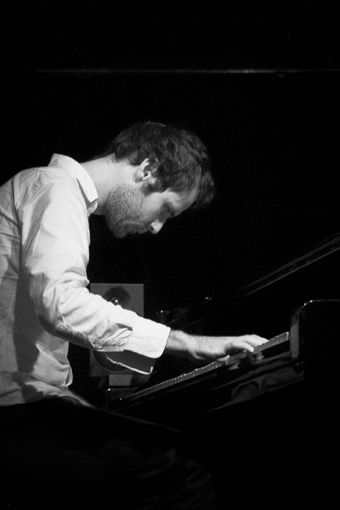
Pierre-Yves Macé
courtesy the artist
Pierre-Yves Macé
THERE IS BARELY AN INTERNATIONAL ARTS FESTIVAL TODAY THAT DOES NOT INCLUDE A COUPLE OF ACTS THAT DEFY A CLEAR ART- OR POPULAR-MUSIC LABEL. QUIRKY STRING SECTIONS AND FIVE-MINUTE MUSIQUE CONCRÈTE INTROS ARE COMMONPLACE IN POPULAR RECORDINGS. EVERY CLASSICAL MUSIC STUDENT IS URGED TO “DIVERSIFY THEIR PORTFOLIO,” WHICH NEVER MEANS “ENGAGE IN MANUSCRIPT STUDY OF THE FLEMISH MASTERS.”
Why, then, if it is a part of everyday musical life, are we so quick to dismiss the “crossover” title? I’d like to ask exactly what crossed over in some semi-popular, semi-art music concerts from 2012 and draw a musical geography of the term. Ultimately, crossover music is the thawing of boundaries that only froze up 50 years ago, but as we reconfigure these imaginary boundaries there are real stakes to be considered.
composing crossovers
One form of crossover is to bring the melodies, rhythms and articulations of popular music into an art music context. An excellent example of this genre of crossover appeared at Paris’ Festival d’Automne this year. Pierre-Yves Macé’s Song Recital is an arrangement of “tubes” (songs covered a cappella by fans on YouTube) for soprano, flute, oboe, clarinet, percussion, electric guitar, harp, Rhodes piano, violin, viola, cello and double bass. The piece is based on Macé’s earlier work, Song Recycle, for tape and piano. His formation in musique concrète, to which he dedicated a musicological doctoral thesis, is put to masterful use here. Each tube is ingeniously remixed to retain the abstracted character of the original song’s melodies, rhythms and articulations while leaving barely a single word intelligible. The tape is no glitch-pop mashup, but a convincing reconstruction of the original musical material that translates beautifully into the live vocal part of Song Recital.
Song Recital was premiered by soprano Natalie Raybould amid the crumbling interior of Paris’ Théâtre de La Chappelle. Barely a detail was not communicated from the original tape part to the live vocal part, including breathy articulations, finger clicks, peaking microphone artefacts and awkward ‘asides.’ Raybould’s performance was more than a transcription of the tape part, but brought each character to life, interacting with the rest of the ensemble as they imitated and accompanied her.
The piece made me think of another work programmed at the Festival d’Automne, Guillaume de Machaut’s 14th century “Tant doucement me sens emprisonnes.” Included for its rhythmic sophistication next to the complex metric superpositions of the medieval Codex Chantilly and a première by the contemporary complexist composer Brian Ferneyhough, the Machaut rondeau could have appeared just as comfortably next to Macé’s work as an example of a medieval composer using art music methods on a popular song form.
One wonders what the reaction of the original YouTube soloists would be to Raybould and Macé’s interpretation of their covers. Would they recognise themselves in Raybould’s contortions or Macé’s abstracted rhythms? Would they think that Macé’s arrangement added value to the original songs? Despite the piece seeming entirely serious (apart from a children’s song fittingly accompanied in Song Recycle by rhythmic piano-lid tapping), would they think it was a bad joke?
an instrumental divide
This year’s Vivid Live festival at the Sydney Opera House invited a host of ‘indie classical’ bands and solo artists to collaborate with Sydney’s art music ensembles. Some of these projects demonstrated the opposite exchange to Macé: from art music into popular music. Where Macé bridged the popular-art music divide using compositional processes, the acts of the Vivid Live festival crossed the divide using instrumentation. But is classical music instrumentation enough to identify a work has ‘crossed over’ from one type of music to another? Even before performing with string sections, Florence and the Machine, a highlight of the festival, seemed to slip into the ‘indie classical’ category simply by virtue of their resident harpist. Their use of harp is purely decorative, limited to glissandi and (out of time) arpeggiated ostinati. Compare the use of harp by Florence and the Machine with that of Joanna Newsom (who was, unfortunately, not at the festival), where the harp is front and centre, as much a part of the song as Newsom’s voice.
Perhaps an instrument from the opposite ‘camp’ has to be an important part of the composition process to justify a ‘cross over’ between genres. Efterklang, whose album Piramida was spurred into existence by the invitation to perform with the Sydney Symphony Orchestra at the Vivid Live festival, have remarked in interviews on the immediate feedback a live instrument provides that a synthesised version may not. Even though they had worked on Piramida for 10 months, they could hear instantly what worked and what did not work when they entered the concert hall with the SSO.
crossing contexts
Yet another way of crossing over between popular and classical music is to present classical music in popular music contexts and vice versa. Sydney’s Ensemble Offspring have worked to break down the sit-down-shut-up concert setting, marketing themselves as a lively group of music entrepreneurs presenting new music to crowds in bars as well as traditional concert halls. Their program at the Petersham Bowls Club this year presented contemporary art music alongside folk and electronica. Melbourne’s new ensemble 3 Shades of Black debuted at the Melbourne Fringe Festival with a program featuring Renaissance vocal music and Terry Riley’s In C, performing in a hall furnished with bean-bags and serving mulled wine.
We have seen the inverse option (dressing up popular music and sticking it in a concert hall in front of a seated audience) more times than we can count. Theatre orchestras provided galas of operetta overtures, military marches and popular songs from the end of the 19th century to the 1960s. We have seen a renaissance of this sort of programming, with this year’s Australian orchestral programs abounding with concerts dedicated to film medleys (the modern operetta overture), Beatles covers and arrangements of indie classics.
an opportunity
Instead of rejecting the term, our awareness of crossover music on the level of individual bands and musicians should extend to an awareness of how our musical palettes and contexts are also becoming increasingly blurred. I am particularly excited about the third form of crossover presented here: that of presenting art music in casual environments. Such concerts invite creative programming to show the lines of connection between seemingly diverse art forms, showing how little musical distance there might be between a New York minimalist composer from the 1960s, a 12th century Parisian choir master and a contemporary Icelandic indie band. While the term may be enabling in terms of programming, the ‘crossover’ label can also be too easily applied where there is only a superficial exchange of styles. The label should be a signal for us to think critically about what exactly is crossing over.
Festival d’Automne à Paris: Pierre Yves Macé, Natalie Raybould, Ensemble L’Instant Donné Théâtre des Bouffes du Nord, Paris Nov 5
RealTime issue #112 Dec-Jan 2012 pg. 36
© Matthew Lorenzon; for permission to reproduce apply to realtime@realtimearts.net
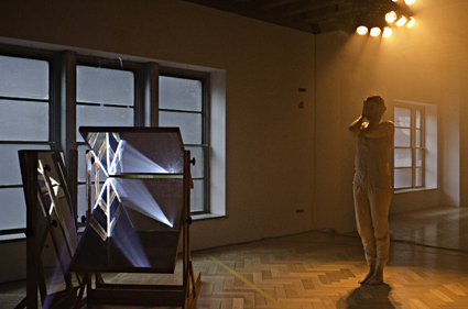
Deanne Butterworth, Twinships
photo Rohan Young
Deanne Butterworth, Twinships
DEANNE BUTTERWORTH’S TWINSHIPS IS A HYBRID CREATURE THAT MELDS DANCE WITH INSTALLATION, WITH A DOSE OF WELL-CURATED SOUND RECORDINGS FOR GOOD MEASURE. THE INSTALLATION COMPONENT CONSISTS OF COLOURED LINES MARKING OUT THE PARQUET FLOOR. WE COULD BE INSIDE A SPORTS HALL; A CURVED LINE RESEMBLES THE THREE-POINT ARC OF A BASKETBALL COURT.
Three mirrors are joined together in a frame contraption and are set at different angles to reflect projections across two walls, a sliver of a triangle on one wall and a bigger slice of moving image on the back wall. Themes of nature, emotional states and a final video of a streetscape through a window create a mood background for the dance.
When we enter Westspace, a smoke haze fills the room. Amid the sound of cicadas and wind blowing, a large paper scroll is unfurled by assistants. A dancer soon appears behind it. Butterworth’s figure casts shadows across the paper and, as she moves alongside it, she briefly seems to be painting. As in Japanese calligraphic art, her body becomes the honshi, the centrepiece artwork. Bending down and bringing her arms down to the ground, Butterworth’s silhouette becomes an inky mountain. From my angle her feet, which are visible beneath the scroll, are about two inches left of her shadow. While her body is graceful on paper with balletic control, her exposed feet with quivering tendons, show the effort in such grace.
The projections cast on the wall via the mirrors provide mood cues during the performance. While interesting sculpturally, the mirrors themselves have only a subtle effect on the projection and their presence is quickly forgotten. There are five chapters to this dance that the projections help to define by colour. In the second part of the dance, red dominates the projection as Butterworth moves like a boxer, swaying and shifting her weight from foot to foot. Repetition and her stance evoke sports training or a controlled fight. Meanwhile the projected video footage becomes choppy—a red sky with scratching tree branches has a schlocky horror film look. The red gives way to green and a recording of a science lecture plays, signalling a return to rationality and control. Butterworth repeats the same step-by-step movements on the spot, tense arms folding and reaching forward as though she is practicing her moves. She then turns on the spot like a cog. Her arms chop the air like windmills before she dissolves into more fluid movements, also reflected in the projection with a close up of tidal waters.
The lines on the floor work in several ways, first in referencing the moments of sport and practice. Butterworth frequently travels in the direction of the lines across the floor, usually running. The arc provides a path for a repeated series of movements with which she measures out space with her hands before falling backwards. They also create visual interest and act to record the dance in a way, as if she is marking the floor. Butterworth becomes the centrepiece of the dance floor and by extension, the gallery space, as she explores twin themes of nature and science, art and sport.
Twinships, installation & performance; performer, choreographer Deanne Butterworth, sound design Michael Munson, lighting design Rose Connors, set construction Jim Stenson, video Michael Munson, Deanne Butterworth, Westspace, Melbourne, Oct 18-Nov 10
RealTime issue #112 Dec-Jan 2012 pg. 28
© Varia Karipoff; for permission to reproduce apply to realtime@realtimearts.net
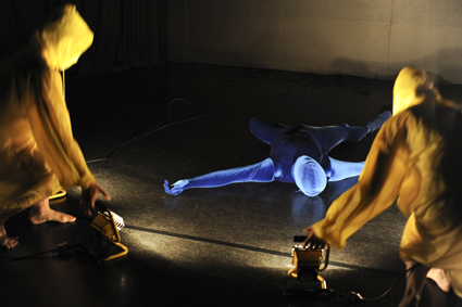
PRIME:ORDERLY, Dean Walsh
photo Heidrun Löhr
PRIME:ORDERLY, Dean Walsh
ON THE DAY THAT DEAN WALSH FIRST SPOKE TO ME ABOUT HIS RESEARCH FELLOWSHIP WITH THE AUSTRALIA COUNCIL, I WENT HOME AND WROTE FURIOUSLY ABOUT ALL THE IDEAS IT BROUGHT UP FOR ME. HEARING HIS THOUGHTS ON MARINE BIOLOGY, SCUBA EMBODIMENT AND SOCIETY’S PROBLEMATIC RELATIONSHIP WITH THE OCEAN, WAS AN INTENSELY IMAGINATIVE EXPERIENCE. THE CHOREOGRAPHIC WORK THAT TRANSPIRED FROM THIS RESEARCH, WALSH’S RECENTLY PERFORMED PRIME:ORDERLY, TURNED OUT TO BE A SENSUOUS AND TRANCE-LIKE EXPLORATION, BOTH ATMOSPHERICALLY AND CONCEPTUALLY ARRESTING.
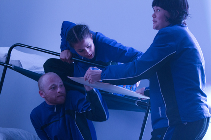
Presented in two acts, the first performed by Walsh and the second also featuring Natalie Ayton and Kathryn Puie, PRIME:ORDERLY progresses from an exploration of the inky, otherworldly velvet of the bottom of the ocean to the sunlit groan and bubble of a shallow reef.
A thick weave of digital sound swallows me up. After some searching in the blue dimness, I spot a moving body. Then another; then another. The sightings are haunting, like that growing awareness of another intelligence in the room that has presumably been there, and aware of you, for some time.
A body clad from head to toe in blue velvet makes its way into fuller light. The limbs are now straight, now rounded; the body now fluid, now rigid. Its movement verges on looking daft: not human, but intelligent. After some time the soundtrack shifts and the body collapses into a sort of bliss, spreading itself out luxuriantly on the floor and slipping into movement that is no longer halting, but entirely fluid.
I do not recognise the groaning and creaking that accompany the opening of act two as the sounds of the reef until a friend leans over and tells me so. For me the sounds evoke the gentle snores of an enormous, sleeping creature. Upon this reef I lose track of time, escorted onwards by the breath and buoyancy of the diver/dancers.
At first through balloon-like appendages and then into microphones suspended low over the floor, the dancers shape the aural backdrop with their constant, slow breathing. They play, they tumble, float, come to hovering stillness together. They couple up, triple up and repeatedly reach to cradle each others’ heads with their hands.
This wordless play is broken up by conversation when the trio rise to their feet and chat, striding swiftly back and forth across the stage. They crash through three mounds of silver foil that have, until now, sat like small glaciers on the floor. The mounds shatter. I gather that dancers are divers: they talk excitedly about their excursion out to sea and make small talk. The chatter is both unexpected and humorous. Personalities and social nuances emerge for the first time. One at a time, the dancers duck out of the conversation for a quick ‘dive.’ Their exits into muteness, weightlessness and horizontality are clear and sudden.
The performers’ conversation doesn’t disturb my sense of being in a state of suspension. On the contrary, it adds to the overall surreality of the piece, which climaxes when all three dancers hit the back wall, causing it to light up as though it were made of gold. Time stands still as the three drift, stare blankly, and perhaps live out in slowed-down verticality what they had lived out on the floor not long before. Conversation is not external to Dean Walsh’s work. It suggests that he understands not only the political importance of human/ocean dialogues, but also their capacity to build aesthetic experience.
Act two closes as the dancers gather up the pieces of silver foil that now litter the stage. This gesture might symbolise human responsibility towards the marine environment—one that is essential, primordial and increasingly at risk.
Form Dance Projects and Riverside: PRIME:ORDERLY, choreographer Dean Walsh, performers Dean Walsh, Natalie Ayton, Kathryn Puie, lighting Mikey Rice, designer sound recorder, mixer Dean Walsh; Riverside Theatres, Parramatta, Sydney, Oct 25-27
RealTime issue #112 Dec-Jan 2012 pg. 28
© Cleo Mees; for permission to reproduce apply to realtime@realtimearts.net
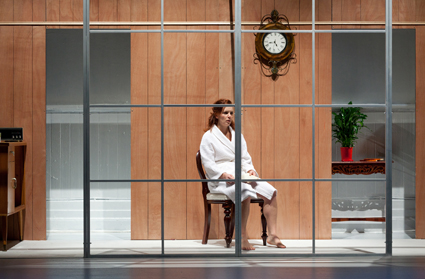
Meredith Penman, Persona
photo Pia Johnson
Meredith Penman, Persona
A BOY OF ABOUT EIGHT OR NINE CAUTIOUSLY MAKES HIS WAY ACROSS THE EMPTY STAGE. HIS MOVEMENTS HAVE THAT COY SELF-CONSCIOUSNESS PECULIAR TO CHILDREN. HE HAS A HEALTHFUL COMPLEXION AND A HAPPY IF SOMEWHAT MISCHIEVOUS AIR, A CONTRAST TO THE ESSENTIAL WHITE CURTAINS AND WHITE FLOOR OF THE SET. AFTER SITTING DOWN AND READING A BOOK IN SILENCE FOR A FEW MOMENTS, HE BRIEFLY EXAMINES THE AUDIENCE THROUGH A PAIR OF BINOCULARS, THEN LEAVES.
Although director Adena Jacobs makes no attempt to find a stage analogue for the rest of Bergman’s modernist cinematic montage, the famous visual poem that opens Persona (1966), she has nonetheless retained this strange prelude figure, the child-psychopomp, who in both the film and this current adaptation leads the audience from its present reality into the next.
Between stage and screen, however, the nature of that next reality must be radically different, and it is the way this difference is articulated by Fraught Outfit, Jacob’s company, that accounts for so much of the remarkable power in this unlikely adaptation.
Elisabet Vogler (Meredith Penman), a well-known stage actress, suddenly falls silent during her performance in the title role of Sophocles’ Electra. Although she eventually continues the performance, the next day she refuses to speak at all. The head doctor at the hospital where she is admitted for psychiatric treatment—in this production a disembodied voiceover (Jane Montgomery Griffiths)—suggests that Elisabet spend some time at an isolated seaside cottage with one of the hospital nurses, Alma (Karen Sibbing), where the doctor thinks she might rediscover the will to communicate. Although Elisabet seems immediately to relax in the cottage, she remains silent. Alma has a naturally lively personality and responds to her patient’s silence with a steady stream of small talk. As Elisabet’s silence seems to deepen, so too Alma’s conversation becomes more personal. When Alma reads a letter written by Elisabet to the head doctor in which she makes light of Alma’s revelations, it becomes too much for the nurse, leading to an intense series of psychic encounters between the two.
Although there is a tradition of producing Bergman’s films for the stage that goes back almost 50 years, and notwithstanding a recent vogue for adaptations of his more affectedly cerebral films, Persona represents an outrageous challenge for theatre makers. So much of its popular significance—its very status as a masterpiece—depends on the medium in which it was produced. It is self-reflexive to the point of incoherence, consistently disrupting narrative clarity and sabotaging authoritative communication by exposing the processes and materials of its own construction. In the words of Bergman, whose own preferred title for the film was Cinematography:
“Today I feel that in Persona—and later in Cries and Whispers—I had gone as far as I could go. And that in these two instances when working in total freedom, I touched wordless secrets that only the cinema can discover.”
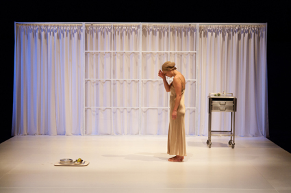
Meredith Penman, Persona
photo Pia Johnson
Meredith Penman, Persona
There is an engrossing and enduring ambiguity in this well-known quotation. He “had gone as far as he could” toward what? The mystery of this question lies in the face—the face as both the principal motif of Bergman’s film and the medium of film itself, the “black hole and white wall, screen and camera.” What Bergman touches on is the truth about the face, and also about cinema: its mesmeric inhumanity and the regime of deception it enforces.
Or, rather, he touches on the ineffable implication of that truth—that peculiar feeling of revulsion at seeing Alma’s and Elisabet’s faces merge at the film’s climax, for example.
“The inhuman in human beings: that is what the face is from the start. It is by nature a close-up, with its inanimate white surfaces, its shining black holes, its emptiness and boredom. Bunker-face. To the point that if human beings have a destiny, it is rather to escape the face, to dismantle the face and facialisation.” (Deleuze and Guattari, A Thousand Plateaus, 1980)
In order to escape the cinema-face and rise above a mere capitulation of doubtful events, Persona must be de-faced for the stage. It must discover, to use the vocabulary of Deleuze and Guattari, quoted above, the ancient “volume-cavity system” of the theatre, or the theatre-body.
At the very back of the deeply set stage, some 10 to 15 metres from the audience, we see the interior of a single room in the head doctor’s holiday cottage. A white curtain can be drawn across this facade, while another is used occasionally to shorten the stage and bring the action forward. This doesn’t so much reproduce the various camera shots, close-up and landscape, as emphasise the divisibility of the shared space.
The extensive use of curtains also suggests that we are all sharing a single chamber, performers and audience, while also underlining the theatrical tradition into which the story has been imported. As the size of the chamber changes, so too does our sense of intimacy with the performers and their secret magnetism. Indeed, intimacy, or the attempt to discover a sense of intimacy that goes behind the face, becomes the thematic core of this adaptation, displacing Bergman’s obsession with the fragility of self-constructed identity.
The effect of this displacement is clear, for example, in the scene where Elisabet’s husband (Daniel Schlusser) mistakes Alma for his wife. Bergman’s tragic eroticism, the hypnotic layering of the three faces, becomes a comic, though still poignant, collision of bodies, an awkward striving to get past the misapprehension of the face. It is this clumsy honesty of bodies that distinguishes Fraught Outfit’s involving dramaturgy, revealing something that Bergman’s faces, sliding gracefully across and into the landscape, otherwise obscure, something typified by Karen Sibbing, for example, as she appears in the latter half of the production, distraught, a chunky bandage on her hand, hair dishevelled and in every way miserably present.
In contrast with other recent Bergman adaptations, including both Jenny Worton’s Through a Glass Darkly (Almeida Theatre, 2010) and Simon Stone and Andrew Upton’s Face to Face (STC, 2012), Jacobs resists the allure of Bergman’s “juicy dream” dramaturgy. When we are at last released from the drama, it is not the enchanted island of Bergman’s Faro that we leave, with its population of demon hypnotists and Strindbergian somnambulists, but the firm, multi-dimensional embrace of the theatre-body. Thus, where Bergman’s film is fundamentally a critique—a demonic critique—of art, artists and civilised life in general, Fraught Outfit’s adaptation is essentially a more positive exercise, an attempt to generate the conditions of intimacy and even perhaps community.
See an interview with Simon Stone about his adaptation of Face to Face (RT110) and the review of the production (RT111).
Fraught Outfit, Persona, from the film by Ingmar Bergman, translator Keith Bradfield, conceived and adapted by Adena Jacobs, Dayna Morrissey, Danny Pettingill, director Adena Jacobs, performers Meredith Penman, Daniel Schlusser, Karen Sibbing; Theatre Works, Melbourne May 18-27, 2012; Belvoir, July 24-Aug 8, 2013
RealTime issue #112 Dec-Jan 2012 pg. 30
© Andrew Fuhrmann; for permission to reproduce apply to realtime@realtimearts.net
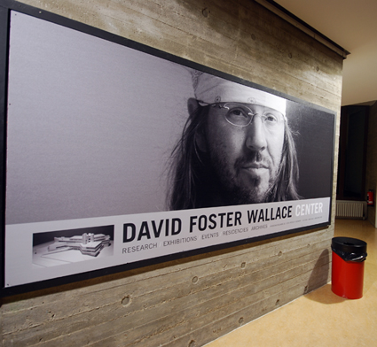
Infinite Jest, 24 Hours through the Utopian West, Hebbel am Ufer
photo Marcus Canning
Infinite Jest, 24 Hours through the Utopian West, Hebbel am Ufer
THE BENJAMIN FRANKLIN INSTITUT FUR MIKROBIOLOGIE UND HYGIENE IS A MENACING BRUTALIST MONSTER. FOR THE NEXT HOUR IT’S THE DAVID FOSTER WALLACE CENTRE. LARGE BANNERS FEATURING A BANDANA-BEDECKED AND BESPECTACLED DFW COVER ITS FAÇADE AND INTERIOR RECEPTION RECEPTACLES. IT’S LIKE SOME NUREMBERG/BOOK WORM CULT OF PERSONALITY CONVENTION HYBRID. A RANGE OF DFW GROUPIE T-SHIRTS ARE FOR SALE. PARTY PACK TOTE BAGS ARE DISTRIBUTED THAT INCLUDE SUSPECT SACHETS OF GLUCOSE POWDER TO HELP YOU STAY AWAKE.
Arriving with expectations of Matthias Lilienthal’s 24-hour (10am to 10am) theatre adaptation of Infinite Jest as high as a recent arrival at the Ennet House Drug and Alcohol Recovery Centre, eventually I needed the long-range stamina of the youthful Aryan Internationale elite of the Enfield Tennis Academy to make it through the 24 hours of the production.
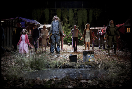
Moving through the walled-off West Berlin of another age, the 150-strong audience was carried in a convoy of double-decker buses to eight futuristic buildings constructed mostly during the 60s and 70s—a period of intensely competitive East-West Berlin development. This was the architectural equivalent of the space race and it led to some truly cosmic monuments to Late Modernist weirdness that today speak of derelict dreams and dystopia. What better arena to stage the seemingly impossible—a theatre adaptation of one of the most sprawling, improbable, dark and densely curious novels of the 20th century.
With Infinite Jest, David Foster Wallace re-wrote the rule book on writing the literary rule book. With Unendlicher Spaß—24 Stunden durch den Utopischen Westen (Infinite Jest—24 Hours through the Utopian West), Matthias Lilienthal presented his penultimate production after a decade as director of the Hebbel am Ufer (HAU) theatre. Over this time he not only established HAU1, HAU2 and HAU3 but housed a startling array of the who’s who of international contemporary performance in these interlinked spaces and beyond, creating a genre-busting program of cross-societal as much as cross-artform collaborations.
Lilienthal assembled his favourite directors, companies and artists from across the globe for this, his last production with the HAU and the world’s first attempt at Infinite Jest live. Germany, the UK, Poland, Australia, Argentina, the US and France were present across the 12 participating groups handed a slice of the Infinite pie and a spot on the magical mystery tour.
Given a freeform chance to explore and experiment with key passages and concepts from the 1,079 pages and 388 footnotes of the postmodern magnum opus with its 200+ characters and multiple interwoven and interleaved micro-narratives, the contributors ran with the opportunity in an array of wildly different directions. Coherence was obviously not the order of the day.
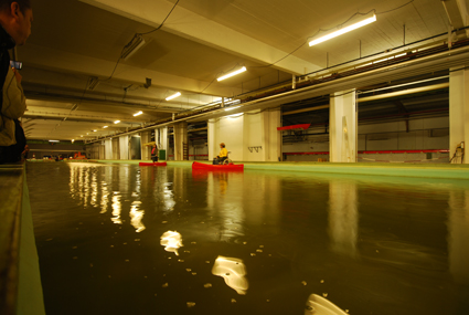
Underground reservoir used as a wave motion engineering facility, Infinite Jest, 24 Hours through the Utopian West, Hebbel am Ufer
photo Marcus Canning
Underground reservoir used as a wave motion engineering facility, Infinite Jest, 24 Hours through the Utopian West, Hebbel am Ufer
By the time we visited a Fritz Langesque 1930s state radio station it was starting to get late. My expectation high had peaked and was starting to crash. Herded into a live sound recording studio, we encountered Madame Psychosis broadcasting her voice-modulated monologue in veiled silhouette from behind the screens of a glass control box in the corner. It was mesmerising… until she broke a fundamental directorial rule and left the booth… trailing a very long piece of tulle… exiting through a brightly lit door as a somewhat stupid metaphor for her untimely demise. It wasn’t the first time surprisingly clumsy direction had undermined the tension and potency of a moment that felt authentically Infinite Jest. I was starting to get frustrated.
This fantastically ambitious production had the largesse and logistic precision of modern warfare, which is always impressive. For the DFW fanatic, it was intriguing, but inevitably disappointing as it kept somehow missing the mark. For the uninitiated, it was obviously an impenetrable nightmare. They were peeling off from the tour and hailing taxis in increasing numbers over the 24 hours.
‘Anti-theatre’ of this ilk at its best, is the best. At its worst, it’s arbitrary avant garde style-over-substance too-smart-for-its-own-good self-indulgence that loses sight of the dramatic potential of its material and enters the terrain of tedium. This production featured both ends of the spectrum, and perhaps that was the point. Infinite Jest is, at its core, difficult, dense, depressing and at times incredibly boring. It’s also quintessentially 90s in style, so why shouldn’t the production be difficult to digest, with large tracts of dull, and feel somewhat dated?
The title, Infinite Jest, is not only a wry reference to a line from Hamlet’s soliloquy to the skull of Yorick, it’s the title of the very last ‘apres-garde’ film made by James Incandenza, a mostly absent character in the novel and around whom many of its narratives swirl. Infinite Jest is a film so captivating it literally entertains you to death. It’s Capital-E entertainment that incapacitates and renders you senseless—a central metaphor for the mindless pleasures of the overbearing culture of consumption that the book surreally portrays.
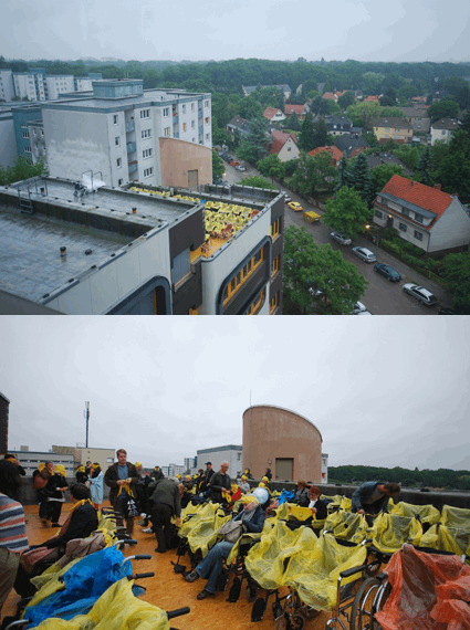
Rooftop gathering of wheelchair assasins, US Office of Unspecified Services, Infinite Jest, 4 Hours through the Utopian West, Hebbel am Ufer
photos Marcus Canning
Rooftop gathering of wheelchair assasins, US Office of Unspecified Services, Infinite Jest, 4 Hours through the Utopian West, Hebbel am Ufer
It’s both poignant and ironic that the not too distant future described in the 1996 novel is now. Somehow it made the art-cool, cerebral distance of much of the direction of the ‘episodes’ feel like they’d missed the once-in-a-lifetime opportunity to kick all of the blatantly ambitious experimental goals set for this production, while also entertaining the crap out of the audience.
I for one was expecting more gratuitous visceral enjoyment and a lot more laughs. It’s what I love about the book. It’s horrifically funny in ways that make you question your own mental health. No one belly-guffawed once during the tour I was on, and I for one never felt my sanity threatened in the slightest, apart from mild sleep deprivation.
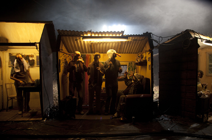
The production’s consistent redemption was the genius of its locations: the Steffi-Graf-Stadium as the Enfield Tennis Academy; the 60s cultural complex ripped straight out of Clockwork Orange where the 5am AA meeting was held under brutal fluorescent lighting amid walls of primary colours; the surreal Teutonic version of a white-trash underground American Western Saloon; the derelict remains of Buckminster Fuller geodesic domes at a CIA monitoring station perched on top of an artificial mountain built from Hitler’s rubble; a vast underground reservoir used as a wave motion engineering testing facility, entered through a building with a monumental intestinal pink fibreglass tube curling through its exterior skin; the glorious 70s Reinickendorf tax office turned into US Office of Unspecified Services where the final manic episodes occurred, culminating on the rooftop at dawn where we all donned happy face banana bandana masks and sat in wheelchairs arranged in rows to become members of the notorious Québecois terrorist cell, the Wheelchair Assassins. There were moments such as these where it all came together and packed the desired punch. I just left wanting more of them in return for 24 hours of endurance. If nothing else, as a tour of West Berlin’s architectural underbelly of bizarre anomalies, the production was endlessly enthralling.
Perhaps this was always going to be a production that looked, and looks, better on paper—destined more for historical traction in the realms of contemporary performance academia due to the literary importance of Infinite Jest, the status of the artists involved and the lofty aspirations of the production, backed up by its densely researched and sexy-as-all-hell reader.
It certainly wasn’t designed to entertain the masses. After all, only eight performances, with half the crowd bailing each night equates to about 500 peeps in total experiencing the entire marathon. With over 100 individuals involved in the production and a lot of development behind it, that’s a gloriously decadent application of German Federal Cultural Foundation resources that would have equivalent artists and companies in Australia drooling at the potential.
Matthias Lilienthal is quoted in the reader as having once said “I was always at my best…when things got really tough.” If this was his best, I for one didn’t think it was good enough. Perhaps ‘things’ should have got tougher.
Hebbel am Ufer, Infinite Jest—24 Hours through the Utopian West: director Matthias Lilienthal, artists Biancchi/Macras, Gob Squad, Peter Kastenmüller, Jan Klata, Chris Kondek, Anna Sophie Mahler, Richard Maxwell, Mariano Pensotti, Philippe Quesne, She She Pop, Anna Viebrock, Jeremy Wade; video animation My best Thing by Frances Stark; Berlin. Berlin, June 2-27
RealTime issue #112 Dec-Jan 2012 pg. 31
© Marcus Canning; for permission to reproduce apply to realtime@realtimearts.net
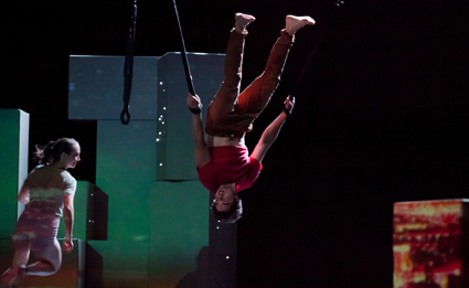
Amy Macpherson, Matt Cornell, Symphony, NORPA, Legs on The Wall
photo Jeff Dawson
Amy Macpherson, Matt Cornell, Symphony, NORPA, Legs on The Wall
ACKNOWLEDGING THE SHEER RHYTHMIC EXUBERANCE AND MASTERY OF BEETHOVEN’S SEVENTH, WAGNER FAMOUSLY DESCRIBED THE SYMPHONY AS THE “APOTHEOSIS OF THE DANCE.” ALL BUT 200 YEARS AFTER ITS PREMIERE IN 1813, SYDNEY PHYSICAL THEATRE COMPANY LEGS ON THE WALL WRAPS ITSELF AROUND STEFAN GREGORY’S SUPERB ELECTRIC-GUITAR RENDITION OF THE SEVENTH AS THE HUB OF ITS EVOCATIVE NEW WORK, SYMPHONY.
Commissioned by NORPA as part of its Generator program, director Patrick Nolan’s largely dance creation is, at once, a homage to the structure and dynamic of Beethoven’s original and an extended meditation on “the dance of self and other.”
Symphony is structured around the four movements of the Seventh. There are four performers, one featured in each movement. The first begins with the blast of a loud, sharp chord. The lights reveal a singular figure (Rhiannon Spratling) on an open stage. Like a child alone at play, her rhythmic, repetitive dance builds with the ebb and flow of the guitar. Again and again, she throws herself wildly across the stage. Three performers (Matt Cornell, Amy McPherson and Joshua Thomson) bring on rectangular metre-high boxes impeding her dance. The boxes line up in four orderly rows, suggesting a landscape encroached on by the grid of suburb or city. The number ‘one’ projected on a box signifies the first movement. Dancer and performers begin playing together. In their exuberance, they knock all the boxes over until they lie chaotically about. The dancer is distressed by the chaos. She carries a box upstage as the movement comes to its close. The performers follow suit and begin building a wall as the lights fade to black and a long silence ensues. With the sombre refrain that introduces the second movement the performers complete the wall with four ‘windows.’
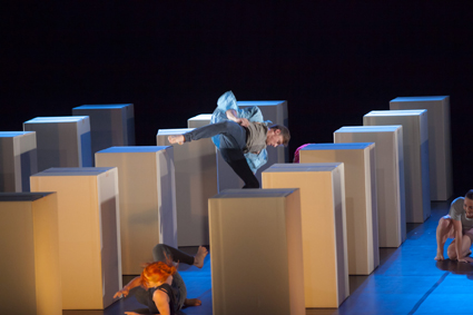
Symphony, NORPA Generator, Legs on the Wall
photo Jeff Dawson
Symphony, NORPA Generator, Legs on the Wall
The wall becomes a potent image and device in Symphony. At the end of the first movement, it seems to represent the alienation of the dancers from each other. Over the next three movements, it will be a wall we look through, like peering through someone’s window. It will become the canvas on which video artist Andrew Wholley projects his wonderful imagery—brick wall, cityscape, circuit board, orbiting moon. It will become the space against which the performers dance, their own forms projected onto their bodies. Its four windows will come to represent both the four movements of the symphony and the four performers. In this regard, designer Alice Babidge has made the right choice to leave the performers in rehearsal clothes. Fnally, the wall will be smashed down and rebuilt as four separate structures.
Symphony then is a ‘self-conscious’ reflection on its own evolution and creation. Its imagery sparks reverberant thoughts without offering the relative certainty of meaning inherent in narrative. Music, dance and image are yoked together to produce a deeply intimate experience. Symphony is a subjective, impressionistic piece; it takes place in the mind of the beholder. Not unlike ‘the dance’ of life really. I would have paid the admission price just to hear Stefan Gregory’s masterly reworking of Beethoven!
NORPA Generator: Legs on the Wall, Symphony, director Patrick Nolan, composer Stefan Gregory, performers Matt Cornell, Amy McPherson, Rhiannon Spratling, Joshua Thomson, designer Alice Babidge, video Andrew Wholley, lighting Matt Cox; Lismore City Hall, Lismore, NSW, Nov 16, 17
RealTime issue #112 Dec-Jan 2012 pg. 32
© Peter Barclay; for permission to reproduce apply to realtime@realtimearts.net
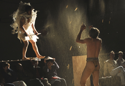
Matt Prest, Lee Wilson, Whelping Box
photo Heidrun Löhr
Matt Prest, Lee Wilson, Whelping Box
WHELPING BOX, PART OF PERFORMANCE SPACE’S SEXES SEASON, WAS A LONG-AWAITED REMINDER OF HOW VISCERAL, PROVOCATIVE AND INTELLIGENT CONTEMPORARY PERFORMANCE CAN BE.
The product of intensive team work, overlapping responsibilities and a range of skills, four artists, working without writer or director, put paid to the notion, once again in the ascendancy, that theatre is foremost the realm of writers—as argued by David Williamson in the STUDIO cable TV series Raising the Curtain, as well as letters-to-the-editor writers hostile to the recent cut-and-pasting of classics by young male directors.
Certainly the great achievements in writing for the stage over thousands of years can never be undervalued, even if it’s not at all clear that we are enjoying such greatness in our own era. Some of the most potent authorship across the last decade in Australia has come in the form of adaptations of classic (and some not so enduring) works by Kosky, Wright, Andrews, Strong, Lutton and others in a tradition that goes back at least to the 1970s; I recall my surprise, and delight, at encountering Charles Marowitz’s “free translations” of plays by Shakespeare at London’s Open Space Theatre in the mid-1970s. Marowitz has been a critic, a collaborator with Peter Brook (another provocative adaptor) at the Royal Shakespeare Company, the co-founder of Encore Magazine, director and playwright. He was part of that 60s and 70s explosion of performative experimentation that opened theatre up to new possibilities—many of them now well-integrated into the mainstream.
Of course, not all contemporary performance works are models of radical cogency, just as many stage plays fail to meaningfully cohere though abiding by the well-thumbed rulebook of tradition. Equally, ‘deconstructed’ classics offer little if they don’t tell us something about the original as much as about ourselves.
The fear among playwrights and the directors who support and often nurture them, is that writer-free (in fact, that’s not always the case) contemporary performance and the emergence of a so-called ‘directors’ theatre’ have reduced the opportunities for good, new plays to emerge in an already small market. Justifiable paranoia, you might think. Meanwhile theatre, in the broadest terms, from the mainstream to burgeoning live art and digital ventures (see review of Kumuwuki), continues to mutate in fascinating and sometimes worrying ways—for example a skill-less DIY dimension in some live art. The debate about the status of the playwright is beyond resolution. Meanwhile cable television has opened up remarkable opportunities for some of the same writers, not a few who’ve become co-producers of their own material. But the screen is not the stage.
performance space, whelping box
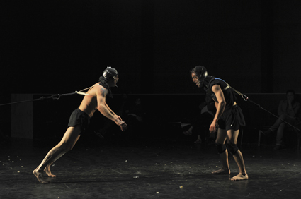
Matt Prest, Lee Wilson, Whelping Box
photo Heidrun Löhr
Matt Prest, Lee Wilson, Whelping Box
Two men, heads masked with tightly bound packing tap bound aggressively towards each other, restrained by sprung leashes that pull them back at the point where skulls might crack. This violent image of humans behaving like fighting dogs in training is central to Whelping Box, the creation of Lee Wilson and Mirabelle Wouters of Branch Nebula and fellow contemporary performance makers Matt Prest and Clare Britton, performed by Wilson and Prest with ruthless vigour and wit.
Prior bouts of training include exercises in which one or other of the men is taught to endure pain (a ‘massage’ with a rusty shovel), to trust his teacher while blindfolded or, critically, not trust at all. The irony is that this all takes place in a large whelping box—a device used for the nurturing of puppies—the audience lining its internal perimeter. Although care seems to be taken, nurture ranks low and our proximity to the performers induces anxiety for them and, at times, ourselves.
The box is cleverly designed to be at once wall, platform and resonant chamber. The two men breach it, running and leaping simian and dog-like around and above us, at one stage naked, thrusting pelvises defiantly at each other, cocking legs as if to mark out territory. The miked box amplifies the thump and skid of bodies, scarily enlarging our sense of their power. The box cannot contain this raw masculine energy which is also clearly cultivated for violence. This tension is a key to the show’s dialectical dynamic—a mix of manipulation and exuberance, risk and play, grim comment and literal and quite lateral parody.
Whelping Box commences with Wilson wielding a long pole with a light at its end which Prest puppyishly pursues, running furiously in circles and then finally joining his master in a war-like dance. After the mid-show leap into anarchy, which includes the spraying of biscuit rewards over the audience, a passage ensues in which the men tie themselves to each other with a long twisted strand of clear tape that is bound around waists and thighs (men in the audience reached nervously to safely cup their genitals). A fearsome tug of war follows, actual competition, a display of strength which is almost sculptural in its moments of taut stasis and near snapping point.
The final stage of the show transforms into idiosyncratic mythmaking—fantasies of the masculine self. In an inversion of the opening scene, Prest as a glittering magician with an almost feminine aura leads a feral dandy Wilson with the tip of his bliss-inducing wand, accompanied by a bee-like buzz and a soaring, wordless soprano sound score. But this moment of transcendence is mere respite before the testosterone finally kicks in again and loud, joyful and thankfully harmless chaos ensues.
In its celebration of masculine physicality, Whelping Box breathtakingly delineates the pleasures, pain and contradictions of play, initiation, bonding, competition, risk and self-mythologising. Within a carefully choreographed framework, Wilson and Prest repeatedly push themselves to the limit, testing their bodies in sustained acts of endurance, living out the very condition they have committed to celebrate and critique.
Like the stage design, Jack Prest’s sound score is enveloping, eerily punctuating and pumping up the action in a quite non-literal manner. A curious design element is a large illuminated square (like an inverted light box) hovering over the action, morphing from one colour to another and slowly descending to the floor where it finally appears to take the two men with it. Did it indicate not so much the demise of masculinity per se, but the condition’s endurance to the end of light and time? What remains so vividly in my consciousness is Whelping Box’s vivid evocation of the complexities of intimate male behaviour (if barely homoerotic) built around physical drive, even at a time when that behaviour can no longer be ascribed to men alone and when the demise of the male of the species is the subject of random sci-fi-ish speculation. (See RealTime TV interview with Wilson and Prest, including footage from the show.)
belvoir, private lives
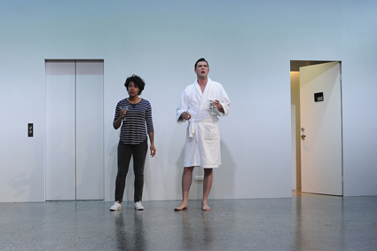
Zahra Newman, Toby Schmitz, Private Lives, Belvoir
photo Heidrun Löhr
Zahra Newman, Toby Schmitz, Private Lives, Belvoir
Noel Coward’s Private Lives (1927), which American theatre writer John Lahr once described “as perfect as an art deco curve,” is given a right rumpling in Ralph Myers’ contemporary rendering. The setting is a style-less hotel room-cum-patio-cum-foyer space (with oddly scaled elevator access) of the bleak modern variety. Muzak and Phil Collins (“In the air tonight”) ominously supplant the genteel music of the 20s. Elegance in gesture and fashion are pretty much absent and Amanda (Jamaican-born Zahra Newman) is played, with tough, energetic verve. The French maid is brutally rude rather than snooty (a very funny Mish Grigor). Precious British accents give way to unmannered voices if too often at the expense of the inherent rhythms of Coward’s dialogue. Languid, sensual intimacy abounds but so too does palpable physical violence, such that the play’s forgiving ending cannot atone for Elyot’s misogyny—verbal and physical. But he is forgiven because Private Lives is a fable of redemption born of accepting difficult love; it’s a genteel farce with heart and a handful of psychological insights and a happy ending. An attempt to turn it into something more serious on the one hand, and more physically funny and far less genteel on the other, is risky but very interesting.
While some have seen Myer’s Private Lives as a worthy, vigorous, very Australian response to a rarely seen theatre classic, I felt that, short on style, it hadn’t found the right contemporary idiom or setting with which to do this comedy of manners justice. It was often obtuse at the expense of subtlety, although the extreme decline of Toby Schmitz’s Elyot into extreme dishabille and abjection compensated somewhat for his underlined sinning. In sync with our reality TV times the lives in this production didn’t seem private at all. With feelings overtly and often very physically expressed, the sense of an inherently repressed culture out of which Coward’s wit and sarcasm erupted to the surface without doing too much damage goes missing. The deco curve is broken in Myer’s nonetheless bold attempt to introduce new generations to an enduring work, albeit one tied more than many to its era, as is often the case with comedies of manners.
sydney theatre company, signs of life
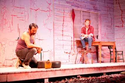
Aaron Pedersen, Heather Mitchell, Signs of Life, Sydney Theatre Company, Black Swan Theatre Company
photo Lisa Tomasetti
Aaron Pedersen, Heather Mitchell, Signs of Life, Sydney Theatre Company, Black Swan Theatre Company
Tim Winton’s Signs of Life is set in an isolated, drought-ruined property, home to Georgie (Heather Mitchell), an elegant middle-aged woman living with the ghost of her recently deceased husband—an apparently ne’er do well but loved hippie. Two other isolates, an Aboriginal brother (Aaron Pedersen) and sister (Pauline Whyman), turn up in the night when their car breaks down. They contrive to stay on, seeking a place by the now empty river where their late, silent father once stayed. In a rare moment of openness, he had revealed to them an affinity with that country although not belonging to it.
Like their father, the siblings are rootless. The brother, Bender, angrily declares that they are without stories, clan or place. “I’m put together from spare parts,” he says. He is an itinerant worker who has removed his sister, Mona (suffering the effects of foetal alcohol syndrome), from an institution where she had been incarcerated for killing her child while drunk. He’s intelligent and funny, quick with the killer quip; the sister blunt and unpredictable; each exudes a peculiar energy, part threat, part determination, indicators too of potential, but not dramatically developed in Winton’s writing.
Initially Georgie entertains no hope for the future of the property, symbolised in a failed olive orchard and the empty river, but by the play’s end she has let go of her husband’s hapless ghost and offered to share the property (which she has no real evidence of owning) with the siblings. Given that there’s little intimacy between the woman and the pair, beyond having heard each other’s stories, and given the absence of rain, the ending is irritatingly sentimental.
Signs of Life is theatrically naive. It’s partly and incompletely narrated by the central female character; it’s awkwardly constructed and directed (not least in the underdeveloped exchanges with the walk-on, walk-off ghost); and the dialogue, laden with exposition, is at times uncomfortably literary. Aaron Pedersen gives a vibrant performance as the brother, although coming close in the writing to yet another quick-witted oppressed Aboriginal, and Whyman brings a rawness to her role that suggests palpable danger—which makes her sudden sense of well-being at the end less than believable.
Performance Space, Whelping Box, co-creator Branch Nebula (Lee Wilson, Mirabelle Wouters), Matt Prest & Clare Britton, sound Jack Prest, producer Performing Lines, Carriageworks, Oct 25-Nov 3; Belvoir, Private Lives, writer Noël Coward, director, designer, performers Mish Grigor, Eloise Mignon, Zahra Newman, Toby Schmitz, Toby Truslove, costumes Alice Babidge, lighting Damien Cooper, composer, sound Stefan Gregory, Belvoir Upstairs, Sept 26-Nov 11; Sydney Theatre Company, Signs of Life, writer Tim Winton, director Kate Cherry, performers Heather Mitchell, Aaron Pedersen, George Shevtsov, Pauline Whyman, designer Zoe Atkinson, lighting Jon Buswell, composer, sound Ben Collins, Drama Theatre, Sydney Opera House, Nov 7-Dec 22
RealTime issue #112 Dec-Jan 2012 pg. 33
© Keith Gallasch; for permission to reproduce apply to realtime@realtimearts.net
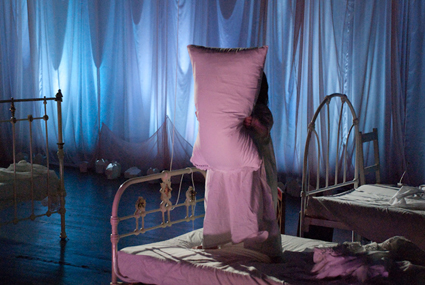
Emma J Hawkins, Take Up Thy Bed & Walk, Gaelle Mellis & Vitalstatistix
photo Jennifer Greer Holmes
Emma J Hawkins, Take Up Thy Bed & Walk, Gaelle Mellis & Vitalstatistix
LOIS KEITH, IN HER BOOK TAKE UP THY BED AND WALK, CHARACTERISED VICTORIAN ATTITUDES TO DISABILITY IN FIVE WAYS: “(1) THERE IS NOTHING GOOD ABOUT BEING DISABLED; (2) DISABLED PEOPLE HAVE TO LEARN THE SAME QUALITIES OF SUBMISSIVE BEHAVIOUR THAT WOMEN HAVE ALWAYS HAD TO LEARN: PATIENCE, CHEERFULNESS AND MAKING THE BEST OF THINGS; (3) IMPAIRMENT CAN BE A PUNISHMENT FOR BAD BEHAVIOUR, FOR EVIL THOUGHTS, FOR NOT BEING A GOOD ENOUGH PERSON; (4) ALTHOUGH DISABLED PEOPLE SHOULD BE PITIED RATHER THAN PUNISHED, THEY CAN NEVER BE ACCEPTED; AND (5) THE IMPAIRMENT IS CURABLE. IF YOU WANT TO ENOUGH, IF YOU LOVE YOURSELF ENOUGH (BUT NOT MORE THAN YOU LOVE OTHERS), IF YOU BELIEVE IN GOD ENOUGH, YOU WILL BE CURED.”
Keith’s book was one of the main jumping-off points for the Vitalstatistix performance of the same name, conceived and created by artist Gaelle Mellis, who has a disability herself. Take Up Thy Bed & Walk is infused with interrogations of Victorian fear and loathing of the disabled. Adelaide has a rich history of works and performance groups (including Restless Dance Theatre and No Strings Attached Theatre of Disability) who have countered traditional narratives of disability, but Take Up Thy Bed & Walk is an attempt to push disabled arts practice beyond critique and towards advocacy and inclusivity. Its aim is an ambitious one: to embed accessibility within the dramaturgy and form of the work itself, by means of the incorporation of Auslan interpretation, projected dialogue and audio description.
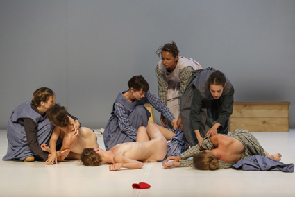
Before the show, the audience is invited to explore the set and given handcrafted lanterns to navigate through the near-darkness. We steer ourselves around five cast-iron beds—one each for performers Emma J Hawkins, Kyra Kimpton, Michelle Ryan, Jo Dunbar and Gerry Shearim—and eerie reminders of other ages: a dolls’ house, a caged scorpion, battered Bibles. We seem to be in a Victorian institution for women, a notion strengthened by the clinical/penal costumes the performers wear as they mingle with us. After a time, we abandon our lanterns and are seated.
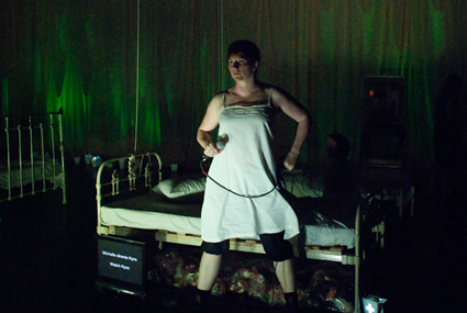
Jo Dunbar, Take Up Thy Bed & Walk, Gaelle Mellis & Vitalstatistix
photo Jennifer Greer Holmes
Jo Dunbar, Take Up Thy Bed & Walk, Gaelle Mellis & Vitalstatistix
What follows is a shifting, heavily mediatised exploration of both how the able-bodied view the disabled, and how the disabled view themselves. The five performers play with Keith’s tenets in critical and ironic ways, using angular, sometimes frenzied choreography and spare, bold dialogue to draw together the Victorian intolerance of physical difference and the still-subordinating discourses around disability in our own age. There is rage and cheekiness—and a great deal of self-deprecating humour—in the narrative fragments which emerge, each one shot through with a punkish spirit of defiance: a bride told she must be ‘cured’ in time for her wedding day, a woman whose walking stick becomes a weapon, a karaoke singer who can do nothing but scream into the microphone.
The effect of all this though is, ultimately, to under- rather than overwhelm. It’s not hard to laud Take Up Thy Bed & Walk’s agenda, but its uneven shape and formal inconsistencies make for a frustrating experience. There is a struggle, never fully resolved, between the Victorian narrative strongly established in the beginning and the post-modern fragmentariness that defines the bulk of the show. I was left wondering whether a more disciplined dramaturgy might have more convincingly revealed the implications of Keith’s book, and made the ending—which seeks to bring the able-bodied and the disabled together in anticipation of a new, celebratory narrative—feel less contrived than it does.
Vitalstatistix: Take Up Thy Bed & Walk, creator, designer Gaelle Mellis, co-director Ingrid Voorendt, writer Hilary Bell, performers Jo Dunbar, Emma J Hawkins, Kyra Kimpton, Michelle Ryan, Gary Shearim, lighting design Geoff Cobham, sound design, music Zoë Barry, Jed Palmer, video production Heath Britton, Jennifer Greer Holmes, animation Heath Britton; Waterside, Port Adelaide, Oct 24-Nov 10
RealTime issue #112 Dec-Jan 2012 pg. 34
© Ben Brooker; for permission to reproduce apply to realtime@realtimearts.net
OVERWHELMED BY THE VAST NUMBER OF SHOWS PLAYING ACROSS SYDNEY IN SEPTEMBER, I MANAGED TO TAKE IN ONLY TWO PRODUCTIONS IN THE SYDNEY FRINGE 2012, BOTH AT PACT THEATRE. ANNABELLE MCMILLAN’S PORPHYRIA’S SLUMBER AND MATRIARK ART THEATRE’S ALARUM MELDED A VARIETY OF FORMS IN HYBRID WORKS THAT REVEALED THE ADVANTAGES OF SUCH AN APPROACH, BUT ALSO THE RISKS.
McMillan disturbingly conflates Robert Browning’s Porphyria’s Lover, that grimly sensual Victorian poem of murderous love, with PL Travers’ Edwardian fantasy for children, Mary Poppins. The performer’s persona appears to be trapped between earth and sky: the floor invites prostration, vegetables are prepared and shared and, at the end, an umbrella will not take flight, leaving McLennan huffing and puffing. In between there’s a superfluity of imagery (despite a program note announcing the work as “an exercise in minimalism”), including a video longueur of a young man (perhaps embodying the narrator of the poem) and an unrevealing list of what the artist imagines when she thinks of Browning—an old piano, crumpled sheets, dust, pollen etc. McMillan is an engaging performer when not overplaying, her material has potential but its realisation is unwieldy and too often opaque.
Writer-director Robert den Engelsman’s Alarum, for Matriark Art Theatre, likewise evinces a futile desire to escape gravity—”I want to fly with Pegasus…but our wings have to be clipped”—and, for what is declared to be a love story, similarly suggests fatal disconnection. The central male character Samuel’s ennui (“my soul is long dead”) pervades the production, with his partner Gabriel struggling to understand his pain. A third figure, the stranger Ahasuerus (eventually revealed as some form of the resurrected Egyptian god Osiris) is a complicating child/adult intruder into the couple’s hopeless relationship, perhaps as Samuel’s doppelganger. Some simple, entwining movement over and around a tabletop evokes their possible oneness. The work’s fatalism is intensified by the use of finely crafted, if not expertly deployed, puppet skeletons (in the style of the Mexican Day of the Dead), allowing the characters to express their plight more passionately, and cosmologically. The director’s writing is awkward, the sometimes American delivery odd (given the absence of any context) and the symbolism overwrought. But there’s no doubting the commitment of the performers to their material.
PACT, Sydney Fringe 2012: Porphyria’s Slumber, devisor, performer Annabelle McMillan, director, dramaturg Danielle Maas, producer Holly Orkin, designer Alice Harvey, lighting Amber Silk; Matriark Art Theatre, Alarum, writer, director Robert den Engelsman, director, movement coach Scott Parker, performers Chase Burnett, Kit Bennett, Michael Smith, dramaturg Kathryn Roberts, designer Aleisa Jelbart, video +Harvest (Mathew Harvey), lighting Vanessa Hall, sound design Tim Fitz; PACT Theatre, Sept 7-29
RealTime issue #112 Dec-Jan 2012 pg. 34
© Keith Gallasch; for permission to reproduce apply to realtime@realtimearts.net
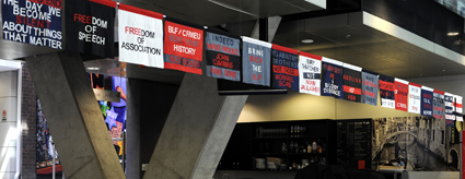
The Making of the Flag: Give Us Back Our Unions, Sussi Porsborg, Performance Space, Halls for Hire
photo Heidrun Löhr
The Making of the Flag: Give Us Back Our Unions, Sussi Porsborg, Performance Space, Halls for Hire
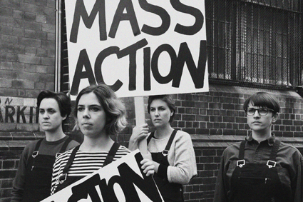
A VIDEO, COMMISSIONED BY PERTH ARTIST SUSSI PORSBORG AND SCREENED AS PART OF HER EXHIBITION AND WORKSHOP AT TRADES HALL IN SYDNEY, WAS SWITCHED OFF BY THE BUILDING MANAGER. HE EXPLAINED HE HAD RECEIVED COMPLAINTS FROM PEOPLE IN THE BUILDING BUT WAS UNWILLING TO SAY FROM WHOM, OR INDEED THE NATURE OF THE COMPLAINTS.
The video was part of an exhibition and workshop, The Making of the Flag: Give us Back Our Unions, presented by Performance Space as part of their Halls for Hire season: “Steeped in a rich history of Australian Trade Unionism, the Sydney Trades Hall is the perfect setting for this politically-charged flag-making workshop. Expanding the notions of participatory democracy in unexpected ways, Sussi Porsborg will take attendees on a live sewing performance that doubles as an educational conversation on the intersection of radical art, nationalism, politics and labour rights.”
The video, The Right to Represent, which can be seen on YouTube, http://youtube/nemJMfBVjqU, had been recently shot in Perth with the artist interviewing veteran trade union organiser Kevin Reynolds (former WA State Secretary of the CFMEU). He recounts the struggles of the movement from the 1960s through to the 80s in the days when the police were in the pockets of the government and employers—like Senator Rocher (Liberal Party, WA), who ran the Trident Building Company. As Reynolds tells his stories large captions appear under the images to emphasise the history, its rhetoric and the opinions of unionists: Taking the Fight Up; Rank and File; No Ticket No Start; Third Wave Campaign; Won the Fight; Retain What We’ve Got; We Can’t Rely on Governments; Intimidate Workers; 457 Visa; Workers Aren’t Getting a Share.
These captions are echoed in the other part of the exhibition and workshop where visitors are invited to heat-seal a slogan of their invention onto a flag or banner using cut out letters provided, already pre-cut from alphabetically arranged piles.
This is an opportunity for visitors, many arriving as invited groups from varied backgrounds, to become immersed in a tradition resonant with history. So what is it that upset the anonymous Trades Hall complainants so much? Is it Reynolds’ outspoken views on contemporary politics and unionism? Is it his recalling the confrontational days of yore? Is it the fact that the artist, a trade unionist herself, has used her imaginative and forthright approach to remind younger generations—the ‘virgins’ to whom Reynolds refers—that the conditions they enjoy in the workplace today are based on the struggles of previous generations, and that vigilance is needed. These conditions are being eroded, as both the artist and Reynolds propose, by the cozy agreements currently in place between the unions, government and industry.
Following an appeal to the general secretary of Unions NSW, the building manager appeared again, not to re-instate the video (now hung with banners made by the artist saying Freedom of Association, Freedom of Expression), but to remove it entirely from the exhibition space.
Why are we seeing such underhand censorship of an artist’s exhibition over content that had been previously agreed to on a handshake? Is freedom of expression and freedom of association really too much for some to take in a building originally dedicated to such principles?
Performance Space, Halls for Hire: The Making of the Flag: Give Us Back Our Unions; Sydney Trades Hall, Oct 2-7
RealTime issue #112 Dec-Jan 2012 pg. 35
© Mike Leggett; for permission to reproduce apply to realtime@realtimearts.net
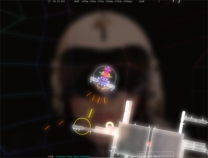
Captain Successor from the Captain Forever series by Farbs
IN THE PAST DECADES, VIDEOGAMES HAVE MOVED INEXORABLY FROM THE ARCADE TO THE GALLERY, FROM BENEATH THE TELEVISION TO THE BACK POCKET, FROM THE NICHE TO THE MAINSTREAM, EVOLVING ALONG THE WAY TO—AS THE INDUSTRY LOVES TO TELL US—A MULTI-BILLION DOLLAR ENTERPRISE THAT IS BIGGER THAN HOLLYWOOD.
Australia has always been part of that change, with the arc of local evolution reflecting and responding to the international eddies of the entertainment industries, technology and culture in its own particular way.
innovative beginnings
In the early years of videogame development, Australia was home to experimental developers and publishers who created influential and genre-defining games like The Hobbit or Way of the Exploding Fist. This became the foundation for the 90s when the texture of local development settled into a mix of original games such as Dark Reign or Powerslide and those based on movies or comics, a mix which reflected wider trends—do the license work to bring in money, use the money to make something original. It was a model that worked well creating a stable industry, but during the first decade of this century the focus of developers tipped in favour of the licensed titles and the mainstream of Australian development became defined by work-for-hire movie or cartoon titles.
crisis time
This local focus made Australian development particularly vulnerable in the early years of the new decade as seismic shifts in development priorities and audience interest—catalysed by the GFC—changed the shape of mainstream game development around the world as publishers began to focus on known big budget blockbusters and smaller digitally distributed titles becoming less interested in mid-tier licensed titles. A shock wave went through studios, closing some and shrinking others, leaving many people wondering what to do next.
a new australian mainstream
Those best placed to ride this change out had adapted or were in the process of adapting to the rising ubiquity of smartphones and digital distribution platforms like the App Store and, in doing so, they created a new Australian mainstream—one focused on mobile, digital distribution, bite-sized arcade gameplay, and in recent years the possibilities of freemium and in-app purchases. Mythologies grew up around companies like Firemint (now Firemonkeys through a purchase from behemoth publisher EA and merger with another local company, Iron Monkey), creators of Flight Control, and Halfbrick, whose Fruit Ninja has had 300 million downloads. Many people, new to games or answering their own questions of what to do next, followed their lead, hewing to the mobile, arcade, freemium lines that seemed to indicate the best chance for success.
But this is only one story of the creation of videogames, and a particularly industrial one. These same changes in technology, in culture, in audiences, and in distribution that all moved games to a wider audience also left a gap, and in that gap, what was once the province of all videogame makers—space for the outsider—shifted and changed. A new mainstream was created, but so too was an evolving fringe of new voices, new makers and new ideas.
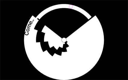
Expand, Christopher Johnson, Christopher Larkin, Best Audio in Game runner up, Freeplay 2012
reclaim the game
In her book, Rise of the Videogame Zinesters: How Freaks, Normals, Amateurs, Artists, Dreamers, Dropouts, Queers, Housewives, and People Like You are Taking Back an Art Form, author and game developer Anna Anthropy calls for people to embrace the potential of games and take them back from this industrial mainstream, likening the possibilities of videogames now to the easy creation and distribution of zines. Anthropy writes about her own creations, like Calamity Annie and Lesbian Spider-Queens of Mars, along with the work of others like Stephen Lavelle, whose website increpare includes a multitude of experimental games and mechanics; Christine Love whose period piece Digital: A Love Story explores young love mediated via technology; and Bennet Foddy, creator of GIRP, QWOP and Pole Fighters.
australian outsiders
Similar outsiders exist much closer-to-home, and each, in their own way, tell unique stories which are defined by the international story of game development, but also the closer to home changes which have directly impacted on them.
Game developer Farbs used to be part of the mainstream, working in the Australian arm of international publishers/developers 2K before quitting, famously, through the unique means of creating a playable game. His work is vibrant, potent and compelling in its focus on a pared-back ideal. Running the range from the arcade mash-up ROM CHECK FAIL, which fuses classic games, mechanics and glitches in a strangely functional, emergent experience to the austere exploring, crafting, shooting of Captain Forever or the bleep-happy rainbow explosion of Cumulo Nimblers, these are games which feel like they’re designed for an audience of one, but which through their sheer force of personality connect with many more people than that.
Glenn Forester says on his website that the only thing he does is make games, and looking at his output, it’s easy to believe that to be the case. A mix of mashup, jam, and rapid experiments, they’re sometimes unpolished, frequently very strange, but in all cases interesting and personal, drawing from the mainstream by co-opting games like Mario, Doom, Minecraft or Tetris and turning them into something new.
Finally, Harry Lee is representative of a new generation of developers who have never been part of the Australian studio system, and whose projects seem more interested in the exploration of ideas through systems, interactions and technology. His notable project, Midas, takes the story of a king whose touch turns everything into gold and converts it into a clear and compelling set of mechanics, which is a hallmark of his other titles Stickets and Impasse.
The emergence of these new makers—both here and overseas—shouldn’t be a surprise to anyone. Other creative forms have their independents, their outsiders, evolving as greater numbers engage with the mainstream and as the means of production and distribution become democratised. Not everything these makers do will be great, not all of it will even be good, but it will be unique, and it will be personal, and it will add to the volume of the voices of artists who make games, telling new stories which have far more to say and will resonate in ways that the mainstream—whether globally or locally— simply isn’t interested in.
RealTime issue #112 Dec-Jan 2012 pg. 25
© Paul Callaghan; for permission to reproduce apply to realtime@realtimearts.net
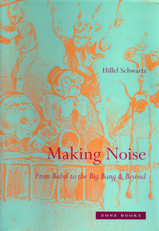
Hillel Schwartz, Making Noise: From Babel to the Big Bang & Beyond, Zone Books, New York, 2011
IT’S AN ALL TOO COMMON MISTAKE. SCHOLARS, SCRIBBLERS AND UNDERGRADUATES ROUTINELY GIVE BACK TO FINNEGANS WAKE AN APOSTROPHE IT DOESN’T REQUIRE. JOYCE’S PUNMANSHIP CONTINUES TO BEGUILE. IT WAS UNDECIDABLE, IMPLYING, RATHER THAN CHOOSING BETWEEN, THE PLURAL TENSE AND THE SINGULAR POSSESSIVE. UNLIKE THE LETTERS ‘S’ OR ‘Y,’ THAT APOSTROPHE DOESN’T HAVE A SOUND (CHEEKILY IRONIC, OF COURSE, IN RELATION TO A BOOK ALL ABOUT SOUND, WITH ITS BABBLING, CHATTERING AND HUNDRED-LETTER THUNDER WORDS).
Hillel Schwartz’s prefatory remarks to Making Noise contain one of the most poetic and beautiful accounts ever written of John Cage’s mythic 1951 visit to Harvard University’s silent, anechoic chamber and the aleatory composer’s wonder at hearing the sounds of his own body. It’s expected, then, to find an account of 1920s radio static and ‘stray’ sounds in Finnegan’s Wake (sic), but surprising to encounter such an elementary spelling mistake by the indefatigable author of The Culture of the Copy (1996). But further, Schwartz neglects to include the surfeit apostrophe before Alfred Jarry’s ‘pataphysics, a bogus, diacritical pomp that, while symbolic rather than sonic, is nonetheless accepted as bibliographic convention. On the other hand the grave accent is correctly placed in musique concrète, in this instance adding appropriate sonic weight and inflection to the pronunciation (Schwartz happily also loses the Austrian-flavoured umlaut often and incorrectly placed over the o in English derivations of Schoenberg).
It would indeed be churlish to spend too much time on such frippery in relation to Making Noise’s extraordinary scholarship and exquisite writing, wit and intelligence, its labour and love. While this suprasegmental detail sounds decidedly bookish it is far from pretentious or fustian. The very notion of the unnecessary, in this instance incorrect marks and “unwanted sound,” of “noise rarely indexed but often hidden,” is unavoidable. This sense of uncontrollable excess, of sound being surplus to need, of the inescapable weight of noise in the world from the beginning of time to the continuous present tense, is what Schwartz’s remarkable book is all about. The blurb (itself a form of noise) on the dust-jacket (of which I’ll say more directly) is succinct: “From the uproarious junior gods of Babylonian epic to crying infants heard over baby monitors, from doubly mythic Echo to loudspeaker feedback, Making Noise follows ‘unwanted sound’ on its paths through terrains domestic and industrial, legal and religious, musical and medical, poetic and scientific.” For a book two decades in the making, we should expect nothing less.
By the age of six, Schwartz tells us, “a child has spent more than 20,000 hours listening to the world and can recognise 10,000 complex sequences of syllables.” This connection between anthropology, sociology and biology, audition and grammar, reinforces Schwartz’s fascination with the human condition as essentially sonic rather than visual. In this, Making Noise daringly flies in the face of a generation of theorists for whom “typographic man” emerged from the Enlightenment as the literate product of the alphabet, dusting off the phonetic savagery of oral cultures along the way. Marshall McLuhan and Walter Ong are barely mentioned, Ted Carpenter and Jack Goody fail to detain the indexer. Put simply, Schwartz tells us that to be alive, “joyfully alive, or deeply troubled, or floating under the spell of a hypnotist” is to be “noiseful.” The Enlightenment has much to answer for, as has been demonstrated by more than 50 years of agonistic cultural criticism and literary theory. Schwartz caps off this counter-critique simply and pithily: being noiseful is evidence, personal as well as impartial, of the “fall of noise into nature.” Jorge Luis Borges taught us in his ficciones that there is something demiurgic about astounding scholarship. Reading this book realistically underlines that fabulatory astonishment.
Apart from the long history of noise and its affinities with culture, this book, if it is about anything that we can tidily name, is about the sounds of modernity. Note not the sound of modernity, since that it is far too monumental and inclusive. Schwartz portrays the emergence of the modern world as the empire of the ear, as a phenomenon that will always elude the anti-noisites and the trans-historical war on noise. Urbanisation, population growth, mass transport systems, stress etc may be things, but they all make sound. Like Joyce before him Schwartz identifies the inventory as one of the decisive techniques of modernity, the capacity to collate the sheer excess of the world into exhaustive lists. Accordingly, some of the sounds and noises of being modern that pepper the book’s pages include: machinery, street sellers, car alarms, primal scream, tinnitus, black noise, white noise, orange noise, pink noise, mufflers, sneezing, sniffing, noseblowing, traffic, toilets, farting, tittering, muttering, mobile phones, jackhammers, muzak, tutting, ventilation, brakes, television, radio. And so it goes. Silencing the noise from the business of being modern, Schwartz emphasises, would be impossible. For good measure he says it again in case we didn’t hear it the first time—“Let’s be blunt: impossible.”
At over 900 pages of text (including index) and 349 of endnotes (as downloadable pdf) Schwartz is no friend of parsimony. But forget for a minute that any words in this text, unlike sound and noise, are surplus to need, extraneous or padding. Schwartz is a writer’s writer, meaning that he is a sublime stylist, can turn a phrase you’ll never forget and knows he is being read by, inter alia, other writers. Which brings me to the dust jacket. I confess that I covet dust jackets and value paper more than cloth binding. On receiving my copy of Making Noise the first thing I did was remove the jacket for safe-keeping. In doing so I realise I had already taken Schwartz’s point before I had even read a word. For the paper cover is secondary, disposable, removable and ultimately unwanted. It is, after Philip K Dick, kipple, stuff that protects and otherwise clutters the real thing. It is an allegory, in other words, of Making Noise itself. As Schwartz says, there is no escaping noise since it is everywhere and all the time and without it, he advises, “we would not be in the world.”
RealTime issue #112 Dec-Jan 2012 pg. 37
© Darren Tofts; for permission to reproduce apply to realtime@realtimearts.net
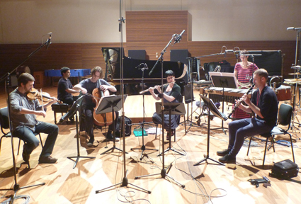
Ensemble Offspring recording SILVA at the ABC Studios, Sydney
courtesy the company
Ensemble Offspring recording SILVA at the ABC Studios, Sydney
TRISTAN MURAIL’S GARRIGUE (2008, FOR FLUTE, VIOLA, CELLO AND PERCUSSION), NAMED AFTER “A TYPE OF SHRUB-LIKE VEGETATION (INCLUDING WILD THYME, ROSEMARY, JUNIPER) OFTEN FOUND IN MEDITERRANEAN FRANCE” (PROGRAM NOTE) WAS AN IDEAL OPENER FOR ENSEMBLE OFFSPRING’S SILVA: NATURAL MUSIC CONCERT, GENERATING UNEXPECTED SOUND WORLDS FROM ACOUSTIC INSTRUMENTS. THE PROGRAM INCLUDED FOUR WORKS FROM THREE FEMALE AUSTRALIAN COMPOSERS—MARY FINSTERER, ROSALIND PAGE, MELODY EÖTVÖS—WHO LIKEWISE INTRIGUED AND THRILLED US WITH APPROACHES AT ONCE FORMAL AND EXPERIMENTAL.
Garrigue has all the buzz, hum and shimmer you’d expect of a wild landscape and from the pioneer of Spectralism. With its moments of agitation, plangency, woodblock jigging and richly textured resonances (gong and vibes) it is a work of more than sonic beauty; finely shaped, it ends in sudden silence (as if someone has shut a door on nature) but not before the emergence of an entrancing melody.
Mary Finsterer’s Circadian Tale 7.1 (2009/2012) aims to evoke “the dreams we hold for ourselves and our children” beyond the everyday rhythms of our lives (composer quoted in program note). It’s a radiant work of individual and coupled utterances: the piano offers and sustains an opening thought; other instruments make lucid, complementary but independent utterances; the cello mutters then sings; violin, piano and vibes merge in a crystalline dream; and finally flute and soulful clarinet leave us suspended in reverie. The responsive audience waits until silence truly arrives before applauding. Finsterer has successfully evoked something that is quite natural to us.
The “knotted melodic plait” of Iannis Xenakis’ Plekto (1993) evokes nature as sound (“the collision of hail or rain with hard surfaces, or the songs of cicadas in a summer field,” writes the composer) and as biology (Xenakis’ musical application of mathematical rules akin to natural growth). Never sounding at all like a field recording, Plekto is full of passion and drama—a pounding piano, a soaring flute riding high above choralling viola and clarinet, a fascinatingly strange percussion passage, a piano and drum dialogue, a climaxing wave of movement physical and sonic and an eerie final keening collectively make for another otherworldly, but of the world, experience.
The title of Rosalind Page’s Being and Time 1: Lacrimae rerum (2012) comes in part from an Imants Tillers’ painting Lacrimae rerum, which in turn is drawn from a line in Virgil’s Aeneid regarding the “tears of matters” that relate to the emotional demands of mortality. Page was also taken with the fragments from a Thomas Bernhard poem in the painting. Despite the power of love, the poet is overcome with a sense of transience and grief—of entering a “land beyond goodbye” (program). Melancholy rather than mournful, Being and Time 1 is dramatic early on with stabbing cello and piano; the flute soars over a moody cello line which is then extended with almost romantic intensity, supported by full-bodied piano and drum. After a thoughtful piano passage the work moves moodily to its conclusion, the cello sad, deep, vibrato-rich and then plucked while the flute suggests a distant ethereal realm. The piano sounds our exit from contemplation. Although least identifiable with the concert’s nature theme, Time and Being 1 nonetheless shares a passion evident in the other works on the program for generating unusual structures; here dice are listed as instruments along with piano, cello, flutes and wind gong. Page explains on the Ensemble Offspring website, “I chose to cast the dice as a performative gesture to create present moments that cannot be predicted with certainty, a scattering of pitch-rhythm, a meeting of elements within and beyond my subjective composer control—and question if this gesture abolishes or indeed generates pure chance, amidst a garden of otherwise consciously signalled decisions” (http://ensembleoffspring.com/media/news/rosalind-page-musical-q-a/).
US-based Australian composer Melody Eötvös’ Leafcutter (2012) is a tribute to the female ants of the Leafcutter species. Those that do not attain queen status nonetheless adopt another function in their society—”rather than being eaten or driven out.” True to the complexity of ant social organisation Leafcutter is a tightly woven, dynamic work, sometimes quite jaunty (not least in a pairing of vibes and clarinet) and rich in escalating, brisk note runs, richly evoking insect life and its complexity.
SILVA (Latin for forest) was commissioned by Ensemble Offspring in honour of Mary Finsterer’s 50th birthday. The composer spoke eloquently to us of her love for Modernist music, of the pleasure of working from a small palette of choices and of those who have inspired her—Stravinsky, her teacher Louis Andriessen and the makers of early European music. Finsterer is taken by the notion of the forest as a place of the imagination but also as a metaphor for the act of composition in its shape and detail. SILVA initially evokes the space of the forest, almost sombrely but enlivened by small bristlings, warbling flute and clarinet and is then enlarged by gong, emphatic wind playing and cello and vibes, the latter then on their own, reverberant and briefly evoking Asian idioms. Suddenly our perspective shifts, from open space to something more internal, dark and primal powerfully conjured by percussion alone with heavy motifs and evocative detail. The other instruments enter, thickening the ‘forest’ air, the piano fast and ‘minimal,’ before a high rippling bell and bowed vibes finally lead us out.
Of course, Ensemble Offspring delivered superb performances of all these works, not least the three world premieres by female composers in yet another impressive concert nurturing new works that will enrich and expand the Australian musical landscape.
Ensemble Offspring, SILVA: Natural Music, violin, viola Graeme Jennings, cello Geoffrey Gartner, flute Lamorna Nightingale, clarinet Jason Noble, percussion Claire Edwardes, piano Zubin Kanga; Utzon Room, Sydney Opera House, Oct 23
See the RealTime TV interview with Claire Edwardes and Damien Ricketson
RealTime issue #112 Dec-Jan 2012 pg. 37
© Keith Gallasch; for permission to reproduce apply to realtime@realtimearts.net
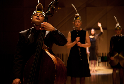
The Minotaur Trilogy, Chamber Made
photo Pia Johnson
The Minotaur Trilogy, Chamber Made
JOURNEY IS SUCH A HACKNEYED TERM, THOUGH WHEN WE ARE TALKING ABOUT A THREE-HOUR EPIC, YOU MIGHT BEAR WITH ME. THE MINOTAUR TRILOGY TAKES YOU TO ANCIENT GREECE, VIA A LOST MONTEVERDI OPERA AND SOMETHING LIKE A SURREALIST BIRTHDAY PARTY. IN THREE HEFTY 50-MINUTE ACTS THIS UNORTHODOX WORK FROM CHAMBER MADE OPERA IS A CRUCIBLE OF MYTH, MINIMALISM AND CREATIVE RUSH.
It’s not an easy work; at times you might wish Ariadne had given you a ball of thread to navigate the dark corners of this particular labyrinth. At other times, you can let go of plot expectations and see The Minotaur for what it is—a meditation on creativity. It’s as challenging for its pace and length as it is extraordinary for unabashedly roaring headlong into the new with the scale and emotion befitting opera. Likewise, the Minotaur, born of a bizarre creative act, is a beast defying easy classification: Pasiphaë had a wooden cow constructed, her lust compelling her to climb inside it in order to copulate with a beautiful bull. It was this act that led to the birth and exile of the man-eating Minotaur.
There begins the first act, The Island, set on Naxos, where Theseus jilts lovelorn Ariadne after she has helped him escape the labyrinth. Any lavishness you might expect from an opera is instead a soft pencil sketch—the music is mostly improvised from performance cues. A double bass (often down-tuned), a harpischord and percussion (often eccentric—any object might be struck or rubbed) make up the orchestra. In the first and third part, the singing is performed with heart-aching clarity, breathing with loss and sea mist. It includes the remaining aria from Monteverdi’s lost opera on the subject of Ariadne and Theseus, Lamento d’Arianna.
Using the sensitive acoustics of the Recital Hall’s Salon, the music borders on a sound art experiment. Even the opening of a wooden box, its contents rearranged, is integral to the musical score. Similarly the set is built from minimal elements such as an old spire that becomes everything from a weapon to a hill to climb. The performers wear sheath-like dresses and handbags on their heads that, worn lengthways, resemble medieval women’s caul headdresses. The Minotaur makes an appearance, pawing at the ground in thick wedged heels, dressed like a frightening dominatrix.
The Minotaur Trilogy fleshes out the emotional content between the lines of the myth. Fear of the Minotaur and Theseus’ escape from becoming a human sacrifice are rendered through visual clues. As I was beginning to grasp symbols such as a large basket becoming a ship’s hull, harpsichordist Anastasia Russell-Head walked on in a baroque red velvet dress and an enormous seagull head. The audience is steered across the terrain of the story with elements that are unexpected and unsettling.
Nowhere is this more true than in the second part, The Labyrinth. The most stripped back of the three parts, it nonetheless has a near intoxicating effect. In almost total darkness you wait for several long minutes. Only small lamps guide performers to make costume changes. A long chant begins in the dark. Then a bright light reveals a series of striking, surreal tableaux vivants against a plain canvas backdrop. A performer might have a stockinged face, be naked or carry a grass catcher—there is a palpable sense of anticipation as we await the next eerie, richly evocative ‘painting’ made briefly visible. The performance is felt as much as seen. Eyes adjust from darkness to light and time slows in the long, dark minutes of silence. It’s as though we are walking through a labyrinth flicking a lighter. All manner of creature, costumed and bizarre, may be encountered here.
The closing act, The Boats, stepped away from the sonic minimalism of the second part. The improvised music included jazz elements lead by Mark Cauvin who bashed out some bigger rhythms before flipping his double bass upside-down and scratching the floor with the scroll. The six performers this time wore beige shoes on their heads, topped off with white feathers—like small boats. As in a feverish dream or in a half-forgotten myth, The Minotaur operates on its own rules and symbols. It boils down the bones of this epic monster, replating its emotions for a contemporary audience. The Minotaur Trilogy, performed with unwavering conviction by the cast, is a fearless creative act full of imagination and unforgettable imagery.
See Matthew Lorenzon’s review of the first part of the trilogy, Minotaur the Island, performed in Western Sydney’s Aurora Festival of Living Music in May: www.realtimearts.net/article/issue109/10711.
Melbourne International Arts Festival: The Minotaur Trilogy, creators Margaret Cameron, David Young, performers Deborah Kayser, Caroline Lee, Hellen Sky, double bass Mark Cauvin, percussion Matthias Schack-Arnott, harpsichord Anastasia Russell-Head, architect Michael Roper, lighting Yasmin Santoso; Salon, Melbourne Recital Centre, Oct 18-21
RealTime issue #112 Dec-Jan 2012 pg. 40
© Varia Karipoff; for permission to reproduce apply to realtime@realtimearts.net
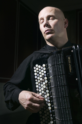
James Crabb
courtesy the artist
James Crabb
THE ACCORDION IS A MUCH MALIGNED INSTRUMENT. OFTEN ASSOCIATED WITH AGING FOLKIES, KITSCH MIDDLE EUROPEAN MUSIC AND DISTANT RELATIVES, FEW LIKE TO ADMIT THAT THEY ENJOY ITS MUSIC. THAT IS UNTIL THEY HEAR JAMES CRABB PLAYING AND HIS INFORMATIVE TALK ON THE INSTRUMENT’S HISTORY AND MANY GUISES. AT CAMPBELLTOWN ARTS CENTRE, CRABB REVEALED UNFAMILIAR FACES OF THE ACCORDION WITH HUMOUR AND CLARITY, AND ONLY POPPED THREE BUTTONS IN THE PROCESS.
Crabb’s program delivered a wonderful balance of convention, innovation, adaptation and piracy. Opening with a work to immediately reconfigure audience expectations, Crabb shared with us De Profundis, Sofia Gubaidulina’s 1978 masterpiece for accordion. Apparently this work has reshaped the direction of composition for accordion, inviting more composers to experiment with the until-recently untapped sound worlds of the instrument. Gubaidulina treats sounds as living things. They shimmer and, as Crabb explains, “do the breathing.” The work has an underlying narrative based on a psalm about forgiveness. You hear of trials and ascension. But for me the most spectacular thing was the careful use of diminuendo. The singing accordion exhales unwaveringly, but as the airspeed decreases the pitch does not drop. It keeps realigning. Listening, it’s as though you had spun around on the spot so many times that you’d fallen to the floor and were watching the room revolve around you, all the while knowing that the ceiling is fixed and your perception lies. This is how pitch whirled as the accordion grew quieter: spinning, continuous and stationary.
Crowd-pleasing Piazzolla tangos punctuated this and the next meaty contemporary work. These were played with incredible sensitivity, and all the subtlety of tango dancers. Next was the world premiere of Campbelltown City Council’s commission from Peter McNamara, Der Ost-Westspiegel, composed for Crabb this year in a collaborative exchange between the two. McNamara had never composed for accordion before so was grateful to Crabb for providing a 20-page manual the musician had written years before on the idiomatic traits and advantages of his chosen instrument.
Der Ost-Westspiegel plays with various contrasts between East and West. Intentionally oblique associations are drawn between East and Western Sydney, East and West Germany, occidental and oriental thought and philosophy. The theme extended also to geographic contrasts, poverty and development. Western Sydney-based composer McNamara explained in the pre-concert talk how these themes related to the work’s musical material, with which he explored extreme contrasts in register and character of sound. How these sounds are arranged follows recognisable patterns too, for example some phrases are mirror images of one another. McNamara has chosen this approach to re-personalise the listener’s perspective believing that East and West will see different reflections in the mirror depending on their circumstances.
McNamara explained, “There certainly aren’t any tunes, that’s for sure…I’m more interested in textures, combinations.” He sees the accordion as a sort of mini-chamber organ, one that can play very widely spaced chords. This is particular to the accordion as players are not limited by their hand spans the way they are when playing a conventional piano keyboard. Don’t be fooled into thinking an accordion has a keyboard on only one side. That instrument is actually a piano accordion, a mutt according to Crabb. Accordions in their purest form have buttons on both sides.
After this premiere we jumped back 300 years to France for three short harpsichord pieces by Baroque composer Rameau. To my surprise, these translated beautifully to the accordion, retaining something of the timbral authenticity of French Baroque dance music. On occasion I could hear the hautbois, cor anglais, flutes and voices amid the memory of the keyboard.
To wind up, Crabb offered a quirky 1985 work by John Zorn called Road Runner. Named after the swift desert hen and its persistently failing pursuer, Wile E Coyote, this romp gave Crabb the chance to act, stomp and holler. It’s an homage to the renowned composer of cartoon music, Carl Stalling, who has conditioned children of many generations to associate sound effects with cartoon character blunders and moments of victory. Quotations surface and subside faster than you can recognise them and then transform. It’s a race. There’s a gasp, a close call, an uneasy stillness. “Is that a tune I know?” Meep meep.
James Crabb, The Classical Accordion, Campbelltown Arts Centre, Campbelltown, NSW, Oct 28
RealTime issue #112 Dec-Jan 2012 pg. 41
© Felicity Clark; for permission to reproduce apply to realtime@realtimearts.net
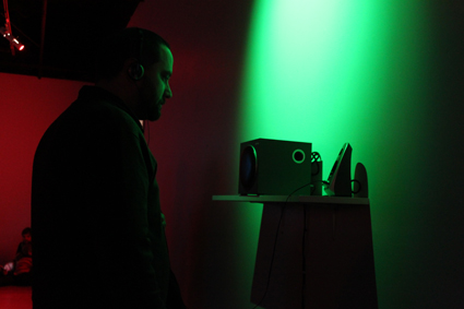
In a Silent Way, CAST
photo Pip Stafford
In a Silent Way, CAST
SOUND ART THAT ATTEMPTS TO ENGAGE WITH SILENCE MAY SEEM DOOMED TO INCONGRUITY IF NOT OUTRIGHT FAILURE, BUT WITH THE STEADY HAND OF CURATOR MATT WARREN ON THE RUDDER A COLLECTION OF THESE DELIBERATELY QUIET WORKS, FILLED WITH SPACE, CAME TOGETHER WELL.
Warren’s best known as a sound and installation-based artist, with this being his first major effort as a curator. What surprised me on first encounter was how easily the work of disparate sound artists came together to produce an exhibition that also sat well with the curator’s own arts practice.
Warren has long traded in the subtle; even when the volume has been intensely loud, or subsonically disturbing, there has always been a strong interest in the quiet and empty spaces between. In conversation around In A Silent Way, Warren noted that the notion of absence is a driving idea in his work. He looks, and listens for that which is not there, discovering that you can miss something—its very absence can create a presence. It’s a hard thing to evoke, and is what has made his work to date seem haunted and emotionally powerful.
In recruiting people who work with sound to create In A Silent Way, Warren gave out a very simple brief: make sound works that investigate silence. This is technically impossible, for silence itself can never truly exist, as John Cage discovered when he visited an anechoic chamber in 1951 and heard the sounds of his own body. Silence is a literal utopia; a poetic idea that occurs only in the imagination. Given this actuality, listening as active became an important focus for the premise of the show—what is it that we hear if we really listen, extending into quiet spaces to seek small occurrences and moments? The curated works became compositions that exist to be played quietly, at the edge of hearing. However, the expectation of focused listening was turned on its head: there were no headphones, instead a dim room lit with the red, green and blue light—from which all colour is constructed for camera, video and television. This delicate hint to mix and create for oneself was certainly inviting.
Most of the works were constructed especially for the exhibition. All were extremely effective as individual investigations of the curatorial theme, and it’s hard to say, given the presentation decisions, if any really emerge as stand-outs. Indeed, that would really work against the intent of the show. What stood out were the moments that occurred organically as sounds interacted. I realised that the blending of Joel Stern’s echoing bells with Gail Priest’s moaning sine waves just as Darren Cook’s slightly woozy playing of a Howlin’ Wolf track lurched into digital shudders, was unlikely to be heard again, given the varying lengths of the looping works. I became quite engrossed at the possibility that only I would ever hear quite that moment. The demand for active engagement was well rewarded.
Nevertheless, the peculiar and obsessive creation that went into UK artist Nicholas Bullen’s work warrants a mention: he recorded a day’s worth of noise from his own house while he was elsewhere. Cherry-picking the recording, he processed and constructed a remarkable sound work that is genuinely creepy.
Potent as well was the responsive performance from the show’s opening event, where Laura Altman and Monica Brooks sat at opposing points in the gallery, gently responding live to the extant sounds, then slowly to each other. Improvising to a moving palette of sound art in a room full of whispering people is a challenge, but the time the two players described with sound hung together with a brittle elegance. People who seem to know their instruments well enough not to demonstrate their skill make fascinating players.
In A Silent Way was a step out of the ordinary for a show based around sound works. I felt as if the installed sounds were a musical instrument and a dance was waiting to happen. The works of varying lengths looped, creating constant change as the sounds intermingled, generating a palpable atmosphere and encouraging me to circle and cross the space again and again, moving to and from sets of speakers attached to the wall like tiny altars. One could be quite deluded at times as to where sound emerged from, given the quiet bleed of the works. The consideration given to the actual install was very precise, and it showed.
After a time another effect became noticeable as I sat on the floor in the space’s centre; the room took on the peculiar feel of a sacred or spiritual place. There’s a moment of secular ecstasy that can sometimes occur with works of art, something like the overpowering feeling generated by the famous Rothko Chapel. While not every work aims to produce transcendence, it is strange and memorable on those very rare occasions one encounters it. This is something that Matt Warren, while not remotely religious, reaches for in his work and achieved with his sensitive curation. The individual works came together as a whole, filling CAST with a cascade of moments that had the peculiar effect of seeming to distort time.
In a Silent Way asked me to question my own notions of sound art, and how much time anyone needs to spend with a work of any kind, time-based or not. Miles Davis, from whom Warren borrowed the exhibition’s title, would likely have approved, given that greatest of players’ command of the rich moment of silence.
All sound works are available as a limited edition CD from CAST. Also visit roomofsilencerecords.bandcamp.com.
In a silent way, curator Matt Warren [2012 CAST Curatorial Mentorship], sound works by Laura Altman, Monica Brooks, Nicholas Bullen, Darren Cook, Lawrence English, Samaan Feick, Gail Priest, Joel Stern, CAST Gallery, Hobart, July 28-Aug 26
RealTime issue #112 Dec-Jan 2012 pg. 43
© Andrew Harper; for permission to reproduce apply to realtime@realtimearts.net
Driving to the Centre of the Earth (detail), silent HD video, Erin Coates, Yonder, PICA
courtesy the artist
Driving to the Centre of the Earth (detail), silent HD video, Erin Coates, Yonder, PICA
THE IDEA OF YONDER AS A PLACE WAS ONCE CONCEIVED AS A SPIRITUAL REALM, A HEAVENLY PLACE, WHERE ULTIMATE AND ETERNAL VALUES WOULD BE FULLY AND IDEALLY REALISED. FOR EINSTEIN IT WAS A SUBSTITUTE FOR A RELIGIOUS HEAVEN AND THE GOAL OF THE PURSUIT OF YONDER IN LIFE WAS A SOURCE OF INNER FREEDOM.
An ‘over there’ which might be heaven, enlightenment, utopia or paradise, is forsaken in Yonder, an exhibition curated by Jasmin Stephens, for an interpretation resonant with the contemporaneity of a globalised 21st century world. The yonder here is political, pragmatic, virtual, actual and magical; it is about the movement of bodies and information, the incongruity of borders and the quest to revive personal memories and forgotten fragments of history. While there might be a spiritual undercurrent, its voice is overwhelmed in an exhibition where yonder as a destination appears full yet fragmented.
At the doorway to the Westend Gallery a lighting fixture (Untitled, 2012) by Jurek Wybraniec hangs from the ceiling, barely noticeable unless you look up. The lights are triggered as you enter the gallery space and again, barely noticeable unless you look back. Light shines on an empty floor, an opportunity promising a moment in the spotlight missed in the blink of an eye; yonder is elusive. Yonder is also a destination that triggers desire, to be elsewhere. This state of yearning for otherness is especially familiar to science fiction and expressed in Erin Coates’ Driving to the Centre of the Earth. To the right of the Westend gallery entrance a smelly little silicon hole escapes into the subcutaneous layers of the Gallery and tunnels toward a video of the artist in her car driving to the Earth’s core. This is a gem of a work that is subtle in its subversion of popular sci-fi scenarios; rather than evoking the gung-ho thrill of such an adventure, it appears rather banal—there is no sense of wonder and instead the burning yonder is approached with indifference.
Many of the works literally, if not metaphorically, extend beyond their physical manifestation in the gallery space into the world at large. Using the symbol of the shy albatross, Perdita Phillips presents Shy (dissolution + exchange) (2012-13), a work in the classic genre of mail art to picture the slow attenuation of a photocopy of said bird as it is repeatedly copied at numerous global locations around the southern rim. Phillips reels in collaborators worldwide, the resulting A4 sheets forming a grid on the wall: wedged within them is a monitor with an animation detailing the slow degradation of the image. In this work, the art is a stand-in traveller for the artist who stays at home, imagining the far flung places the albatross roams—from across the road to Africa and back home again.
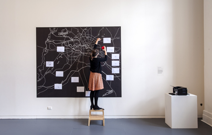
Simon Faithfull, Limbo: An Expanding Atlas of Subjectivity, 2012, digital drawing, pictured with Renae Coles, Yonder, PICA
photo Bewley Shaylor
Simon Faithfull, Limbo: An Expanding Atlas of Subjectivity, 2012, digital drawing, pictured with Renae Coles, Yonder, PICA
The theme of mobility is core to the exhibition; to get to yonder it is necessary to travel—by proxy, mentally, virtually or physically. For humans, movement all too easily lends itself to mapping and Simon Faithfull in Limbo: An Expanding Atlas of Subjectivity (2012) presents a map of drawn moments encountered in his daily life, which happens to be in Berlin for the duration of the exhibition. Faithful holds claim to being one of the first artists to work with a custom-designed mobile app. The drawings are created using a PalmPilot and DAGI stylus or finger and can be delivered by website, Twitter, Facebook, RSS and iPhone. In the context of PICA they crawl out of a printer to be pinned to a vinyl map of Berlin. The cartographic symbolism of the map is overlayed with a more personal, idiosyncratic language, consisting of sundry everyday observations from afar.
The ultimate yonder with no return that we are all faced with but all too easily in denial of, at least in Western societies, is death. Questions of life and death are approached with humility in The Sound of Your Own Breathing (2010), a trio of animated shorts by Richard Lewer. Simple charcoal drawings are animated alongside the breathless voice-over of rope-skipping characters telling stories of the loss of loved ones to a boat accident, to terminal illness and a bank robbery. In a deadpan manner this series tackles the fickleness of life with the threshold to death so easily crossed.
Stories also drive the work of Heman Chong, in the form of a series of short vinyl text works, Walking Long and Hard (2004) describing walks and personal and angst-ridden existential moments in places including Berlin, Melbourne, Beijing, Linz and New Orleans. Chong has not been to all of these places. This work therefore presents a slippery play between fact and fiction, past and future, action and imagination. Being a contemporary artist today is about responding to and living within a global culture. There is little room for parochialism and this work situates itself within a world context in an elegant, succinct and evocative manner.
There is no guarantee that yonder is a satisfying destination; even though we often assume that the grass is greener, we never really know what lies over the hill if we’ve never been there. Both the potentially sinister and more delightful notions of yonder are addressed within this show, if not so much the spiritual or religious. The works present abstracted and uniquely contemporary, conceptual and subjective responses to the concept. The show is also notable for its diversity of media; print, animation, photography, video, painting, sculpture, mail art, drawing, custom electronics and text. Despite today’s so called ‘post-media’ condition, perhaps this diverse selection is part of the reason for the initial sense of aesthetic dissonance. Beyond first impressions, however, close attention to the individual works does make for unique, surprising and revealing journeys to that place ‘over there.’
PICA: Yonder, curator Jasmin Stephens, artists Andy Best, Erin Coates, Heman Chong, Simon Faithfull, Benjamin Forster, Tony Garifalakis and Richard Lewer, Charles Lim Yi Yong, Clare Peake, Perdita Phillips, Helen Smith, Kai Syng Tan, Warren Vance, Jurek Wybraniec; Westend Gallery, Perth, Sept 8-Oct 21
RealTime issue #112 Dec-Jan 2012 pg. 44
© Laetitia Wilson; for permission to reproduce apply to realtime@realtimearts.net
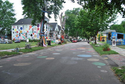
Heidelberg Project, Detroit
photo Tessa Zettel
Heidelberg Project, Detroit
IN MAY 2012 REBECCA CONROY EMBARKED ON A FOUR-MONTH TOUR OF NORTH AMERICAN ARTIST-LED SPACES AND INITIATIVES ACROSS 14 CITIES. THIS IS THE SECOND IN A TWO-PART SERIES. IN THE FIRST SHE VISITED CHICAGO; HERE SHE’S MOVED ON TO DETROIT AND THEN MINNEAPOLIS AND ST PAUL IN MINNESOTA.
detroit
Detroit is a spectacular story, as large as the infrastructure and the grand architectural gestures that it left behind in the wake of race riots, white tax flight and the free market destruction of the auto industry. Some attribute the demise to those 1967 race riots, the largest and most devastating in US history, when cops busted a blind pig [an unlicensed bar. Eds], disrupting a gathering of black servicemen just returned from Vietnam. Colour is certainly a key narrative in the story of Detroit. But related threads, such as the GFC and continued off-shoring of labour to China, have undeniably contributed to weakening the city; as has the crazy tax base, which has allowed large companies to operate from the city but pay their (minimal) taxes to the predominantly white outer-lying suburbs beyond the 8 mile. Yep, the one that Eminem sings about.
But the past decade has seen the once grand Motown, or Motor City, slowly re-emerge as an urban farming oasis; and many artists are pricking up their ears. The combined allure of cheap houses and the urban-pioneering potential of a place that has been all but abandoned have rendered Detroit a veritable artist beacon. Its arts community also appears to be benefiting from a healthy lack of artist ego, free from the banal prescriptions of an art market. If you can move beyond the ruin porn, there is a bounty of narratives to get your head around. One well known character is Phil Cooley. You couldn’t have written a better script if you tried: young man walks off catwalk in Europe, returns to his native Detroit and, with the help of his real estate agent parents, buys large warehouse to turn into a creative playspace, while running an award-winning restaurant business on the side. The space is called PonyRide, a multi-purpose, artist business incubator space consisting of a dozen different ventures including a hip hop dance studio, a social enterprise and textiles project for homeless people, a letterpress and a recording studio. Kaija Wuolett climbed on board the Cooley wagon as an architect fresh out of grad school. She described the familiar DIY artist-run warehouse fit-out as an organic process of designing and building as they went along, including reusing their own materials and salvaging other materials from abandoned houses. The next lot of plans involves setting up an artist residency program, which they hope to launch in 2013.
In a city with a combined acreage of vacant lots as large as the area of Manhattan, projects connected to housing and buildings have naturally driven a number of artist-led ventures. Design99 is the work of designer and architect duo Gina Reichert and Mitch Cope who “investigate new models of contemporary art and architectural practice”. They have been living and working in the neighbourhood of Hamtramck for the past 10 years, and in 2009 started Power House Productions as a not-for-profit to specifically support their community anchored projects. This year Power House was awarded a lucrative $250,000 ArtPlace grant to continue with three projects, one of which includes the Ride On Skate Park, and another which is a collaboration with the hinterlands, a performance company who relocated to Detroit from Chicago in late 2010. My introduction to Detroit was in fact hearing about the $100 house that another artist couple, Jon Brumit and Sarah Wagner, had decided to purchase after encouragement from their friends Gina and Mitch, and which they have since turned into an artist residency space called Dflux.
There’s also the Heidelberg Project, 3600 Heidelberg Street which has just celebrated 25 years. It started as a protest by artist Tyree Guthrie and his father Sam Mackey when they gathered toys and other domestic debris left over from abandoned houses and used them to make large-scale installation works—as big as houses. The site, having grown several blocks in size, is now recognised internationally as an outdoor sculpture park, having survived two attempts by the Mayor’s office to bulldoze it.
minneapolis/st paul
On the west side of the Mid West spectrum, the state of Minnesota and the twin cities of Minneapolis/St Paul are considered progressive by American standards, benefiting from healthy tax contributions to the arts and cultural life. Works Progress is an artist-led public design studio led by collaborative duo Colin Kloecker and Shannai Matteson. Previously they ran a space called the West Bank Social Centre, whose byline, “Unpredictable things are happening,” was largely due to the precariousness of the space and its associated responsive programming. Works Progress sees itself as an artist-led platform, producing publications, workshops and events, such as the very fun live-action arts magazine Salon Saloon and large scale gigs such as the Mississippi Megalops [“big fish”], a boat ride down the Mississippi, which functions like a “floating Chautauqua.” A Chautauqua is a term for the adult education movement that started in 1874 by Lake Chautauqua near New York. It usually featured lectures, plays and musicals, typically in farming or ranching communities.
For these events and others, Works Progress collaborates with many, including the intelligent and delightful Andy Sturdevant. An artist, writer, presenter and arts administrator, Andy runs quirky and deeply informative tours of the city with his collaborator, Sergio Vucci, through Common Room in association with a contemporary art space, the Soap Factory in North Minneapolis. I was fortunate to attend a genuinely fascinating tour of the Mall of America, apparently the largest in the Northern Hemisphere (America would probably say the Universe).
Minneapolis is also home to Red76, an occasional collaboration of associated artists conducted by Samuel Gould. They publish the Journal of Radical Shimming and create responsive works, which function among other things as a framework for ‘public inquiries.’ Previously Red76 were based in Portland Oregon, which has been a formative influence on their methodologies and approaches to public dialogues, social histories, gatherings and collaborative research. Across the river in St Paul is Public Artist in Residence for the city Marcus Young, who describes himself as a behavioural artist. Grace Minnesota is the platform for his collaborative and solo works, one of which, Pacific Avenue, is a city and traffic calming initiative. The project, which he describes as lifelong, involves Marcus walking very slowly along iconic streets, taking three to four hours to complete a seven-minute stroll. For this occasion the rather tall and slender Asian-American dresses in traditional Asian attire and sports a parasol. Minneapolis is also home to 24/7, a car service run by artists and musicians. Similar to another in Brooklyn, this service operates by word of mouth and is designed to provide a flexible income for artists and a taxi service for those working late night gigs or attending events. The car fleet is owned cooperatively and uses a limousine license, which means bookings are essential and drivers are not obliged to pick up anyone from the street. And it’s a very nice ride!
local postscript
Since I returned to Sydney in mid September, Bill+George, our artist-run space, was subjected to an unlawful rent hike, which unfortunately resulted in eviction at the end of October. Pabrik Productions, the incorporated association which produces the ARI, will continue to operate with a number of off-site projects into 2013. As the Sydney real estate bubble continues to expand, Detroit is looking more and more attractive by the hour.
See also part 1 focusing on Chicago and Rebecca Conroy’s Detroit RT Traveller
RealTime issue #112 Dec-Jan 2012 pg. 44
© Rebecca Conroy; for permission to reproduce apply to realtime@realtimearts.net
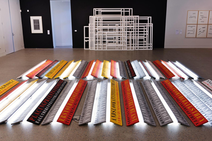
Ruark Lewis and Jonathan Jones, Homeland Illuminations, 1997
photo Alex Wisser
Ruark Lewis and Jonathan Jones, Homeland Illuminations, 1997
FOR AN ARTIST WHO DEFIES CATEGORISATION, THE PRESENTATION OF A CAREER SURVEY PRESENTS SOME UNIQUE CHALLENGES. NOT ONLY DOES RUARK LEWIS’ THREE DECADES OF PRACTICE CROSS DISCIPLINARY BOUNDARIES, MOVING SEAMLESSLY BETWEEN DRAWING, TEXT-BASED WORKS, INSTALLATIONS, CIVIC INTERVENTIONS, PERFORMANCE, VIDEO AND AUDIO, BUT IT ALSO RAISES A BROAD ARRAY OF CONCEPTUAL CONCERNS.
Frequently with long gestating periods, these concerns have deepened in complexity over time. How then to steer the viewer through such a labyrinthine practice in ways that are legible, accessible and engaging?
In an interview I conducted with Lewis prior to the launch of the first installment of his two-part survey beginning at Hazelhurst Regional Gallery in late September (see RT111), it was clear that the artist had given much thought to such a question. He explained his intention to create a certain formality within the main gallery space while activating the outdoor areas in a more informal fashion to encourage visitor interactivity and hands-on engagement. Walking through the installed exhibition a month later, expertly curated by Dr James Paull, I sensed immediately that this approach had paid off. As I paced the open and airy expanse of the Federation Room gallery, there was a sense of elegant restraint in its pared-back organisation, which encouraged visitors to move slowly through its delicately choreographed space and to trace links and discover correspondences between works.
At the eastern end of the gallery, the focal point was the alluring juxtaposition of light and language in Homeland Illuminations (2007). A collaboration between Lewis and urban Indigenous artist Jonathan Jones (with whom Lewis has worked on a number of projects), the floor installation presented fragments of quotations from an oral history belonging to Jones’ grandfather. A Waradjuri man who worked as a wool-classer in western New South Wales in the 1930s and 1940s, his words were stencilled in industrial lettering onto two parallel grids of painted wooden boards. Propped beneath the boards was a network of white fluorescent light tubes emitting a haunting aura around the text. As it simultaneously conveyed a complex economy of relationships and exchange while resisting the fixing of the oral history into a museum object by relaying it in coded form, the installation manifested an intriguing tension between concealment and revelation.
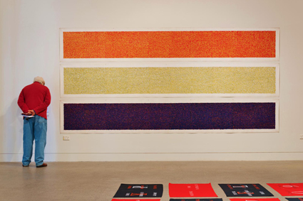
Ruark Lewis, Water Drawings, 1997
photo Alex Wisser
Ruark Lewis, Water Drawings, 1997
This practice of ‘disguisement’ of narratives through the strategic insertion of voids and ellipses or the layering of elements is a defining characteristic of Lewis’ highly reflexive engagement with text and language. This reflexivity also extends to his responses to the works of authors and poets (see RT 87, p50). Particularly memorable were those works which originated from an enduring dialogue with the works of French novelist, playwright and essayist Nathalie Sarraute (1900-1997). The austere minimalism of the artist book installation Just for Nothing (1997), for example, resonated with the psychological tautness of the play which it translated, Pour un oui ou pour un non, and revealed an early example of Lewis’ use of colour coding as a design principle. A decade later, such principles were extended in the 2007 mixed media installation, An Index of Silence. Featuring abject statements drawn from Sarraute’s play Silence stencilled onto 36 black and red cotton flags, the circumvention of easily graspable slogans with oblique literary phrases produced a displacing reading experience that shifted the viewer onto uncertain ground.
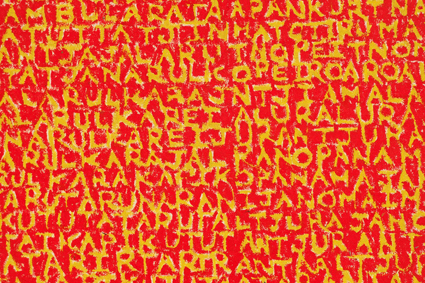
Ruark Lewis, Red Water Drawing, 1997, detail
photo Alex Wisser
Ruark Lewis, Red Water Drawing, 1997, detail
As I understand it, during their exhibition at Post-Museum in Singapore the flags had functioned as a score for a moveable vocal performance by Lewis. At Hazelhurst, traces of the readings, performances, live actions, audio compositions and dance interpretations which frequently form vital components of Lewis’ installations were fairly discreet. Yet this edited approach to performance documentation lent greater impact to the selected examples. The screening of Lewis’ blackly humorous public performance made for video, Euphemisms for the Riotous Suburbs (2007), presented audiences with an opportunity to reflect upon the events of the 2005 Cronulla riots. Two live collaborative performances in the gallery space were also programmed. On the closing day of the exhibition, an attentive crowd gathered in the gallery to watch movement artist Alan Schacher interpret Lewis’s reading of Directions, an epigrammatic poem by the anarchist philosopher poet of the 60s Sydney PUSH movement, Harry Hooton. As he interacted with and animated the objects in the space Schacher brought their agitprop dimensions to life and gave tangible expression to Hooton’s humanistic pronouncements.
Other installed works showcased the sophistication of Lewis’ uniquely devised method of transcription drawing. Among the highlights were the Water Drawings (1997), initially created as accompaniments to Lewis’ renowned modular wooden beam installation, RAFT (1995), which was absent from the survey, perhaps for practical reasons given its imposing scale. The Water Drawings, however, poetically developed its thought lines in their rendering of an Aboriginal rain song cycle, transcribed from sources in German, English and Arrente, across three horizontal scroll-like canvases and deploying modest oil crayons to work up extraordinarily layered palimpsests. Following an accretive logic, there was a visceral beauty in the textured surfaces of the “language paintings,” while their varying degrees of legibility provoked meditation upon the collisions and confusions of knowledge which occur in acts of translation.
Stepping outside into the gardens, the increasingly civic dimension of Lewis’s recent practice was apparent in the new and reprised installation pieces and audio poem. The suburban tranquility of Hazelhurst changed the context for a piece like Banalities for the Perfect House (2007), which previously presented a confronting force when installed on a busy street in Redfern. Here, the striking black-and-white wall of aphoristic phrases worked more subtly to question the ideology of suburbia. The protean nature of Lewis’ engagement with the notion of home was likewise observable in the new Star Shelters (2012) scattered across the lawns. This series of nomadic wooden shelters evolved from a series of prismatic graphite drawings that Lewis made in response to ideas of Aboriginal astronomy during a prolonged stay in a Darwin hospital. Having cut and folded the drawings like origami and then scaled them up into three-dimensional forms, the shelters blended a functional purpose with an angular and asymmetrical sculptural aesthetic, inflecting a high modernist formalism with local geographical and cultural touchstones.
Early next year, Macquarie University Gallery will host the second part of Lewis’ survey and I imagine it will be less a repeat than a reconfiguration involving a process of addition and subtraction in response to the site. At Hazelhurst, the many facets of this unique community venue were thoughtfully incorporated to enact a journey across a significant and conceptually rigorous practice which has only grown richer, more nuanced and exploratory with the progress of time.
Ruark Lewis Survey 1982-2012, Part 1, curator Dr James Paull, Hazelhurst Regional Arts Gallery, 29 Sept-Nov 11; Part 2, Macquarie University Art Gallery, Feb 6-March 13, 2013; http://www.mq.edu.au/about/events/view/ruark-lewissurvey-part-ii/
See also Ella Mudie’s interview with Lewis in RT111
RealTime issue #112 Dec-Jan 2012 pg. 47
© Ella Mudie; for permission to reproduce apply to realtime@realtimearts.net
Ai Weiwei, Never Sorry, Madman DVD
Dan Edwards writes in this edition (p19) “Never Sorry [is] the debut documentary of US director Alison Klayman and the first sustained look at this crucial figure in contemporary Chinese culture.” The film places the work of this internationally acclaimed visual artist in context. While providing glimpses of the artist’s early years and his life now “Never Sorry’s main interest is Ai’s place within an increasingly fractious domestic debate about China’s future and the need for greater transparency….The man may be caged, but his humour, defiance and sense of play remain strong.”
6 copies courtesy of Madman Entertainment
The Sapphires, Hopscotch DVD
 Directed by Wayne Blair from an adaptation of the Tony Briggs’ stage musical, The Sapphires has been a huge popular success in Australia. Four young women from a remote Aboriginal mission are forged by an enterprising manager into a powerhouse quartet who entertain American troops in Vietnam in the late 60s. The combination of ‘true story,’ comedy, romance and drama, realised by fine performers, plus audience curiosity about a rarely addressed, complex period of Australian history has proved a winner. As well, the high calibre of Aboriginal-directed films (Beneath Clouds, Samson & Delilah, Stone Bros, Here I Am, Bran Nue Dae, Toomelah) has guaranteed continued interest in films about the lives of our fellow Australians. The film stars Deborah Mailman, Jessica Mauboy, Miranda Tapsell, Shari Sebbens and Chris O’Dowd.
6 copies courtesy of Hopscotch Films
Aki Kaurismaki’s Le Havre, Madman DVD
 Finland’s Aki Kaurismaki is one of cinema’s great directors, idiosyncratic and consistently inventive. His humorous-sad vision of humanity, sometimes bordering on pessimism or exuding an aura of deadpan optimism (or elsewhere just funny, as in his Leningrad Cowboy films) has created in Le Havre an empathetic fable about the plight of refugees in which a small African boy is rescued by an ageing shoeshine man in the northern port of Le Havre. If you don’t know Kaurismaki’s films, Le Havre is an excellent starting point. The film received the prize for best film at the 2011 Cannes Film Festival and, Laiki, the dog featured in Le Havre, won the Special Jury Palm Dog Award. What more recommendation do you need?
6 copies courtesy of Madman Entertainment
Email us at giveaways@realtimearts.net with your name, postal address and phone number.
Include ‘Giveaway’ and the name of the item in the subject line.
PLEASE NOMINATE ONLY ONE GIVEAWAY
These Giveaways are no longer available.
RealTime issue #112 Dec-Jan 2012 pg. 48
© RealTime ; for permission to reproduce apply to realtime@realtimearts.net

After All This, Elbow Room, Under the Radar
photo Richard Kendall
After All This, Elbow Room, Under the Radar
THIS YEAR THE BRISBANE FRINGE FESTIVAL GOT PERSONAL. UNDER THE RADAR WAS DOMINATED BY INTIMATE, LANGUAGE-DRENCHED WORKS EXPLORING INTERIORITY, GRIEF AND MEMORY. UNDER THE RADAR WAS ESTABLISHED BY THE BRISBANE FESTIVAL IN 2008 TO CUT THROUGH TRADITIONS OF BREEZY, SUB-TROPICAL SPECTACLE WITH A PROGRAM OF CURATED, EXPERIMENTAL WORK.
As Virginia Baxter noted (RT110 online), the differences between the two festivals are now harder to discern as Under the Radar delivers a diverse and sophisticated program of local talent, ‘hit’ shows from the national Fringe circuit and a smattering of international work.
berlin nevada: still night
My Under the Radar voyage began with European duo Berlin Nevada and their new work: Still Night. This adaptation of Italo Calvino’s iconic Invisible Cities was performed in a ubiquitous inner-city apartment/hotel. Ushered into a curtained convention room, we were greeted by Silvia Mercuriali delivering a lecture in a fantastical nonsense language. Her topic, a fabulist Brisbane, Huoz, where maps of the city were woven into an enchanted tale about her quest to go ‘down’ through the cracks of the pavement into an imagined, underground Brisbane. This intoxicating premise echoed Calvino’s Scheherazade plot, where Kubla Khan was entranced by improbable tales of imagined cities.
Then we were given headphones and listened to a velvet-voiced man reading excerpts from Calvino’s novel and instructing us to breathe, open our eyes and close them again as we watched the two women re-create the cities onstage for our delectation. Alas, the sound cut out and without the voice-over the delicate, child-like pact of the performance dissolved. Technical glitches aside, the reliance on the headphones shifted the work from an imaginative translation of Calvino into literal quotation. Despite the reaching and sensual intellect in the piece, it was a lesson in the limits of selecting such a counter-theatrical performance form.
isthisyours?, best we forget
Fascinatingly, the next show was also a lecture, this time delivered by three appealing young women about the psychological, personal and cultural aspects of memory. Developed by Adelaide-based theatre company isthisyours?, Best We Forget was an inventive and discursive lecture but as a performance suffered from the same inherent limitations as Still Night. When the performers reached across the lecture format and transformed it for us, when they made us believe the convention desk was a karaoke stage, when the two presenters became characters in their own action movies, the work exploded into life. These moments demonstrated the intellect, flair and pop culture chops of the creators, but somehow did not add up to a cogent performance experience for the audience. The novelty of the idea, the co-option of the lecture, couldn’t replace the resonant depths of a fully interrogated theatrical world.
elbow room, after all this
Indeed, the standout show for the 2012 Under the Radar took the meme about the borders between presentation/performance and information/story and injected it with a fully fleshed theatricality. After All This by Melbourne-based Elbow Room was an exploration of the nature of belief, the afterlife and grief. The piece was divided into three installations, with the audience walking between each. The first was a short, almost naturalistic scene, where two bewildered siblings reconciled themselves to a newly acquired stepfather who was a Creationist.
The second installation was, again, a lecture, which eventually morphed into a short performance piece that recreated the life of American mathematician George Price (1922-75). After developing a theorem for morality and natural selection, he abruptly converted to evangelical Christianity before finally committing suicide. The third installation, and the most successful, corralled the audience into the last moments of the American Heaven’s Gate cult. We watched them die in their matching tracksuits, then rise up and lead us, singing, through the tunnels and byways of the Brisbane Powerhouse. We emerged, blinking, many of us crying. The cynical distance with which we approached the discussion of religion, the convictions of science and the experience of spectatorship had been disarmed by the eloquent barrage of words, the surprising and tangential changes in form and most powerfully, the simple experience of walking in the dark surrounded by voices in harmony.
other adventures
There were many more adventures to be had from the remaining Under the Radar program including the naked, white-boy ennui of MC Matt O’Neil’s hip-hop set Envoyé ://: Fragmenté, about erectile disfunction, global aid and love. There was the reptilian, witty, anti-capitalist contemporary dance from Slovenia, Capital, which saw each audience member provided with a bound book of junk mail to sit on as we watched the performers ape the excesses of consumption and demand money to finish their performance at the 27 minute mark. There was the delicate, subtle choreography of Leisel Zink’s dance piece Fifteen set amidst the commuter traffic of the Queen Street Mall; and the charming but naïve play about grief, The Things I’d Say to You by the newly minted local collective, Fixate.
hermione merry & henriette kassay-schuster, heaven :: himmell
The final work, though, that had real substance and power was the screen-based installation Heaven :: Himmell. This intriguing collaboration between Australian Hermoine Merry and German Henriette Kassay Schuster was deeply evocative and elusive. You stepped into a half-lit space, surrounded with screens of lush greenery, text and mirrors. In the centre of the room was an installation featuring a car with rear view mirrors. Out of the corner of your eye you could see a girl in a blue frock. Like Alice Through the Looking Glass you followed her around a corner where she made a series of hand gestures with detached but child-like intensity. It was like walking into your own half-forgotten memories of riding home at night as a child while your parents talk and you fight sleep; or playing spotlight, I found you, I know where you are, on a hot night while adults drink.
While I confess to some nostalgia for the intensity of earlier years, when we crammed into Metro Arts, the Brisbane Festival should be applauded for growing Under the Radar into a large-scale event that has become a credible part of the national and international touring landscape.
Under the Radar, Brisbane Festival, Brisbane, Sept 8-29; www.brisbanefestival.com.au/events/under-the-radar
RealTime issue #112 Dec-Jan 2012 pg. 16
© Kathryn Kelly; for permission to reproduce apply to realtime@realtimearts.net
WE COULD HAVE DONE WITHOUT THE FREQUENT REPRISING OF WHITNEY HOUSTON’S UBIQUITOUS ANTHEM, BUT WERE WELL AND TRULY COMPENSATED WITH THE SHEER INVENTIVENESS OF THE VARIATIONS ON HER THEME IN THIS EVENT CRAFTED BY CAMPBELLTOWN ART CENTRE’S DANCE CURATOR EMMA SAUNDERS OVER TWO YEARS INTO A PROGRAM OF DIVERSITY, SKILL AND AMBITION.
wetubelive

WeTube Live, Ben Speth, Oh I Wanna Dance With Somebody
photos Heidrun Löhr
WeTube Live, Ben Speth, Oh I Wanna Dance With Somebody
For the event’s Friday night opening, the stately Tea-Dance project involving ballroom dancers from the community segued, with the parting of a theatrical red curtain, to an explosion of divergent dance forms in Ben Speth’s WeTubeLIVE—“50 solos ripped from the internet” interpreted and performed by a wildly diverse group of professional and amateur performers. There was a great sense of community engagement as sensuous hula shimmied alongside boot scooting and hysterical dummy-spit met cute kitty. We first became aware of Speth’s WeTubeLIVE when it was sighted at the Junction Festival in Launceston in 2010 (RT99) and it was great to finally see it in action. Each performer is confined to a metre or so of space while a wall clock dictates the timing. At a designated signal, everyone stops as if summoned: a woman reading to a group of children nods off mid-tale; a Grey Nomad ceases uploading her holiday snaps, wondering if anyone will actually sight them. They start up again: an Indian dancer is absorbed in her ancient ritual while the adjacent room with its cast of drooling vampires and obsessive compulsives feels like the set of Marat/Sade. We are definitely feeling the heat.
narelle benjamin, anandavalli & parvathy baul
In the a.m. Andrew Morrish, with his philosophical improvisations on the here-and-there and the in-between, prepares us in the best possible way for Saturday’s full program. Thankfully, the here and now rings with the soulful sounds of singer and poet Parvathy Baul from West Bengal, a mystic minstrel in the Baul tradition invited as part of the OIWDWS project to work with contemporary dance exponent Narelle Benjamin and Sri Lankan-born Sydney-based dancer Anandavalli, herself skilled in the Bharatha Natyam and Kuchipudi traditions of Indian dance. Together they present Kaal, the result of their collaboration, over what must have been a remarkable two weeks, focusing on the goddess Kali “whose name may be translated as the feminine form of time and transformation.” In this three-part performance Parvathy Baul’s presence is central. She moves amid the dancers, while centre stage, Anandavalli responds with intense and highly coded physical and facial gestures that are not literal interpretations of Parvathy’s songs but abstracted and symbolic. Benjamin’s movements meanwhile are discernibly more fluid and expansive. At times, bodies entwine, performers working fluidly together in a meticulous investigation of forms.
phil blackman & martin del amo

Phil Blackman, Martin del Amo, Songs Not to Dance To, Oh I Want to Dance with Somebody
photos Heidrun Löhr
Phil Blackman, Martin del Amo, Songs Not to Dance To, Oh I Want to Dance with Somebody
Phil Blackman, a dancer from Lismore, was introduced to Martin del Amo by Emma Saunders identifying “two men of similar disposition, at different points in their careers.” Together they create Songs Not to Dance To in which dance confronts musical overstatement. The songs are iconic or cheesy and the challenge of the premise designed to highlight some of the connections and disconnections the two dancers faced in their exchange. They begin with symmetry in a mechanical duet. In synch, they make eye contact only at the end. The song, ABBA’s “The Way Old Friends Do,” suggests the comforts of togetherness while the movement remains determinedly unromantic.
Next up, del Amo takes on the big one, “I Will Always Love You.” He runs from a number of key points on the stage, the light expanding with him, stops and starts again. He mirrors the singer’s vibrato in shuddering movements. He sweeps through the space—if there were scenery, he’d eat it. He makes one last attempt to deal with the swelling score with a sweeping dash around the space but inspiration deserts him. He finishes centre stage, with that same convulsive movement—spent. Music/dance: one-all.
The two well-matched dancers are restrained as the airwaves fill with that orgy of self-affirmation, Christine Aguilera’s “Beautiful.” This time, movement comes from the diaphragm. Unlike the calculated stiffness of the first piece, here the dance is angular, ungainly and then fluid; the performers working in close proximity developing a distinct weave of bodies, nearly entwining, almost but never quite intimate. Words won’t bring them down.
Blackman’s final piece begins in silence till Jimmy Barnes’ “Working Class Man” kicks in. (Dance/music degree of difficulty: 9/10.) Blackman swats at the air. He moves in a strange crawl, looking up; he responds to the chorus with a series of leaps and then stumbles. He listens for something then falls hard. Blackman tells us later that in this collaboration with Del Amo he has detoured from more literal interpretation. His movement becomes increasingly abject and diametrically opposed to the triumphalist tone of the song. This is no parody, more an attempt at resistance against oppression that in the end defeats him. In this collaboration between region and city we experience another fulfilling engagement between two different but simpatico dancing bodies.
elizabeth ryan & romance was born

Elizabeth Ryan with dress by Romance Was Born, Oh I Want to Dance with Somebody
photos Heidrun Löhr
Elizabeth Ryan with dress by Romance Was Born, Oh I Want to Dance with Somebody
Vivaldi’s Magnificat! Elizabeth Ryan appears in flesh-coloured underwear behind a microphone on a stand. Alongside her a dressmaker’s dummy displays an elaborate Edwardian-style dress with colourful, tiered flounces and a long skirt. Such is the power of this garment that it has its own microphone. What follows is a series of imaginings on the dancer’s body and the costume that threatens to define it. We observe Ryan assessing whether she has the measure of this garment. Can she carry it off? She’s an easy performer, projecting a sense of unconscious display. Her movements are elegant, not showy, simultaneously self-absorbed and conjuring a state of being—a state of undress perhaps. Occasionally her hands flutter bird-like at her throat or draw attention to her feet. She slips into blue stilettos, uneasily at first and then commanding the space as she adapts to her heightened status. She approaches the dress, moves downstage with her microphone (though she never speaks), placing the dress closer to us so we can appreciate its opulence and detail. Finally envisaging herself in it and fulfilling our desire, thwarted till now, to see the dress on the woman, she whips the garment off the dummy and zips it up. The ease of this action is another surprise. We have watched Ryan’s gradual transformation over a short but intense time, the symmetrical relationship between woman and outfit. I Was Made For Loving You is a little gem of a performance, the result of yet another clever collaboration arranged by the OIWDWS project, this time between Elizabeth Ryan and the design team from Romance Was Born (Anna Plunkett and Luke Sales) who used “fabrications and elements from their new Autumn/Winter Collection: Little Lord Fauntleroy.” For Ryan there was inspiration aplenty in the relationship: “a weaving of my movement investigations with their world of materials, form, design and desirability” (program note), and it shows.
anton & david capra

David Capra, Anton, DURAK, Oh I Wanna Dance With Somebody
photos Heidrun Löhr
David Capra, Anton, DURAK, Oh I Wanna Dance With Somebody
For something completely different, we couldn’t have wished for better than the very lateral and funny hyper dance work DURAK. Dancer/choreographer Anton and visual artist David Capra, both of Ukrainian heritage but distinctly varying stature, team up to explore something of the myriad shapes of Eastern European masculinity in movement derived according to the program “from the European folk dance the Hopak and the Ballet Russes.” Anton set non-dancer Capra no easy choreographic task, but he appeared to wholeheartedly embrace the challenge. Two budding dictators from another era, one in a white shirt, one in black, sporting arched smiles, matching sashes and epaulettes, posture to a tinny recording of the Volga Boatmen. At one point Anton has his face pressed into the gallery wall, while Capra stands close behind him attempting to copy his erratic arm waving gestures. We get a rear view of the increasing frustrations of demagoguery. The education of the young despot continues with chest slapping, balalaika music and unison thigh slapping. The horrors of fascism and its cheery folkloric connections makes great material, hilarious at times. The work culminates in a virtuosic seated Cossack dance in which everything gets The Slap before the two march out of sight. As well as fashioning the costumes together, the two shared family memories along with “intergenerational trauma and how it can be found in the framework of their bodies” to create this seriously entertaining work.
jochen roller and nadia cusimano
Yet another lateral take on the form came from The Dance Tourist, a somewhat amorphous comparison between the Campbelltown we were in and another, a fishing village in Scotland. Compiled by multi-disciplinary artists Jochen Roller and Nadia Cusimano, the installation built on the physical sense of disjuncture felt by Roller when he first came to Campbelltown. “When I entered the tourist information centre, I felt like I was in another place that I knew in Europe.” A series of comparative sightings (stark renderings of people in malls, public utilities) are presented in colour photographs as well as a set of postcards. There’s a memory game with the cards and a mysteriously symbolic cake ceremony. The two also created a set of quirky souvenirs for sale in the gallery shop.
paul gazzola & paul granjon

EBEMU, Paul Granjon, Paul Gazzola; Oh I Wanna Dance With Somebody
photos Heidrun Löhr
EBEMU, Paul Granjon, Paul Gazzola; Oh I Wanna Dance With Somebody
The weekend concluded with a parade devised by the Experimental Body Extension Manufacturing Unit (EBEMU http://ebemu.com) another project running over a number of weeks at the Centre in which local people were encouraged to volunteer ideas on using recycled materials to create prosthetic devices to solve everyday problems. There was no shortage of ideas and when we visited in the afternoon, the EBEMU workshop (Paul Gazzola, Paul Granjon) was working furiously to finish off a number of prototypes, among them, a video antenna to allow an introverted person to walk through a crowd without having to face anyone; a vehicle to carry shopping up 13 steps for a wheelchairbound woman and a video periscope to check the tops of cupboards.
For the evening’s Parade, MC Granjon wore a “twinset” of self-illuminating hat and plywood slippers. The introvert looked like he might draw a different kind of attention, resembling an aardvark in his coffin-shaped headgear with video camera and aerial attached to provide his desired third person POV. I’ve put in an order for a couple of the Personal Space Activators, a skirt-like arrangement made from bicycle spokes with lights that you can flare outwards to delineate your preferred distance for personal space. Meanwhile, The Connector made use of a multi-use arm plate to send paper planes into the crowd containing messages such as “Am I lonely tonight?” Paul Gazzola modelled the Backpack Recliner, which unfolds so you can lean back and check your map. The Bruiser Butler, an automated trolley for serving refreshments, looked distinctly dangerous. The EBEMU reps explained that it was a young work—only a week old—and not quite house-trained.
Andrew Morrish saw us out, riffing for a time on the connections between the works we had witnessed over this magical weekend and then, unusually for a born improviser who “has so many problems, it makes his work easy,” was momentarily lost for words (“Listening to people too much”). Not that we minded. By then we had no place for words, replete as we were with all that dancing.
Oh I Want to Dance with Somebody, Curator Contemporary Dance Emma Saunders, Project Director, Michael Dagostino, Campbelltown Arts Centre, October 19-21
RealTime issue #112 Dec-Jan 2012 pg. 2-3
© Virginia Baxter; for permission to reproduce apply to realtime@realtimearts.net

Raimund Hoghe, Lorenzo de Brabandere, The Rite of Spring
photo Rosa-Frank.com
Raimund Hoghe, Lorenzo de Brabandere, The Rite of Spring
RAIMUND HOGHE’S COMMITMENT TO THROWING LIGHT ON THOSE OFTEN MARGINALISED BY SOCIETY—THE SICK, THE DISPLACED, THE PERSECUTED—AND SERIOUSLY INTERVENING IN ASSUMPTIONS REGARDING THE IDEAL DANCING BODY, IS PERFORMED THROUGH HIS OWN PHYSICALITY.
“My body is not the usual body; you don’t see this kind of body often onstage. I have a hunchback. I’m not very tall” (in Bonnie Marranca, “Dancing the sublime,” PAJ, May, 2010). Born in post-war Germany, Hoghe has remarked that he is lucky to have just missed the persecution of the physically imperfect by the Nazis. Perhaps it is this brush with fate that has made him a quietly political artist, highlighting injustices of all kinds. He asserts, “I don’t believe in nations, I believe in human beings.”
It misrepresents Hoghe to suggest that his work is weighted down with commentary on sinister social ills; his choreographies are as often light and humorous as they are dark and tragic. But his underlying political commitment to inclusion and diversity began in written portraits published in the German newspaper Die Zeit. This interest in individual lives continues, either through choreographed portraits of his heroes such as Maria Callas (36, Avenue Georges Mandel [2007]) and Jewish soprano Joseph Schmidt (Meinwärts [1994]) or in dialogue with other dancers who often provide both inspiration and act as a physical counterpoint.
I spoke to Raimund Hoghe 10 days after the premiere of a new piece, Cantata, about an earlier work, Sacre—The Rite of Spring (2004), which has a season in Sydney Festival 2013. I first saw Hoghe perform Dialogue with Charlotte (1998) in 1999, a duet with performer Charlotte Engelkes that played on the contrast between Hoghe and the tall, glamorous woman. One image that still circulates from this work shows Hoghe lying across Engelkes’ lap pretending to swim. This ‘danced dialogue’ format also applies to Sacre—The Rite of Spring. The piece is a duet with dancer Lorenzo De Brabandere whom Hoghe first met when working on Young People, Old Voices (2002) with a group of 12 young performers. Hoghe says, “Lorenzo was 18 and not trained as a dancer but had this incredible youth and energy—and I am the opposite.” As Arnd Wesemenn has put it, “Difference is his theme” (The biography of the hump: Raimund Hoghe, 1999).
Another strong thread in Hoghe’s work is music—there are the already mentioned portraits of music stars but also Hoghe’s repeated mantra: “Just listen to the music. It will tell you what to do.” Igor Stravinsky’s The Rite Of Spring (1913) featured in Young People, Old Voices and a dedicated work for De Brabandere and Hoghe emerged out of the younger dancer’s affinity with the score:
“From the very first meeting when I played the music Lorenzo didn’t really know, he was performing like he knew the music already, like it was in his body already which was very strange to see. From the first moment he felt very close to the music.”
Hoghe says that the duet is normally performed to a recording of Leonard Bernstein performing Stravinsky’s piano score (for the Sydney Festival the music will be performed live by Alain Franco and Guy Vandromme), and that Bernstein had said that “the music is really about the sexual awakening and energy of young people.” It is Hoghe’s ability to filter such deeply personal points of reference with an intense formalism that has seen him pioneer both the ‘conceptual’ dance genre (followed by Boris Charmatz, Xavier Le Roy and Jérôme Bel) and the ‘historical turn’ so pronounced in contemporary dance currently. It is his history as dramaturg for Pina Bausch from 1979 to 1989 that appears to have developed his sharp eye for a compressed choreographic structure. He says:
“For me the subject comes during the process. I watched the performance of Cantata on video and was very surprised at how clear it was, very clear and simple. I like to see very clear images, a stage without decoration, to see the personality of the dancers, the music is there, the light is there—very simple but good lighting. There are not 20 lighting cues. So then you understand something through simplicity—maybe you don’t need much more…I try to create my universe with simple things. With Sacre it’s a bucket of water and a plant in the back.”
This follows Bausch’s intention to spotlight not the movement itself, but the forces that produce movement. The question here is not ‘what dance’ but ‘why dance.’ Hoghe’s aesthetic of reduction also spotlights how little you need to evoke a world of ideas around a moving body. Simple walking patterns and repeated gestural motifs are the main substance of his dances and more often than not last the length of a song.
Regarding his interest in the history of 20th century dance, he says, “something in contemporary dance is lost or missed and I wanted to remember something of this dance history.” This is inextricably tied to his interest in music. He speaks of music as a trigger for cultural and collective memory.
“It was important for me to put [Sacre—The Rite of Spring] into the context of Stravinsky and his statements about the work and how the people reacted. They couldn’t hear the music anymore because people were shouting. So I put the work in the context of the history of the music as I have done with [Debussy’s] Prélude à l’après-midi d’un faune, [Ravel’s] Bolero and [Stravinsky’s] The Firebird. Music connects directly with the memory of [choreographers such as] Nijinsky, Bausch and Béjart. So I work with this context of history—not to repeat but to follow something before.”
Elsewhere I have described Raimund Hoghe’s work as “highly formalist…where humanity seeps from the body” (RT105). And his body is at the centre as a rich starting point that commands attention in a very different way from the virtuosic moves of highly trained dancers. He has often cited singers as a point of reference for his movement, finding that the most iconic singers often have one movement for each song that forms a gestural motif. In a series of afternoon talks at Montpellier Danse 2011, Hoghe showed footage of Edith Piaf, European pop star Dalida and Callas, asking us to watch them as dancers. Part of his process is to share these performances with his dancers.
“It’s also about the dancers having a strong personality. They can do very little things and it’s interesting. You don’t have to jump or do spectacular things to impress people. It’s about their ability to connect to the music. This is something very strong for me; that they all peform with the music. They don’t do it for me, they don’t do it for the audience, they do it for the music only, for the art. They are fantastic people and I love to work with them. I am very surprised that little things can express so much, connected with personality and simplicity. This is the same with my writing—it is very simple. I like Anton Chekov very much. His writing is very clear and simple. Reduction is very important, so you arrive at the important things. In Chekov there is no decoration.”
My final question to Hoghe is about the easy mobility of his work, not only practically, due to his minimal approach to design, but conceptually and aesthetically—the invitation to enter into and engage with a work through familiarity with music and gesture, but also the easy step in his work from the simple to the profound.
“It’s not money that makes a performance strong…It’s important to not be dependent on the materials of set design but on honesty, form and the music. Music is so strong—I want to share this with people, that finally we don’t need so many different things.”
Raimund Hoghe, Sacre—The Rite of Spring, Carriageworks, Sydney, Jan 5-9; Sydney Festival 2013, Jan 5-27;
www.sydneyfestival.org.au
* * *
other sydney festival highlights
Legs on the Wall presents Symphony, commissioned and recently premiered by NORPA in Lismore, performed to a live electric guitar rendition of Beethoven’s 7th Symphony (see review). Branch Nebula corrall skateboarders and BMX bikers in a suburban skateboard park in Concrete and Bones Sessions (see the RealTime TV video interview). The great maker of theatre as magical installation, Heiner Goebbels, will stage Eraritjaritjaka with French actor André Wilms, live video by Belgian filmmaker Bruno Deville, Amsterdam’s Mondrian String Quartet and Goebbel’s own design. See Janice Muller’s 2004 interview with the artist in RealTime 63, p8 about Eraritjaritjaka, its theme (isolation and language) and surprising devices. From the Perth creators of The Adventures of Alvin Sputnik: Deep Sea Explorer there’s It’s Dark Outside (RT110). Ludger Engel’s Semele Walk, a substantially pared-back 80-minute version of Handel’s opera, will be staged as a catwalk parade costumed by Vivienne Westwood. This curious crossover will doubtless attract much attention. Handel fans though are well-used to radically dressed but musically faithful accounts of his operas over the last two decades. There’s a huge music program of all kinds and a promising performance program over a long weekend at Carriageworks with 45 showings by nine groups, some ticketed, some free—a great opportunity to enjoy a live-in festival event. Not to be missed will be Sydney-based visual theatre group Erth’s Murder. Using puppets and performers it’s inspired by Nick Cave & The Bad Seeds’ Murder Ballads, directed by Scott Wright, written by Raimondo Cortese and choreographed by Kate Champion. RT
RealTime issue #112 Dec-Jan 2012 pg. 4
© Erin Brannigan; for permission to reproduce apply to realtime@realtimearts.net

Laurie Anderson & Kronos Quartet, (l-r) Hank Dutt, Jeffrey Zeigler, Laurie Anderson, John Sherba, David Harrington
photo Jay Blakesberg
Laurie Anderson & Kronos Quartet, (l-r) Hank Dutt, Jeffrey Zeigler, Laurie Anderson, John Sherba, David Harrington
IT SEEMS THE 1986 ADELAIDE FESTIVAL WAS RATHER MIND-BLOWING FOR MANY AUSTRALIAN ARTISTS. THIS IS HARDLY SURPRISING GIVEN THAT THE FESTIVAL, DIRECTED BY ANTHONY STEEL, FEATURED SOME OF THE MOST INFLUENTIAL ARTISTS OF LATE 20TH CENTURY: PHILIP GLASS, THE WOOSTER GROUP, JAN FABRE AND LAURIE ANDERSON.
For me, coming into the performance scene in the early 1990s, Anderson’s multimedia concert at that festival had become legendary and while she has since appeared in Australia (at least four times in Sydney), none of these concerts has been able to match the scale, whether real or apocryphal, of that 1986 event. (Of course at Vivid 2010, we did get the live-in experience of Anderson as co-festival director with Lou Reed, appearing in several concert manifestations). Nonetheless, Anderson has still impressed many of us in the next generation, mainly via recordings, with her idiosyncratic compositional style but most particularly her unique brand of whimsical profundity—everyday observations, personal stories and reconfigurations of philosophy that she can deftly turn into serious insights into life and mortality, or incisive criticism of American proselytising, warmongering and the toll of unchecked capitalism.
Adelaide Festival comes to the rescue again. In 2013 Australian fans will enjoy perhaps the most comprehensive picture to date of Anderson’s oeuvre, not just as a poet/musician, but as a truly multimedia and multimodal artist via three quite different events. Anderson will present the results of her musical collaboration with the Kronos Quartet; she will perform her latest spoken word piece, Dirtday! and also exhibit a selection of installation and visual art pieces from various stages of her career at the Anne & Gordon Samstag Museum.
I had the privilege of speaking via phone with Laurie Anderson who was in Los Angeles rehearsing with Kronos Quartet on their new, as yet untitled work.
kronos collaboration
You’re certainly making the long haul trip worthwhile, presenting three works in Adelaide. Can you tell us about the Kronos collaboration?
This is the third time that we’ve gotten together to work on it and it’s pretty inspiring. These people can really play. For example, some of the sounds that will be in it come from a keyboard that has a lot of information stored on optical discs. It sounds very lo-fi and very sort of sad, like some kind of old ice skating rink from 30 years ago. Playing with sounds that have a quality like that—of scratchiness and eerie otherworldliness—is something that they can do in their sleep. It’s really amazing how they can adjust their playing into that world.
So the piece uses text and stories but it’s triggered by their playing?
Yes it’s some software that I wrote. Imagine superfast subtitling that’s triggered by sound—and different aspects of sound, the note you’re playing or how loudly you’re playing it. You’re listening and reading things and you suddenly realise that you can read 10 times faster than you thought. Which is really kind of exhilarating. Also new alphabets suddenly get introduced and you realise you can read these new alphabets also…
The meaning of a work of art is wrapped in colours and sounds and whatever material the art is made of and the audience looks at it or listens to it and unwraps the meaning from those works—aha there it is! In this case it’s really about that search…I’m hesitating because it sounds really pompous to say it, but we really are meaning machines. Walking down the street we are always trying to look for a resonance or look for things that mean something. And so this is about that act itself. Suddenly you catch yourself looking for how systems work and then you realise that you can read this certain kind of code.
So is it all text on screen?
No there’s spoken text as well. For example, imagine you are listening to somebody speaking and the words that you are hearing are the words that you’re seeing and that works for a while and gradually other kinds of icons start invading the written text. For example the graphics sign for ‘staircase’ starts becoming the word ‘snake’ and you realise very quickly that you can read that. I’ve always wanted to actually design an alphabet. It’s weirdly about different kinds of music notation too because some of the alphabets really begin to look like music…So it’s really an interesting system to be working with. I’ve never tried anything like this before.
dirtday!
I understand Dirtday! was inspired by the Occupy movement. I’ve heard you mention that you were trying to make a music-driven piece and that the words took over. How do you negotiate your need to make music and your need to write words?
It’s always a bit of a fight. I’m not sure why one begins to dominate but I’ve never done a piece in which there’s the complete balance between music and text. I think this is also because I really like the relationship of spoken words to music as opposed to lyrics or rhymed words which I find are usually kind of static. There’s the ‘moon in June’ rhyming and after that it becomes kind of almost silly. When I hear really wonderful lyrics that have really strange rhymes I like it very much, but I’m not very good at it myself. So I don’t do that very much.
Dirtday! is based on quite a political topic. Do you feel like the times are forcing you to become more forthright with your messages?
Sometimes things are very explicit. I usually shy away from that because I’m so afraid of being preachy, but once in a while it’s just too tempting not to comment specifically on what’s going on.
Does this have visual material as well as your spoken and performed music?
A very little bit. Basically it’s one very long mental movie and I find working in that way just really exhilarating. When you hear a story you really begin to build up a visual world, and it’s your own world in the way that your dream world is your own world. I’m just using words to do it so it’s very much a collaboration with the audience in that way.
the language of the future?

Laurie Anderson, Duets On Ice (1976)
photo Canal Street Communications
Laurie Anderson, Duets On Ice (1976)
You’ve always managed to maintain such a high-level of experimentation but at the same time your work is incredibly accessible. Is that a conscious choice or is it just the way your experimentation plays out?
For a long time I really didn’t want to repeat things. That of course became impossible and exhausting. As soon as you’d invent something you’d have to invent something else and that just seemed like a completely artificial way of treating material and it meant that also you wouldn’t be able to get very good at presenting it. So eventually I got over that very strict way of looking at the world. I was like that because I didn’t like the concept of theatre, it seemed too mannered, so I decided to experiment with every work. That’s changed over the years but I still tend never to do old things. I’ve maybe done two tours in my life in which I played old material. It was great fun to do that and I’m not sure why I don’t do that more often. Maybe I’m just talking myself into doing one right now.
Is the exhibition The Language of the Future something of ‘greatest hits’ show?
It’s not a retrospective, it’s a few chosen works. One will be a very old work from the 70s when we did music in really old broken-down warehouses using equipment that was just falling apart [The Electric Chair see video]. Then there’s going to be a visual piece that has a funny resonance because it looks like that sound piece but it’s serene and purely visual. And then there’s some story pieces as well and some installations and some photo works.
You’ll even be performing your famous early work Duets on Ice.
Yeah, that’s going to be fun. That’s from 1975 and it was a show that was done outside on the street using the violin that I made that played by itself. There were speakers inside and you would play duets with it live. Because it was the kind of show that could theoretically go on forever—it didn’t have a beginning or an end, it was just a loop—I thought what’s the clock here? When is the show over? So I set a kind of time mechanism: I wore some ice-skates with their blades frozen into blocks of ice so that when the ice melts and you lose your balance the concert’s over. Sometimes that took a very long time. What’s the weather like in Adelaide?
Adelaide is notoriously hot and dry.
Well, it’ll be a short show!
* * *
other adelaide festival highlights

Sylvie Guillem, 600 Miles Away
photo Bill Cooper
Sylvie Guillem, 600 Miles Away
The 2013 Adelaide Festival program looks like it might come close to the mind-blowing status accorded to the 1986 program. Other highlights include 6000 Miles Away with Sylvie Guillem choreographed by Mats Ek, William Forsythe and Jirí Kylián (RT106); Hotel Modern’s confronting Kamp (RT96); several interactive works by Ontroerend Goed whose The Smile Off Your Face is a quiet classic (RT89); Wim Vandekeybus and Ultima Vez’s What the Body Does Not Remember (Vandekeybus was possibly in Jan Fabre’s work at the 1986 festival); a concert by renowned US music producer Van Dyke Parks; and three nights of experimental audiovisual works presented by the Unsound Festival (Krakow/New York) including Ben Frost and Daniel Bjarnason’s Solaris with film manipulations by Brian Eno and Nick Robertson (RT103). There’s a healthy quota of Australian companies such as Erth, Brink, The State Theatre Company, The Black Lung Theatre and Whaling Firm (see RT111) and a new work from Adelaide choreographer Larissa McGowan.
Adelaide Festival: Laurie Anderson with the Kronos Quartet, Adelaide Festival Theatre, March 2; Dirtday!, Dunstan Playhouse, March 3; The Language of the Future, Anne & Gordon Samstag Museum of Art, March 1-April 19; www.adelaidefestival.com.au
Laurie Anderson and the Kronos Quartet will also be performing their collaboration at the Perth International Art Festival, Feb 27. See also Keith Gallasch’s interview with Perth Festival guest, US media artist Jim Campbell; www.perthfestival.com.au
RealTime issue #112 Dec-Jan 2012 pg. 5
© Gail Priest; for permission to reproduce apply to realtime@realtimearts.net

Scattered Light, Jim Campbell
photo James Ewing
Scattered Light, Jim Campbell
SAN FRANCISCO-BASED PIONEERING MEDIA ARTIST JIM CAMPBELL, RENOWNED FOR HIS CUSTOMISED ELECTRONICS AND UNIQUE LIGHT SCULPTURES, IS FEATURED IN THE 2012 PERTH INTERNATIONAL ARTS FESTIVAL WITH HIS MUCH LAUDED INSTALLATION, SCATTERED LIGHT. PHOTOGRAPHS AND VIDEO REVEAL VERY LITTLE ABOUT THE ACTUAL EXPERIENCE OF APPROACHING A STARRY WALL OF LIGHTS IN A PUBLIC PARK AT NIGHT AND, DRAWING CLOSE, DISCOVERING SOME 1,800 TRADITIONAL LIGHT BULBS SUSPENDED AT VARIOUS HEIGHTS IN THREE-DIMENSIONAL SPACE.
As well, at a distance you might notice human shadows hurrying across the light field, as if on a screen, but up close these movements are abstract—the nature of the artwork has changed, and your experience of it. Doubtless, as your senses adjust, questions spring to mind. Whose shadows? Why light bulbs? Why the perceptual shift?
Campbell, with degrees from MIT in Electrical Engineering and Mathematics, has since the late 1980s combined technological know-how with art to create interactive and other works exhibited around the world in galleries and public spaces. His latest creation, Exploded Views (2011), suspended in the San Francisco Museum of Modern Art’s atrium (until October 23 this year), uses 3,000 LED lights that comprise a “gigantic three-dimensional ‘monitor’” on which are ‘screened’ four films (each shown over a two-month period) of contemporary dancers, a flock of birds, pedestrians and boxers.
Scattered Light is not as complex as Exploded Views but works from similar principles in the creation of the shadowy figures generated by the flickering lights.
Campbell, an experienced filmmaker, videos pedestrians, maximises the contrast to eliminate intrusive detail and downloads the images to his customised (and patented) computer circuitry which controls the on/off position of each light bulb, thus impressionistically reproducing human movement. The mass of lights effectively becomes a three-dimensional LED screen.
I asked Campbell how he came to focus on perception. He explained that “it happened almost by accident years ago with a grant that [allowed me] to look at exploring low resolution imagery as an experiment. I was pleasantly surprised that there were a lot of interesting things about low resolution that I hadn’t seen or thought about before. And so it’s taken over my art thinking over the last 12-13 years.”
What did he learn about low-resolution imagery? “How rich something can be when you take most of it away. I became interested in what was left when you take away all the details and the colour we’re used to for defining an image. You take them away and there’s a lot left. Even more profoundly, what’s left is masked by all the other information that’s there. With a moving image of a person walking, your brain is trying to figure things out, looking at the colour, the edges, analysing that information. When you eliminate the details, all the sharpness, the high resolution, your brain doesn’t really analyse any more, it just takes it in, in what I would call a more primal way, and that makes sense because what is left is rhythm movement. With peripheral vision, which I’m also interested in, you’re only paying attention to movement. There’s an evolutionary reason for that—survival. I like creating images that are experienced more primally.”
I asked Campbell how this notion connected with the actual making of a work like Scattered Light. “I start with a video that’s very simple. If the background’s too complicated you can’t tell what you’re looking at—too much ‘noise.’ So I look for simple backgrounds and very big contrasts. In Scattered Light most people are wearing black but there are people walking past in white shirts; they’re not all shadow figures. In Grand Central Station most people were wearing black or dark colours. The background is the floor—I shot from above at an angle—so you’ll see white shirts against it.”
Why focus on walking? “It goes back to the primal. It’s such simple movement so we automatically understand it—we have an intuitive relationship with it— and it works best in low resolution.”

Scattered Light, Jim Campbell
photo James Ewing
Scattered Light, Jim Campbell
What’s the difference between Exploded Views and Scattered Light? “Conceptually they’re the same but Exploded Views has more resolution—nearly 3,000 pixels and twice the resolution and in a more controlled environment where there wasn’t wind. I didn’t necessarily know what I was going to do with Exploded Views—it was a kind of experiment. For 12 years I’ve been looking for a certain kind of imagery that would work with my technology. So I was very excited by designing the image and working with a choreographer. We created an image in a studio rather than me wandering around with a tripod for a week. The boxing we did in a gym with control of the background, shot it with five or six different cameras, but ultimately only using the one that worked by far the best.”
A striking characteristic of Scattered Light up close is its multitudinous light globes. Sometimes described as an homage to the traditional globe, the work is also a critique. The pleasing shape is contradicted by the device’s enormous power usage. Campbell was looking for low resolution and low wattage: “My assistants took an electric hacksaw to 2,000 light globes. They removed the tungsten filaments and replaced them with LEDs.” So the whole work then is a 3D LED display? “Right.” And a comment on this period of transition in our use of electricity? “Right.”
As an aside, Campbell, the engineer, reveals his disappointment with the new generation of domestic lights: “Ironically, LEDs have a very different quality than tungsten filaments and it has to do with the way heat is given off from the LEDs—it’s conducted rather than radiated, so [new generation] light bulbs should be designed completely differently from the old model. But because of the existing fixtures of the last 100 years the new lights now imitate the old bulbs. For Scattered Light we created a hybrid.”
Campbell’s work in the late 80s and 90s was notable for its digital interactivity. I wondered if it still played a role in his work. He said that it had been very important in the first 10 years of his practice but then he had become more interested in perception. However, the notion of interactivity remains embedded in his work of the last decade: “Scattered Light is extremely interactive because it will look abstract from 90% of the places you view it from and it will only resolve in certain areas. So you’re constantly moving to and away to change your perception of it—moreso than for a typical image or painting. It’s a different kind of interactivity.”
tenebrae et lux
Campbell’s technical prowess will be demonstrated in another Perth Festival work, an installation-cum-concert, Tenebrae et Lux (Darkness and Light) by pioneering French interactive video artist Benjamin Bergery who will responsively light the University of Perth’s Winthrop Hall for a performance of Carlo Gesualdo’s intrinsically dramatic, 400-year-old Tenebrae Responoria as performed by the St George’s Cathedral Consort singing acapella. The Bergery work is a Perth Festival commission.
Originally, as they had in Paris and the US, Campbell and Bergery were to collaborate on Tenebrae et Lux, but Campbell’s workload prevents it on this occasion. Bergery will instead work with a Campbell system using lighting controllers software that can modulate the lighting according to certain rhythms.
What’s keeping Campbell at a distance from Tenebrae et Lux is a major commission from San Diego Airport due for completion in 2013 as part of their Green Build: Public Art program. Campbell describes it as a 600 foot long, six feet wide sculpture—an undulating ribbon of light suspended over the walker and with an image that stays with you as you travel the concourse. He admits having to face some considerable challenges because of the scale of the work: “It’s made like Scattered Light and Exploded Views, but there are 35,000 pixels, each individually hung. It’s out of my realm how to do it. There’ll be a lot of subcontracting.” But the end result should be magical, maybe relaxing or strangely distracting.
other perth festival highlights
Chinese artist and activist Ai Weiwei is the designer for The Truth 25 Times a Second for Belgian choreographer Frédéric Flamand and the very contemporary Ballet National de Marseille. In 3G (Trois Générations) Idiosyncratic French choreographer Jean-Claude Gallotta collaborates with STRUT Dance and three generations of Perth performers—“innocent,” “professional,” “mature”—each responding to the same musical score as three discrete works. Robert Wilson’s production of Brecht’s The Threepenny Opera (1928) for the Berliner Ensemble is a must-see, with Wilson directing, designing and lighting. New York’s The TEAM in Mission Drift tackles 400 years of American capitalism using the tools of the musical. Great Australian pianist Sally Whitewell has her own recital but also joins Philip Glass and Maki Namekawa to perform all the Glass Etudes. Fans of contemporary music theatre will want to see Heinz Carl Gruber’s Frankenstein and Thomas Ades’ Living Toys in an outdoor concert titled Soft soft Loud: the Antihero Suite. For younger audiences Barking Gecko will stage, with a live orchestra, an adaptation of Wolf Erlbruch’s Duck, Death and the Tulip in which a duck and Death become friends. Melbourne’s Arena Theatre, in a co-commission with the festival, has invented The House of Dreaming, a hands-on house with robotics and projections and characters, directed by the ever inventive Chris Kohn. There are also six screenings of the award-winning Caesar Must Die by octogenarian filmmakers Paolo and Vittorio Taviani in a strong film program.
Perth International Arts Festival, Feb 8-March 2; www.perthfestival.com.au
RealTime issue #112 Dec-Jan 2012 pg. 6
© Keith Gallasch; for permission to reproduce apply to realtime@realtimearts.net

– ruangrupa (Indonesia), THE KUDA: The Untold Story of Indonesian Underground Music in the 70s 2012, Band artwork
commissioned for APT7, image courtesy the artists
– ruangrupa (Indonesia), THE KUDA: The Untold Story of Indonesian Underground Music in the 70s 2012, Band artwork
HAVING LONG ANTICIPATED THE “ASIAN CENTURY,” THE ASIA PACIFIC TRIENNIAL OF CONTEMPORARY ART (APT) HAS FIRMLY ESTABLISHED ITSELF AS ONE OF THE GREAT AUSTRALIAN ART EVENTS, OPENING OUR SENSES AND INTELLECTS TO THE CULTURAL WEALTH OF THE REGION THROUGH PAINTING, SCULPTURE, INSTALLATION, FILM, VIDEO AND POWERFUL PERFORMANCES. THE PHRASE “CONTEMPORARY ART” IN THE TITLE BELIES THE TRIENNIAL’S INCLUSION OF STRIKING TRADITIONAL PRACTICES NOT ONLY FOR THEIR ARTISTRY BUT FOR THE CONTEXT AND INSPIRATION THEY OFFER NEW GENERATIONS OF ARTISTS. THERE IS NOTHING LIKE AN APT.
Russell Storer, Head of Asian and Pacific Art at the Queensland Art Gallery, tells me that a multitude of APT7 works engage with video, music, animation and a variety of performance modes. Six young artists from Jogjakarta “with a strong element of street culture” and working collectively, as ruangrupa, across music and video address “the crazy competitive scene in that country at the moment, and histories using archival photographs and reworking them.” For THE KUDA: The Untold Story of Indonesian Underground Music in the 70s (one of a number of APT7 commissions), Storer says the group “has been researching 70s rock during the Suharto era and finding resonances with the Brisbane music scene in the Bjelke-Petersen period. Working with graffiti artists and musicians they’re creating a narrative around a fictive Indonesian band that had a presence in Brisbane in the 70s.”
In The secret life of objects, another young Indonesian artist collective, Tromarama, uses comic stop-motion animation and video featuring everyday objects. In the APT catalogue Fiona Neill describes their practice as indicative of a flourishing DIY aesthetic in Indonesia which has grown from the necessity to ‘make do’ with the materials and technology at hand.” In a music video format, the possessions (shoes, handbags) of the well-to-do young bicker and bully in an increasingly consumerist society.
Yuan Goang-Ming, Taiwanese artist and influential new media art teacher, says in an interview in the APT catalogue, “In 2009, four months after the birth of my first child, my father died of stomach cancer. For those four months I faced the incompatibility of a new and a fading life, while imagining my child’s future and retracing my father’s past” (interviewer Amanda Slack-Smith, July 2012, APT7 catalogue). Storer describes the panoramic three-channel video work, Disappearing Landscapes, as “reflecting on cycles of life and death using extraordinary pans and zooms underwater, through drains and through the home.” Yuan Goang-Ming sees himself as having “experimented with a form of image-making between cinema, documentary and video art, in an attempt to accurately express my thoughts at the time.” The video includes “the reconstruction of my father’s study, which is a surrealist dreamscape for me.” It’s an eerily beautiful and sometimes spectacular work which can be glimpsed on YouTube.
From India, Raqs Media Collective, “formed in 1992 by Jeebesh Bagchi, Monica Narula and Shuddhabrata Sengupta to explore urban geography, epistemology and creativity through emerging media technologies” will bring an archival installation of documents, books and films to APT7. Raqs members are well-known to Australian media artists as participants in the founding of Sarai, “the New Delhi-based research centre and archive dedicated to critical discussion on urban experience.” Apparently the collective’s name describes the ecstatic state entered by whirling dervishes; it could simply refer to dance or be an acronym for ‘rarely asked questions’” (Reuben Keehan).
reaching out to western asia

Parastou Forouhar (Iran/Germany), Written room 1999-ongoing, Stadtgalerie Saarbruecken, Germany 2011
courtesy the artist
Parastou Forouhar (Iran/Germany), Written room 1999-ongoing, Stadtgalerie Saarbruecken, Germany 2011
For the first time APT is geographically expanding its reach to include western Asia, all the way to Istanbul. Iranian artist Parastou Forouhar (Iran/Germany), working with calligraphy, will ‘write’ a room in which she will then perform with musicians. She says, “What emerges again and again in my works is a tension between apparently harmless surfaces and what is actually represented by the content” (interview Bree Richards, July, 2012). Turkish artist Inci Eviner, says Storer, looks at Europe from a feminist Turkish perspective, at times absurd and bawdy. Her work has three video channels titled Demonstrations, Violence and Immigrants which include political marches—the banner texts created by the artist— and belly dancing, sports day movement (“a series of leg movements seeming like an ungendered can-can”), burning fields out of which arise new buildings, and images pertaining to the plight of refugees. “The crisis created by the refugee pushed me towards the re-discovery of the body. It was important to catch the traces of totalitarian regimes in bodily gestures; it opened a venue for exploration beyond rationality” (Kathryn Weir, interview with Eviner, September 2012).
In Rulers and Rhythm Studies, music and sound artist Cevdet Erek, from Turkey, works with rulers to measure out personal, political and musical chronologies, determined for example by the incidence and duration of coups. In A Piece of the Middle East, an American-Jordanian artist, Oraib Toukan, has set up a fictional real estate agency with which to sell off the troublesome Middle East. In a series of video works inspired by Amin Malouf’s The Crusades through Arab Eyes (1983), Egyptian artist Wael Shawky recreates the history of the Crusades from new perspectives. He transforms predictable historicising by having children play all the roles. In the catalogue interview he told Russell Storer, “the most important part of using kids in all my work [is] because they don’t have this dramatic memory about anything…It doesn’t leave the value of the work to the skills of the actor. The historical event becomes the main issue.” In other works on the same subject, Shawky uses finely crafted ceramic marionettes and elaborate sets, focusing, says one writer, in a Brechtian manner on political rather than religious motivations (excerpts can be seen on YouTube).

Almagul Menlibayeva, (Kazakhstan/Germany), Kurchatov 22 (stills) 2012
image courtesy the artist and Priska C Juschka Fine Art, New York
Almagul Menlibayeva, (Kazakhstan/Germany), Kurchatov 22 (stills) 2012
Almagul Mellibayeva’s new work, the five-channel video work The Ground Recalls (Kazakhstan/Germany), says Storer, will resonate with Australian viewers. It’s set in Kurchatov in north-west Kazakhstan in the former Soviet Union, near the centre of 40 years of nuclear testing, that left a legacy of toxic residue. The work is part documentary, part symbolic fiction (“dramatised scenes of women performing strange gestures in degraded landscapes”). In the APT catalogue Jose Da Silva writes, “Through her videos and photographs, Menlibayeva has explored the idea of developing a new contemporary mythology for Central Asia, one that engages with what she has termed ‘Romantic Punk Shamanism’ to reflect a rebellious celebration of nature and the spiritual aspects of Kazakhstan’s nomadic heritage and shamanistic, pre-Islamic religious traditions.”
closer to home
In (disarmed) imagining a Pacific Archive, Torika BOLATAGICI (Australia/Fiji), Mat HUNKIN (New Zealand/Samoa), Teresia TEAIWA (United States of America/Kiribati/New Zealand), will focus on the militarisation of the Pacific, while Aboriginal Australian artists, Daniel Boyd, Lorraine Connelly-Northey, Michael Cook, Timothy Cook and Shirley Macnamara will deploy a variety of media to reflect on a sense of place—personal and collective.
True to the enduring spirit of the APT and QAG there will be 13 works for children, including a massive 30 metre ephemeral, architectural work outside the gallery. The Asia Pacific Triennial of Contemporary Art has long been a great playground for adults too, displaying an abundance of colour and political directness Australians are mostly not used to. The Australian Government, with its Australia in the Asian Century White Paper, looks like it’s going to attempt, at long last to catch up with the Asia Pacific Triennial.
7th Asia Pacific Triennial of Contemporary Art (APT7), Queensland Art Gallery & Gallery of Modern Art, Dec 8 2012-April 14 2013, free; www.qagoma.qld.gov.au
RealTime issue #112 Dec-Jan 2012 pg. 8
© Keith Gallasch; for permission to reproduce apply to realtime@realtimearts.net
CATHERINE DE ZEGHER AND GERALD MCMASTER, THE CO-CURATORS OF 
Postcommodity, Do You Remember When, 2009
photo Jason Grubb
Postcommodity, Do You Remember When, 2009
THE 2012 BIENNALE OF SYDNEY, SET THEMSELVES AN AMBITIOUS AGENDA. SUBTITLING THE EVENT ‘ALL OUR RELATIONS,’ THEY ADDRESS THE WAY IN WHICH PEOPLE INTERRELATE—WITH EACH OTHER AND WITH THE WORLD GENERALLY. THEY SUGGEST THAT WESTERN CULTURE HAS HITHERTO REINFORCED OPPOSITION AND FRAGMENTATION BUT THERE IS NOW A NEW AWARENESS OF OUR TRUE INTERCONNECTEDNESS, AND THIS AWARENESS IS REFLECTED IN CONTEMPORARY ART.
The Biennale itself is posited as a gesamkunstwerk produced collectively. De Zegher considers it is necessary to “attend to connection and coherence; to build new narrative structures…The democratic significance of the 18th Biennale of Sydney is of exchange, mutuality and accessibility” (Catherine de Zegher and Gerald McMaster, All Our Relations, Biennale of Sydney, 2012).
Their approach recalls the concept of relational art and aesthetics, where the artists are models or catalysts of cooperative action and the audience is a community connected with the artists and each other actively and intersubjectively. Although de Zegher suggests they did not start with a preconceived theme, it appears that much of the art assembled for the BoS is characteristically relational, emphasising interactive processes over the production of aesthetic objects.
The concept of relational art is not especially new, having been identified in the 1990s. But presenting it on the scale of a biennale provides an updated survey of such art practice and creates an immersive experience that tests the hypothesis that collective, relational activity is becoming the dominant operational paradigm not only in art but in society generally, a paradigm that potentially addresses significant social, political and environmental issues. De Zegher suggests that, “In a way, this Biennale may be described as an act of consciousness interrogating consciousness itself. Its mission is different from the proliferation of biennales as thematic compendia.”
The selected art involves relational interaction of various forms: Lee Mingwei mends clothes brought in by audience members, Nadia Myre invites the audience to create representations of their scars and the audience participates in Eva Kot’àtkovà’s performances. Lyndal Jones’ performance involves pairs of blindfolded people entering an ark. Some art is produced cooperatively, for example that of Monika Grzymala working with the Euraba artists and papermakers. Some art represents a community, such as that of Dorothy Napangardi. Bouchra Khalili presents the stories of refugees. By contrast, Judy Watson, Hassan Sharif, Sarah Vanagt and Katrine Vermeire, Juan Manuel Echavarria and Jananne Al-Ani variously examine communities, histories or events archaeologically. Yun-Fei Ji depicts in Chinese classical-style painting a village community’s forced migration in the face of the Three Gorges Dam project. The telling of stories is a characteristic of much of the work. But it is difficult to establish conclusively whether the selected art typifies contemporary practice or demonstrates increased social interconnectedness.
The centrepiece of the BoS is perhaps Postcommodity’s Do You Remember When? in the basement of the AGNSW—a hole cut in the concrete floor of the gallery revealing the earth beneath in a political act of reclamation of the culture of the original inhabitants, displayed with the excised slab and an audio recording documenting the installation process. It’s as if the entire Biennale emerged from beneath the gallery’s floor, challenging the AGNSW as emblematic of western thinking. Ironically, institutionalising such a work within the BoS defuses its iconoclastic power. The floor will duly be restored.
Throughout BoS, art historian Moira Roth’s blog facilitated audience and artist interconnection, extending the Biennale’s function as a relational artwork. The 400-page catalogue can also be seen as a relational artwork. Its format enables the reader to pair images of the artworks, each pairing creating a unique synthesis (literally embodying the well-known idea of the birth of the reader). The numerous essays by thinkers and artists range across the economic, philosophical and psychological aspects of relationship and cooperative activity, making the catalogue a parallel dialogue and equal partner with the art. Given its size, only committed readers will plumb its depths; similarly with the art, which demands close analysis. The effort required to come to terms with both the art and the catalogue is, however, well rewarded, but each work also needs to be appreciated for its individual merits outside the institutionalising context of the BoS.
The pivotal essay is French philosopher Bruno Latour’s Attempt at a Compositionist Manifesto, in which he argues against oppositional critique and proposes compromise as a more productive and realistic alternative. He suggests, “For a compositionist, nothing is beyond dispute. And yet, closure has to be achieved. But it is only achieved through the slow process of composition and compromise…” Including Latour’s essay offers compositionism as the philosophical ground for relational art and positions the curators as compositionists. Whether such thinking has any impact beyond art remains to be seen, but the shift from a critical to a compositionist stance entails at least the temporary suspension of disbelief. Curating is a critical as well as a compositionist endeavour.

Gao Rong, The Static Eternity
photo Ben Symons
Gao Rong, The Static Eternity
The artwork I kept marvelling at was The Static Eternity, Mongolian-born artist Gao Rong’s replica of the interior of her grandparents’ house. On close inspection, we see that every surface and every object in the house is covered in cloth embroidered to replicate the authentic surface: painted timber complete with scratches and chips, stained walls, the bricks on the floor, even the stove are all rendered with startling accuracy in embroidered cloth of typical colours. Evidently, this massive embroidering project was undertaken cooperatively by the local community (thus satisfying that criterion for relational art) and in part is intended to retrieve the traditions of embroidery. Appearing as the physical manifestation of a memory of, or a desire for, home, it invites us to rethink our familial and community connections. And it prompts consideration of what the minimum of material comforts necessary for survival might be.
The Static Eternity also speaks about the forms and media of visual representation and about the deceptive nature of appearances, and thus has a strongly conceptual character. My response is alternately subjective and objective—I’m an actor in a play, I’m immersing myself in someone’s story and I’m rethinking my own relationships. Simultaneously, I detachedly critique it as an art object, consider sociologically the phenomenon of its creation and ponder the art of embroidery.
Contemporary art, and audience engagement with it, can be seen as a reflexive aggregation of social practices. The huge and diverse audience for the BoS, including family groups, seems comfortable meandering among art of all kinds, conceptual and relational. The question is whether the audience, in person and online, will be influenced in their thinking and behaviour or will instead remember the BoS as another saturating wave thrown up by the ocean of global culture lapping their doorsteps. While it might identify traditions and histories that would otherwise disappear, assembling art from many cultures must inevitably accelerate cultural and artistic evolution and, by rendering the BoS as a sociological museum and us as flaneurs, heighten our sense of detachment from our own traditions.
Ultimately, our future rests on the production and consumption patterns of seven-plus billion people who are generally expected to act in their own interests and only cooperate for immediate advantage. We can’t predict the future except to acknowledge that the world will soon be unrecognisably different and the transition will be uncomfortable. Relational art can show us, archaeologically, what we will lose. It might also be used to facilitate dialogue and to recalibrate our values and beliefs.
18th Biennale of Sydney, 2012, All Our Relations, Curators Catherine de Zegher and Gerald McMaster, Art Gallery of NSW, Museum of Contemporary Art Australia, Pier 2/3, Cockatoo Island, Carriageworks, June 27-Sept 16
RealTime issue #112 Dec-Jan 2012 pg. 10
© Chris Reid; for permission to reproduce apply to realtime@realtimearts.net

If There Was A Colour Darker Than Black I’d Wear It by Rising Damp Youth Theatre & Illuminart
photo Jennifer Greer Holmes
If There Was A Colour Darker Than Black I’d Wear It by Rising Damp Youth Theatre & Illuminart
IN OCTOBER, COUNTRY ARTS SA HOSTED THE 2012 NATIONAL REGIONAL ARTS CONFERENCE, KUMUWUKI/BIG WAVE, IN GOOLWA, SOUTH AUSTRALIA (SEE THE INTERVIEW WITH DIRECTOR STEVE MAYHEW IN RT 110, P12). ANNE THOMPSON, FOR REALTIME, CAUGHT AS MUCH AS SHE COULD OF THE INNOVATIVE, COMMUNITY-FOCUSED LIVE ART AND PERFORMANCE PROGRAM.
the coriolis effect
This event is the outcome of a professional and creative development program for 10 artists exploring regionally based live art collaborations. Country Arts SA and central Victoria’s Punctum worked together on the program supported by a grant from the Theatre Board Cultural Leadership Program. Artists from Central Australia, Victoria, Tasmania and South Australia participated.
In physics, the Coriolis effect is a deflection of moving objects when they are viewed in a rotating reference frame [Wikipedia]. In this Coriolis Effect an audience on bikes becomes the rotating frame of reference. Armed with maps and orange vests for visibility we rode to and between five sites. First, a short ride to the wharf where artist Ben Fox unloads a van. He shows me a picture taken 99 years ago near Hindmarsh Island just across from where we are. It’s of a boat in the 1913 Goolwa Regatta decorated with flowers and swastikas. He has a set-piece boat, costumes, beach chairs, plastic flower garlands, costumes, props and symbols crafted by a group of artists in Indonesia. Our job is to set up and be in a photo using the boat and any other material. The source photo is soon forgotten in the flurry and fun of dressing up and posing, people coming and going.
Then a 15-minute bike ride to a bird hide set amongst the reeds on the River Murray. We are met at the start of the boardwalk to the hide by a woman (Susie Skinner) in 60s dress, coat, red wig and court shoes. Is this Giuliana (Monica Vitti) from Michelangelo Antonioni’s 1964 film, Red Desert? Speaking with an Irish accent, she hands out books with photos of the bird hide and the words “In Loving Memory Yarluwar—Ruwe (Sea Country) and the Murray River.” We are at a wake for the River Murray. Standing in the road, she recites a poem, an invocation to turn away from material consumption. She walks towards the hide and we follow her. Sitting inside on wooden benches, we can see the river from our place of hiding. The Adelaide roots/alt country duo the Yearlings (Robyn Chalklen and Chris Parkinson) along with Jacques Soddell and Jamie Brown accompany Skinner. A number of songs are sung, songs of loss and being lost. She then offers us a whisky to toast the river. I am being led through a ritual that feels familiar and comforting. I like being there just as I can like sitting in a church. Other things can happen that I didn’t plan, like finding myself still amid the world; like thinking about a river.
I ride into a head wind to The Palace of Nothing. Franca Barraclough has worked with locals Kate Toone, Andrew Bray and Marike Oliphant to create this palace. The site is a derelict milk shed. The interventions do nothing to mask this. Leaving my bike in ‘the black hole,’ a painted circle on the weeds out front, I am guided to some children’s chairs and books. Inside the front cover of every book is a mud map of the site. The voice of a young woman plays through speakers, describing what it’s like being young and living in Goolwa. She paints a picture of boredom and time filling, of treasured childhood pursuits no longer possible, with nothing new existing to fill the gaps. I climb the stairs to the milk shed. The door is boarded up but I can see through a gap. A film of the view out of a car window driving around Goolwa plays on a loop. A miniature model of the township with matchbox cars fills the veranda space. There’s not much here. I guess that’s the point.
Back into town to visit the Goolwa library. I am met by Michael, a tall, affable man in his 70s who asks me why I have come to Goolwa and whether I have been here before. What have been my impressions? He takes notes in pencil on an index card. We chat about the Wooden Boat Festival and about places to go rowing. Just as I go to leave, Katerina (Kokkinos Kennedy) grabs me and asks me to describe my experience of Goolwa. I find myself saying something unexpected. She’s a member of Triage Live Art Collective which “creates intimate and social live art events that allow strangers to encounter one another in disarming, playful and sometimes confronting ways.” The starting premise for this event called Snapshot is the fact that the history of a place is full of holes so people have been invited to bring to the library a story, email or object to be archived for the future.
Just round the corner on open ground I meet Tamara Marwood unknotting some string. She tells me that in 1928 the mayor of Goolwa, Percy Wells, failed to get support for a state of the art cinema so he went ahead and built it at his own expense and ran it successfully for 30 years. It is now the Civic Centre. There are kit bags and some tent-like structures dotted around a central table. Marwood invites me to build my own structure for civic gatherings using one of the kits: a large sail, tent pegs, poles, string. I lay the sail out. It rains briefly and I shelter under it. I decide I want it to form a roof. There will be no walls, just a flapping sail roof. I worry about my ability to achieve this idea. Then Steve, Antonietta and Craig turn up. Craig organises poles, guy ropes and pegs and in no time there’s an open structure with a sail roof about 1.5 metres off the ground. I’m both grateful and disappointed I didn’t get to work it out. Marwood films the process on her phone.
mcmansions, shacks, fries & a coke
I board a coach. Our tour guide is architect Steve Grieve. Over 10 years ago he bought a house on Goolwa’s outskirts, liked it so much he purchased another down the road, renovated this one, sold it, then demolished the first and built a new one on the property. This is his subjective tour of Goolwa. We see stone cottages and Norfolk pines in Little Scotland and simple shacks built in the 60s: one storey shacks, two storey shacks and A-frame shacks on properties with a native tree or bush or two. No formal gardens or fences here. We drive past a number of eccentric homes. Then we travel across the bridge to Hindmarsh Island. We hear the story of the building of the bridge from Grieve’s perspective. We disembark to visit a one-room shack on the island. We travel through farming land. Most of the island has been cleared. We then arrive at the Mariner and drive past two-storey ‘mansions,’ their style appearing in housing estates across the land. We stop at one particular house and Grieve explains the glorious mishmash of architectural features in evidence. He awards it a finial [a sculptured ornament, often in the shape of a leaf or flower, at the top of a gable, pinnacle, or similar structure. Eds], planting one near the letter box. Complimentary cocktails at his house conclude the trip. He’s a wry and engaged commentator with an axe to grind about beach homes needing to reflect the simple human impulse to have shelter near the water and in a landscape.
i met goolwa
The Australian Bureau of Worthiness (theatre makers Tessa Leong and Emma Beech with visual artist James Dodd) has spent a week in Goolwa asking people “What makes your day worth it?” Goolwa is the fourth place they have surveyed; the others are Port Road in Adelaide, Geelong in Victoria and Viborg in Denmark. From the experiences of the week the Bureau has organised a low-tech presentation. This one included Beech telling stories and impersonating people, James Dodd showing his drawings of Goolwa using an overhead projector and some sound grabs of music and recorded interviews orchestrated by Leong. Having experienced a number of raffles during the week, the Bureau ran one themselves and in a nice turn of the table, the winner got to ask any member of the Bureau any question and they had to answer. A picture formed of the people of Goolwa and the Bureau, the sum of the parts. I found myself appreciating the care in this project—for community per se, for this community in particular and for us in the sharing of what was unearthed in living in and talking to the people of Goolwa.
if there was a colour darker than black i’d wear it
We meet at a bus stop for If There Was A Colour Darker Than Black I’d Wear It by Rising Damp Youth Theatre and Adelaide-based projection specialist Illuminart. We are introduced to Ado through projection: a figure in a hoodie on a shed wall, spray paint can in hand. We text a mobile number and our message appears as graffiti across the wall. It’s a fun game. We board the bus. It’s dark outside. On a screen next to the driver we watch YouTube-style clips of Ado, his mates and girlfriend mucking around, talking to camera. We pull up at a house to be greeted by two performers, Ado’s parents. It is his 21st. Their performance is heightened, grotesque. We visit the party but Ado never turns up. There is punch, signing the card, Twister and stylised interactions between the parents. Things go awry. Ado’s dad hits Ado’s mum. He chaperones us out. Ado’s mum is last seen out the back banging her head against the glass patio doors. Back on the bus we receive texts from Ado over the next hour: “Home soon Mum. Please don’t embarrass me in front of my friends. Do you need me to bring anything? A.” And “Mum if you are going to hack my Facebook page at least log out afterwards,” and “Sorry I swore at you. Didn’t mean to make you cry. A,” and “Love you mum. X Adrian.”
Ado’s Facebook page appears on the screen. Past posts are shown. Audience members post new messages. Then the bus pulls up at a football oval. We pile into the club rooms—inspirational notes, lockers, footy boots and then a video plays above the door showing the coach in close-up revving us up for the game. We file out. On the field we see Ado in footy garb, an opposition player and the coach. Their breath steams in the cold night air. We get grabs of a game as floodlights turn on and off. But these figures exist like ghosts outside of time since there are no other players, or crowd or noise. Then we climb stairs and enter the clubroom set up for an awards night. The coach wanders amid the tables, sits and eats a sandwich, puts money into the jukebox and stares out the window. The sounds and speeches of an awards night can be heard but there are no players.
Back on the bus an eerie noise pervades while on the screen video footage taken from the driver’s seat of a car repeats, headlights lighting up a bend. We pull in somewhere to see a car on fire; a closer look reveals the flames as projections. My mood has changed from intrigue and anticipation to dread. After some time in the dark we arrive at a hall. It is empty. Home movies of Ado and the ocean play over each other on the walls. We walk through a small room with sympathy cards, remnants of a wake, serviettes, mugs and an urn unplugged. Back outside, we hear the messages on Ado’s answer machine, people looking for him, waiting for him, as we watch him walk away from us and disappear, a projection on a stone wall.
By now I felt completely interpolated into the drama and felt sick to my stomach in the bus once I realised Ado was about to die or was dead or had disappeared. The piece also worked retrospectively. On the way home I reconsidered the video footage and scenes we had witnessed, seeing them as after-images of the disappearance rather than as present time images leading to it. The experience lingered for days.
Kumuwuki, Regional Arts Australia National Conference, Goolwa, SA, Oct 18-21
RealTime issue #112 Dec-Jan 2012 pg. 12
© Anne Thompson; for permission to reproduce apply to realtime@realtimearts.net

Gary Warner installs his Geodesic dome
photo Heidrun Löhr
Gary Warner installs his Geodesic dome
SITEWORKS IS ALL ABOUT THE BUNDANON ESTATE AS A SITE FOR INVESTIGATION AND CONVERSATION ACROSS DISCIPLINE BOUNDARIES. SINCE 2008, WHEN BUNDANON INITIATED AN ENVIRONMENT/ART PARTNERSHIP WITH THE UNIVERSITY OF WOLLONGONG’S SCHOOL OF EARTH AND ENVIRONMENTAL SCIENCES AND SCHOOL OF CREATIVE ARTS, THERE HAVE BEEN ANNUAL OPPORTUNITIES TO UNDERTAKE SITE-BASED RESEARCH AND INTERDISCIPLINARY DISCUSSION, EACH ONE WITH A SLIGHTLY DIFFERENT EMPHASIS.
The prototype for Siteworks was the creative development residency called Ten Trenches in 2009. Led by the Cohen brothers, creative producer and artist, Michael and scientist, Tim, this project saw auger holes drilled, and ten slot trenches dug, in order to examine the flood behaviour of the river from up to 8,000 years ago. The purpose was to reach the Pleistocene period when the sea was about a metre higher than present—a level which is predicted to reoccur within the next 100 years. The project culminated in the night-time performance, Site by Night animating the trenches, illuminating the flood plain and generating a sense of the extraordinary regenerative potential of our planet.
In 2010 and 2011, extended residencies by artists and thinkers saw a number of commissioned artworks and performances, creative laboratories and an increasing number of collaborations between local residents, artists and thinkers taking place with the public outcomes presented over a weekend each Spring. This has led to a growing understanding of the land from cultural and scientific perspectives, encompassing both Indigenous and non-Indigenous histories of place, and inevitably, considerations of land usage and discussions around the future of food and water.
I’ve been privileged to be an audience member at successive Siteworks which have involved some truly wonderful performances and artworks as well as important conversations around the compelling and urgent issues of our time. I’ve planted trees and whacked weeds, wandered the river at dusk and heard the echoes of voices past and present ricocheting across the water and off the hillside. I’ve eaten weed pie, local black fish, freshly slaughtered beef and seaweed salad. I’ve watched the construction of an iron bark canoe and a geodesic dome, and listened to birdcalls both live and recorded. I’ve seen more kangaroos, wallabies and wombats in one place than just about anywhere else in Australia, and I’ve stood in deep trenches and marvelled at the layers of earth, rock and clay dating back ten thousand years.
As each Siteworks rolls into the next, the conversations continue and deepen. Of course the fact that Bundanon is a working farm, makes the topic of food and water particularly pressing, and provides a relevant context. For instance, an exemplary presentation by Professor Lesley Head, Director of the Australian Centre for Cultural Environmental Research (AUSCCER) on the cultural ecology of wheat in 2010 articulated the “perspectives on human-plant interactions by tracing and connecting the cultural, economic and ecological networks in which wheat is embedded from production to consumption.” Taken in tandem with Diego Bonetto’s social tactics with weeds, an understanding of human-plant relationships has been enabled in new and compelling ways for participants.
being there

Weed Whacking; Siteworks
photo Heidrun Löhr
Weed Whacking; Siteworks
To arrive at the Bundanon Homestead on a glorious Spring day is to pretty much arrive in heaven. The rolling green pastures, the rich perfume of the cottage garden in flower, the beautiful colonial homestead housing an extraordinary collection of art including several new commissions; a band—Paul Greene and the other colours—playing under the coral trees; fresh produce by local market gardeners, a fantastic coffee experience and happy families everywhere. Somewhere out in a paddock, Gary Warner is constructing a Geodesic dome. There are 100s of young seedlings to plant and lots of fireweed to pull out. Two of Brooke Andrews’ caravans from his Sydney Festival project, Travelling Colony, house videos documenting artists’ projects: Cross (X) Species Adventure Club: Australian Safari by Natalie Jeremijenko and Food for Thought by Tom Rivard, Jodie McNeilly and Michael Lewarne. It’s cosy viewing squished into a caravan watching the adventures of artists and cultural activists.

performance by Robyn Backen & Plank, Siteworks
photo Heidun Löhr
performance by Robyn Backen & Plank, Siteworks
In the lushly chintz music room of the Boyd’s family homestead, Nigel Helyer’s 8-track sound installation, Milk and Honey, references the biblical book of Exodus whose poetic language is in stark contrast to the prosaic diary entries written by colonial settlers in the 1880s. The murmuring of voices, the humming of the bees, the sound of waves lapping against a bow, transports listeners into a poignant and resonant sonic space. In the evening we all wander down to the riverbank and, as night falls, listen to the voices of Robyn Backen’s performers (Plank) echoing across the river, reporting the weather from a century and a half ago. Flickering torchlight occasionally illuminates the scrubby hillside, throwing up strange shadows, as a ghostly procession of performers climbs the hill, to disappear mysteriously into the blackness.
postcards from the future
Punctuating these bucolic experiences were two key conversations. The first, Postcards from the Future, was facilitated by Fiona Winning. The brief was to imagine, optimistically, what the brave new world of future food might be in 2032. I suspect that it was the optimism that each speaker found most challenging…Chris Presland, from the Southern Rivers Catchment Management Authority (CMA) and chair of the Greenbox Regional Food Cooperative, addressed a postcard to his granddaughter, imagining a world in which government and community finally recognise the fundamental necessity of prioritising a healthy natural environment, as well as the need to make conscious choices about food. Artist Barbara Campbell’s postcard to her niece, on the occasion of the Spring Equinox Festival, was a celebration of all the things that connect us, cultural and plant diversity and the importance of planting seeds both conceptual and physical. Shane Norrish from Landcare Australia, writing to his partner Rosemary, celebrated the achievement of sufficient water on tap in Kenya, allowing him to note that 40% of the world’s populations live in river basins currently suffering severe water stress. Chris Andrew from Greening Australia talked about the importance of ‘joined-up thinking,’ of the need to break out of discipline silos to address the pressing and profoundly connected issues of energy, food and water.
eating animals
Lunch was pretty awesome. Prepared by Dank St Deport chef Jared Ingersoll chef and an extraordinary team of helpers, the feasting offered an optimistic view of what the future might hold, if only we tend to our environment, harvest wisely and eat what is grown, produced and marketed locally. On the menu was local blackfish with seaweed salad, cultured and harvested by Aquatic Scientist, Pia Winberg; organic chicken with weed salad and, of course, a vegetarian option. Undoubtedly the most confronting item on the menu, however, was the Bundanon Beast (numbered RT-106), an Angus mixed with Black Simmental steer, slaughtered for the Siteworks feast at the request of property manager Henry Goodall. The project was contentious, even for Bundanon staff, but in the end Henry’s argument about the importance of making the connection between the actual animal in the pasture and the food on our plate was an essential one.
In order for participants and eaters to more fully understand the relationship we have with the animals we eat, Goodall worked with filmmaker Mike Leggett on a video called RT-106: The Beast of Bundanon. It was screened in one of the upstairs rooms at the homestead, and just to make sure that we all got the point, we sat watching the video with our feet on the tanned hide of RT-106. As Jonathan Safran Foer wrote in Eating Animals (2009): “Perhaps there is no meat. Perhaps there is this animal, raised on this farm, slaughtered at this plant, sold in this way, and eaten by this person…”
These are not the shockingly, brutal images of a Four Corners program; the abattoir is clean, the workers efficient and there is no gratuitous brutality. The moment of slaughter is not shown, but the hung cadaver of a large steer skinned, gutted and then butchered, is in striking contrast to the images of that same, wet-nosed young steer sniffing the air from the back of a truck on its way to the abattoir, or the big eyes of cows and their calves in Bundanon’s paddocks gazing into the camera. There is respect and poignancy, but no sentimentality. We are eating animal.
postprandial conversation: future food
Cleverly facilitated by Gretel Killeen, this conversation involved chef Jared Ingersoll, an outspoken advocate of sustainable, ethical eating; Ingrid Just, media spokesperson for Choice; futurist Mike McCallum; dairy farmer Lynne Strong; Professor John Crawford, who holds the Judith and David Coffey Chair of Sustainable Agriculture at the University of Sydney; and Jodi Newcombe, environmental engineer and economist.
The point was compellingly made that our future food system must take us beyond a merely economic relationship with land, and move to smaller, more distributed networks of food production. The cost of food and food production was a recurrent trope with Jared Ingersoll making the point that we seem to want obesity and poor health delivered to us at bargain prices. Mike McCallum followed up by pointing out that governments need to make decisions about food quality; currently economic incentives make it easy to eat badly. Food typically represents 10% of the average household’s income, meaning that it’s never been cheaper. Food is now bred for quantity rather than quality; there has been a 50% decline in nutritional density from f50 years ago. Ingrid Just on the other hand, argued that Siteworks attendees were middleclass and out of touch with the realities of the average suburban household, where shopping is predicated on cost and convenience, while making a compelling point about packaging by dumping in front of us the rubbish she picked up from junk food wrapping on a stretch of roadside just outside Nowra.
Dairy farmer Lynne Strong had some good things to say but telling us that organic farming is more environmentally costly than factory farming was not one of them. John Anderson made the chilling point that no-one is thinking about the global rate at which we are losing top soil; apparently we have about 60 years of top soil left, while McCallum further commented that cities are consuming the best arable land. Strong told us that less than 6% of land in Australia is arable. Anderson also argued that the next 10-15 years would see major conflicts associated with water shortages. “Hungry people,” he said, “are angry people.”
One of the great things about the curated conversations at Siteworks is the bringing together of people from very different lived experiences and perspectives. This is not a scenario where everyone sits around agreeing with each other. Instead the inevitable paradoxes, contradictions, vested interests and passionate engagements come into fruitful but sometimes frustrating interaction. One of the particularly interesting things about putting ‘experts’ into conversation with regular punters is that they/we sometimes have to unpack some of our most treasured tenets, adopted practically as items of faith, while experts can assume that punters know nothing and having nothing valid to contribute.
where to next?
It’s clear that information is one part of the story. We can’t talk about food security without talking about health. We can’t talk about health without talking about the environment. We can’t talk about the environment without talking about culture. Growing ideas is as important as growing food. Ultimately, however, the challenge is not only to envision the future, but also to map it, and get on track. We know what we need to do. The future is in our hands.
Bundanon Trust, Siteworks, Future Food Feast, Bundanon, NSW, Sept 29; https://www.bundanon.com.au/siteworks
RealTime issue #112 Dec-Jan 2012 pg.
© Sarah Miller; for permission to reproduce apply to realtime@realtimearts.net

An Act of Now, Chunky Move
photo Jeff Busby
An Act of Now, Chunky Move
THERE’S A LINGERING WHIFF OF THE CULTURAL CRINGE TO THAT OFT-EMPLOYED PHRASE, ‘WORLD CLASS.’ IT’S SLAPPED ON NEW ARCHITECTURE AND RESTAURANTS, BUT EQUALLY BESTOWED AS A KIND OF HONORIFIC ON CULTURAL ARTEFACTS. IN A PAROCHIAL SENSE, IT SUGGESTS THAT SOMETHING ISN’T JUST GOOD, BUT GOOD ENOUGH FOR ELSEWHERE, WHERE STANDARDS ARE PRESUMABLY HIGHER. IT’S A TERM OF PRAISE THAT CAN ALSO BELITTLE. NOT ALWAYS, OF COURSE.
There’s a realm in which ‘world class theatre’ is a very accurate descriptor—that space occupied by works that consciously seek a diasporic status, and that often address internationalism on both a thematic and contextual basis. Think of Ariane Mnouchkine’s touring productions, or those of the Roberts Lepage and Wilson. These situate themselves in a floating world that may touch down on earth here and there, but never take firm root. They travel well, but sometimes at the expense of a profound engagement with the local.
All of this is a way of thinking through the dilemma of the international arts festival in Australia today. The works that are brought here must strike that balance between the exotic and the universal, be indicators of elsewhere while still speaking to the familiar, and admit of a plurality without losing intelligibility. At the same time, new Australian work presented in a festival context will be (perhaps unconsciously) viewed with a comparative eye—is this of the same quality or kind as its visiting brethren? Is it too Australian? Not Australian enough?
These are usually unhelpful questions, but we ask them. I don’t know how well the range of new Australian work at this year’s Melbourne Festival would travel, but its relationship to the burgeoning economy of global cultural exchange is certainly worth examining.
chunky move, an act of now
Anouk van Dijk’s first production as head of Melbourne’s Chunky Move was a must-see for several reasons. Appropriately titled An Act of Now, it’s a dazzling, immediate production that negotiates continuity and change. An exploration of group dynamics, exploitation, surveillance and the madness of crowds, it makes great demands on its dancers and achieves equally thrilling results.
It’s also an urgent work in the way it manages the expectations of its audiences. Chunky Move is one of the country’s flagship dance companies, and has been pivotal in the incremental development of performance styles that are both distinctive and influential. How these would fare under the stewardship of an incoming choreographer from the Netherlands was always going to be a matter of intrigue. An Act of Now suggests that van Dijk will have an admirable creative impact on the next generation of Australian dance, since the work features much that is strikingly different from the story we’ve seen thus far.
The dancers are locked in a large glass box, greenhouse-like, which is filled with rolling pillows of smoke and lit by invisible sources. They strike poses in sharp silhouette, distinguishable only by things that hint at character—a pair of sunglasses, high heels or brawny broad shoulders. They appear for a moment then melt into invisibility. They’re insubstantial but iconic, unreal but instantly recognisable. It’s a fitting beginning. The next hour or so will demonstrate how the reduction of the individual to an image, so common in the contemporary mediascape, is both dangerous and seductive.
The obvious parallel here is that of a Big Brother house, in both an Orwellian and reality TV sense. The relationships that form between dancers are always made desperate by our scrutiny. Bonds form briefly, but are forever threatened by the lack of control the situation demands. The group turns on a member, pairs isolate themselves, attempt to escape or find some solitude, upset the precarious social balance of the hothouse ecosystem. The audience, meanwhile, exercises its voyeuristic gaze over the proceedings while remaining ultimately disconnected from the interior worlds that are denied us. The transmission of the score via individual headphones also subtly furthers this, separating us from our fellow viewers and the real sounds occurring outside.
If it’s an indicative work, van Dijk’s arrival will prove a positive force in the evolution of Australian dance. The piece is ‘international’ in a sense, since it would fare well in cities across the globe, but that could be said of most of Chunky Move’s previous productions. More interesting is the way it seems aware of the international market without particularly caring about it one way or another—its goals are aesthetically driven, first and foremost.
the rabble, orlando

Mary Helen Sassman, Dana Miltins, Orlando, The Rabble
photo Sarah Walker
Mary Helen Sassman, Dana Miltins, Orlando, The Rabble
The same can be said of The Rabble’s startling adaptation of Virginia Woolf’s Orlando. Its visual language evinces a consciousness of recent trends in post-dramatic theatre around the world, but its impact is utterly of its own voice. The closest referent might be Daniel Schlusser’s gripping eviscerations of classic texts (and Schlusser has worked with the company in the past), but even that comparison diminishes the brave originality on display here.
This is most definitely not Woolf’s Orlando. Where the original tale of a youth who switches gender, lives for centuries and seems unaffected by time’s decay is a love letter that bursts with pleasures and a kind of uncontainable joy, this production does a terrible violence to its source. Both are powerfully feminist visions, but where one celebrates possibility, the other introduces the most monstrous elements of patriarchy into a system that imagined alternatives. Here Orlando is not liberated when she attains her female form, but instead finds herself on the wrong side of a system of oppression to which she herself had previously contributed. This Orlando is rapist, perhaps murderer, victim, mother, hysteric, dunce, clown and much more. Indeed, all of Woolf’s characters are made into carnivalesque grotesques, or robbed of voice, or drawn in mere outline—there is no way of interpreting them in a realist manner, and equally the thicker meanings of this production will be debated by audiences who may each feel they’ve witnessed a different work.
There’s a sculptural quality to the palette—the alabaster surfaces of both set and players could make them marbles stolen from some older culture, but in their whiteness the cast are equally the colonials doing the thieving. There’s also a Catholic dichotomy between the strict and repressive atmosphere and the perverse fascination with an iconography of morbidity and excess.
Like An Act of Now, this Orlando is less remarkable for the way it speaks to its predecessors than for what it points to ahead. The Rabble has been a company to watch for some years, but the daring and acuity of this work is of the sort that indicates a giant stride has been taken, one which other companies will be well-advised to take notice of.
polyglot theatre, how high the sky
Polyglot Theatre’s recent years have been just as compelling. The company has had to adapt to survive, and in this case that’s meant developing a strong touring presence with a travel itinerary that is quite astonishing. I don’t know whether this has anything to do with the sheer level of confidence that must have allowed a work like How High the Sky to even be conceived of, but it’s the kind of so-crazy-it-just-might-work thing that few might even consider attempting.
The production is pitched at three very distinct audiences: babies under a year old, their carers, and a third group of onlookers. To create something that will speak to each of these, who will all have very different investments in the ongoings, is more challenging than may be obvious. To provide engagement with the perceptual psychology of an infant demands a carefully thought-out kind of immersive spectacle, but how compelling will this be for an adult sitting to one side? And what of the parent who is both onlooker and participant?
I don’t profess to any great understanding of babies’ mental worlds, but the youngest audience for How High the Sky gave out a sense of wonder that any work of theatre should be admired for producing. The space is an unfolding sea of balloons big and small, streamers, shifting sound and lightscapes. There’s an undersea aspect to it all, a fluidity and weightlessness. Puppeteers discreetly manipulate the environment and the kids are free to handle their way around the space. Carers are initially seated with the babies, but after some time are invited to move to the sidelines and most surprising of all is the way that the children are by this time so involved with their surrounds that there’s no real sense of separation anxiety.
For the third party onlookers, the responses of the babies are themselves undoubtedly the ‘show’ here, but it’s not some creepy Anne Geddes-style objectification of infants. The babies are not performers, but an audience we’re allowed the privilege of seeing. If anything, the looks on the faces of the children here were a reminder of how rare an aesthetic experience of sheer wonder is for an adult. It’s saddening, but also heartening to be offered a moment of pre-linguistic engagement, if only by proxy.
lucy guerin inc, weather

Weather, Lucy Guerin Inc
photo Heidrun Löhr
Weather, Lucy Guerin Inc
While Lucy Guerin has often employed spoken words in her work, it too often seems to occur in a space outside of language. Rather, sounds produced by vocal mechanics are just another extension of the body itself—the sense of their employment here is not that of reason and discourse but of the physical being of the noises we make. At the same time, Guerin’s choreographic interests have straddled a line between that immanent physicality and cooler, more cerebral constructs that exist almost purely as abstractions.
So while it’s possible to say a lot about things such as climate change, the invisible forces of nature or the effects of the environment on the human form when thinking about Guerin’s Weather, it’s not right to imagine that the work says anything about these concepts. The hundreds of plastic bags that make up the set might allow thoughts of the destructiveness of human waste-making; the hydraulic breathing of an arresting opening solo might suggest our fragile dependence on our atmosphere; but this thinking occurs after the fact, outside of the condition Guerin has created for us. More than most of her peers, I would argue, Guerin works intensely to efface any literalism from her choreography, and to equally subtract a sense of definitive authorial intention through which the dance can be ‘decoded.’
But despite her long and reckonable career, Guerin shares something in common with new and emerging choreographers. There are only a few tiny moments in Weather that gesture to her earlier work; more often it seems that she is trying to find new modes of expression. She’s not one to focus on developing a signature, a consistent style that carries across her body of work. But as with many of her contemporaries, this creates a kind of permanent crisis of creativity. Making it new is easy when you haven’t yet made much to speak of, but attempting not to settle back into familiar routines is a much trickier imperative to artists with decades of experience.
Weather isn’t a showy work, but there are brief sequences that rise up and make an attestable impact. Perhaps the finest impress most because of their simplicity: with the playing space entirely covered in the gently drifting plastic bags, the six dancers lie upon their backs in a row, link arms and slide the length of the stage like a snow plough, shoring up everything in its wake. Again, it doesn’t say anything. Indeed, it doesn’t really create many conscious associations. But it’s a movement that seems to emerge from nowhere, and disappears just as quickly.
–
Melbourne International Arts Festival: Chunky Move, An Act of Now, concept, choreography Anouk van Dijk, composer, sound designer Marcel Wierckx, costumes Anna Cordingley, lighting Niklas Pajanti, performers Peter Cseri, Leif Helland, Stephanie Lake, Lauren Langlois, Paea Leach, Alya Manzart, James Pham, Nina Wollny, Sidney Myer Music Bowl, Oct 18-27; The Rabble, Orlando, after Virginia Woolf, creators Emma Valente, Kate Davis, direction, lighting Emma Valente, design Kate Davis, performers Syd Brisbane, Dana Miltins, Mary Helen Sassman, Malthouse Theatre, Oct 12-27; Polyglot Theatre, How High the Sky, concept Sue Giles, Jessica Wilson, Anna Tregloan, directors Sue Giles, Jessica Wilson, design Anna Tregloan, composer, sound designer David Franzke, lighting Andrew Livingston/Bluebottle3, Arts Centre, Melbourne, Oct 24-28; Weather, director Lucy Guerin, choreography Lucy Guerin with the dancers Talitha Maslin, Alisdair Macindoe, Kirstie McCracken, Harriet Ritchie, Lee Serle, Lilian Steiner, design Robert Cousins, lighting Benjamin Cisterne, composer Oren Ambarchi, costumes Shio Otani, Malthouse, Oct 18-21
RealTime issue #112 Dec-Jan 2012 pg. 15-16
© John Bailey; for permission to reproduce apply to realtime@realtimearts.net
unwanted xmas gifts
for refugees—temporary bridging visas
for 800 TAFE NSW arts staff—the sack
for schoolchildren—NAPLAN
for babies—business plans
for nsw national parks—guns & horses
for 40% australian workforce—insecurity
for queenslanders—austerity packages
for actors—american film stars in oz films
for single parents—newstart
for the disabled—unfunded disability insurance
for literati—the poems of gina rinehart
for eastern states—a good fracking
for murray-darling basin—drought
for artists—more grant applications for less money
But cheer up! It’s the thought that counts.
We’ve survived 2012 and we look forward to keeping you afloat in 2013 thanks to the regenerative power of art etc etc.
With thanks and best wishes to our writers, readers and supporters.
The RealTime team
RealTime issue #112 Dec-Jan 2012 pg. 1
© RealTime ; for permission to reproduce apply to realtime@realtimearts.net

300el x50el x30el, FC Bergman
photo Sofie Silbermann
300el x50el x30el, FC Bergman
FOREIGN AFFAIRS, A NEW FESTIVAL AMID THE BERLINER FESTSPIELE, STARTED THIS YEAR UNDER THE ARTISTIC LEADERSHIP OF FRIE LEYSEN, INITIATOR OF BRUSSELS’ KUNSTENFESTIVALDESARTES. IT WAS GREETED AS THE FIRST LARGE, INTERNATIONALLY ORIENTED FESTIVAL FOR THE CITY.
Even though German theatre is of high quality, it is less exposed to global winds than one might think and it has developed a culture, a way of doing. German stages set the bar for theatre globally, yes, but the eagerness with which the main stages have absorbed innovation has left no outsiders out in the cold to eventually gang up and invent renegade movements. The corollary, in simple and gentle terms, is that Foreign Affairs, despite intentions, was bold and inventive in the normal qualities of German ‘theatre theatre’—set design and philosophical narratives—but almost in equal measure poor in theatrical explorations that experimental performance has pursued over the past two decades: the audience-performer relationship, spatial and temporal poetics of performance, the nature of theatrical illusion. We sat and watched a lot of goings-on under the proscenium arch, so to speak.
rodrigo garcia, golgota picnic
Almost every production I saw suffered from triteness of stage imagery, as if the great wealth of experiment from the previous two decades has suddenly run dry, and left European theatre with a vast hope chest of increasingly tired pictures. The standout productions were heterogeneously so. Rodrigo Garcia’s Golgota Picnic was mid-1990s postmodern eclecticism in almost every aspect, and tiresomely so: a long text in a stage poem about the crucifixion of Christ delivered to a rotating spectacle of vaginas, hamburger buns, vomit, all readily recast by the wandering video camera. However, Garcia’s search for the imagery of crucifixion in Western art ended in a full-length performance of Haydn’s Seven Last Words of Christ on the Cross. Annoyance and discontent could be palpably sensed in the audience, many of whom clearly did not know what to do with their eyes while the stage sat still. But this shift of focus from visual to auditory image of pain, demanding a recalibration of one’s attention and focus, was uncompromising, rewarding and, in a certain sense, courageous.
fc bergman, 300el x50el x30el

300el x50el x30el, FC Bergman
photo Sofie Silbermann
300el x50el x30el, FC Bergman
FC Bergman, an up-and-coming young Belgian theatre collective, presented probably the most satisfying work of the festival, 300el x50el x30el. The set is a realistic-looking clearing in a Nordic forest: a semicircle of huts, in the centre a waterhole, at it a seated man, behind him a forest. Right until the end, almost nothing happens on stage, only inside the huts, and we are confined to observing private dramas on the video screen appended above the stage.
There is a naïve, clumsy freshness to FC Bergman, who have clearly seen more television than theatre (one of the main aesthetic inspirations for 300el x50el x30el is clearly Scooby Doo). However, the steadily circling camera reveals an array of rather ordinarily imagined bourgeois troubles. Even when the images descend into surrealism, the purported critique does not surmount its own conservatism: the women are asexual, the men are uncontrollable in both violence and sexuality, the children are pure, and classical music stands for repression. And yet, the final 10 minutes of the production turn this set-up around, disarmingly, exhilaratingly and ultimately redeemingly. FC Bergman dispense with filmed representation for the raw catharsis of mass movement—the stage explodes in music and dancing—and deliver salvation for these pathetic petits bourgeois, not through a story, but through the gut.
fabian hinrich, die zeit schlägt dich tot
The most visually entertaining performance came in the form of Die Zeit schlägt dich tot (Time Beats You to Death) by Fabian Hinrichs, actor and regular collaborator with the Volksbuehne-based great director Rene Pollesch. Pollesch’s work dispenses with narrative and illusion in favour of theoretical discourses, simultaneously interrogating both philosophical ideas and theatrical illusion, and reconfiguring theatre as a place of social encounter, as an agora. Hinrichs authored his first one-man-show in a copy of Pollesch’s work, but without reaching the same philosophical depths or directorial heights. Still, throughout his somewhat trite essay on the impossibility of community or individuality in the city, many wonderful, Polleschian things happened: having to watch an exercise ball with ME written on it slowly deflate; a minute of silence, with Hinrichs on stage, peacefully reading a book; or being asked to tell our seating neighbour, “You look good.”
romeo castellucci, the four seasons restaurant

The Four Seasons. Romeo Castellucci
photo De Lage Wikispectacle
The Four Seasons. Romeo Castellucci
Romeo Castellucci’s The Four Seasons Restaurant closed the festival with a difficult attempt to dramatise the death of image and the self-annihilation of the artist. The title refers to Mark Rothko’s controversial withdrawal from a commission for paintings for the Four Seasons, a luxurious New York restaurant. Castellucci attempts to go beyond image by opening in complete darkness, submerging us in the deep, bone-crushing murmur of a black hole (digitalised by NASA) and finishing with a swarmy, chaotic picture of…the same? In between, a flock of Amish-looking women cut their tongues out and then perform Hölderlin’s dramatic poem about the suicide of Empedocles (another self-silencing hero). The poem’s terrifically heightened language is matched by the women’s terrifically static poses: they continuously form classical tableaux, many recognisable from classical paintings—it is as if the history of art flashed before one’s eyes. Their voices are gradually replaced by a recording, their lip-sync gradually worsens.
Whether or not this two-halved production succeeds in portraying the tragedy of self-abnegation, or is too didactic and aestheticising, remains an open question for more than one critic. However, I was mesmerised by the (possibly unconscious) way in which Castellucci’s production mirrored Vegard Vinge’s John Gabriel Borkman (RT110). Entire scenes, through their employment of heightened slowness, of repetition, of overdubbing, of mass nudity, of extreme artificiality of representation, could have been direct high-art parodies of the splatterpunk Borkman.
More than any other, this production revealed a sense of humour in Castellucci’s poetics. But it also brought the entire festival to a satisfactory conclusion. There was no need for Castellucci to declare the death of image: Foreign Affairs was already, in its visual repetitiveness, a requiem to the stage image of a certain declamatory, distant, representational kind. Through Castellucci’s drawing and quartering of his own approach, what emerged was less Sturm und Drang, NASA sounds and swarms, than a new way of making theatrical realism: layered, ironic, dense, funny, visceral, deeply fascinated by abjection and already alive in the work of the younger generation. If only they had been invited to Foreign Affairs.
Foreign Affairs: Gólgota Picnic, author Rodrigo Garcia, Oct 16-17; FC Bergman 300elx50elx30el, Oct 9-10; Fabian Hinrichs, Die Zeit schlägt dich tot, Oct 20-22; The Four Seasons Restaurant, direction, design, costumes Romeo Castellucci, Oct 25-26; Haus der Berliner Festspiele, Berlin, Sept 28-Oct 26
RealTime issue #112 Dec-Jan 2012 pg. 17
© Jana Perkovic; for permission to reproduce apply to realtime@realtimearts.net

Frances Barret, Kelly Doley, Kate Blackmore, Di Smith, Mass Action, Brown Council, for Performance Space’s Halls for Hire
photo Pia van Gelder
Frances Barret, Kelly Doley, Kate Blackmore, Di Smith, Mass Action, Brown Council, for Performance Space’s Halls for Hire
RECENTLY I WAS GIVEN A CATALOGUE FROM THE LANDMARK 1977 EXHIBITION THE WOMEN’S SHOW, ORGANISED BY THE WOMEN’S ART MOVEMENT IN ADELAIDE. LOOKING THROUGH THE GRAINY BLACK AND WHITE PHOTOS OF WOMEN IN JEANS AND SKIVVIES SITTING AROUND TABLES ENGROSSED IN DISCUSSION, I HAD A RUSH OF NOSTALGIA. GIVEN I WASN’T BORN UNTIL 1981, IT’S HARD TO TELL IF THIS YEARNING FOR THE PAST WAS JUSTIFIED, OR WHETHER I WAS JUST ROMANTICISING A MYTHOLOGISED ERA OF FEMINIST ACTIVISM AND AFFIRMATIVE ACTION.
It seems like there’s been a rise in blatant sexism lately, and bewilderment as to how to respond to it. From Alan Jones’ ‘wrecking the joint’ proclamation to the shamelessly gendered attacks on Julia Gillard, through to the ‘binders full of women’ and rape apologist comments of Mitt Romney and the American Right, sexism appears to be rampant. Now more than ever, we need a better understanding of how feminist cultural output might respond to the overt assault on women’s voices in the public sphere.
Bonita Ely, one of the influential artists who emerged from The Women’s Show, commented in a recent interview, “often art leads the way.” Certainly, in the past decade we have seen a series of major exhibitions, conferences and publications focused on ‘women’s art’ and the legacy of feminism and its relevance today. These include WACK! Art and the Feminist Revolution (MoCA, Los Angeles), Global Feminisms (Brooklyn Museum, New York), Modern Women (MoMA, New York) and in Australia our very own Contemporary Australia: Women (GOMA, Brisbane). As well as these large survey shows there has been a hive of local activity such as Performance Space’s SEXES program and Serial Space’s sessions on women and technology as part of the Time Machine festival in Sydney.
Amid what seems to be a Zeitgeist of reviving debates about gender, cultural participation and political activism, I wondered if other women were nostalgic for an era of 1970s collectivism. I began by asking fellow Brown Council member Kelly Doley, who recently presented The Learning Centre: Two Feminists at West Space, in which 16 people gave her lessons on feminism in exchange for a painted portrait. She agrees there was a “surge of interest” among our peer group “within the past year or so.” She also feels that the revived interest was “inspired by increased recent international and localised activity of women’s collectives, exhibitions, feminist articles and panels.” She continues:
“It seemed that we all suddenly started talking about the ‘F’ word, like waking up from a deep sleep. Prior to this feminism was a term to be avoided, cringed at or considered as ‘boxing in’ our artistic practice. But in the past year or so the mood has changed.”

Kelly Doley, The Learning Centre: Two Feminists (The CoUNTess), performance documentation, Westspace Melbourne, 2012
photo Kelly Doley
Kelly Doley, The Learning Centre: Two Feminists (The CoUNTess), performance documentation, Westspace Melbourne, 2012
Doley suggests there has been a “call to arms” and a desire to re-visit the perceived unity of 1970s feminist creative practice, reflecting on our joint work: “This focus on feminism in my work came out of an increased engagement with feminist art history, aesthetics and politics in my daily life. Working with Brown Council in particular, as four women we started to investigate this stuff and became very interested in the history of feminist activism in the 1970s.”
As joint members of Brown Council, it’s hard to tell how much our ideas overlap, so I was interested in garnering the opinions of others whose experience is less directly attached to my own. I contacted Brisbane artist Alice Laing, who established the female-run and focused artist-run initiative LEVEL with Courtney Coombs and Rachael Haynes in 2010. Laing and Coombs recently presented Food For Thought, a project that brought together a range of women over the dinner table at the 2012 Next Wave Festival. Discussing their work, Laing comments: “Building connections between early career and more established female visual artists has been an ongoing goal of LEVEL. Food For Thought provided an opportunity for us to branch out and generate a national discussion that involved past generations and to tap into that wealth of knowledge and experience.”
Like Doley, Laing believes the revived interest in feminist art and activism is brought about by “the rise of political conservatism that has occurred globally and recent events within Australia such as the election of our first female prime minister.” She concludes, “It’s harder to be complacent about sexism when it’s right in your face.”

Monster Body, Atlanta Eke, Next Wave Festival 2012
photo Sam Ackroyd
Monster Body, Atlanta Eke, Next Wave Festival 2012
Contemporary dance artist, Atlanta Eke, has a different perspective. Eke presented the acclaimed Monster Body at the 2012 Next Wave festival. Asked about her relationship to the traditions of feminism, she comments, “I do not consider feminism as a tradition and definitely not an aesthetical art practice.” She continues: “Being categorical is reductive; historically labeling art ‘feminist’ has been an easy option for art institutions to throw a lot of significant female artists into one bag. From my position today, the feminisms of the past have not worked.”
Eke’s comments made me wonder about the impact of feminism and whether I was romanticising an era that looks good in the faded pages of an old catalogue but had no lasting legacy.
So far I’d only asked women in my own age group. I wondered what the perception was among women who’d been personally involved in an era I was perhaps unjustifiably mythologising. I decided to ask UNSW College of Fine Arts [COFA] artist and lecturer Bonita Ely for her reflections on The Women’s Show, its legacy and whether she thought things had altered since 1977. On the changes of the past 35 years, she comments, “I imagine there is, not so much affirmative action, but mindfulness that women must be included, not in a tokenistic way but on an equal footing in events and opportunities.”
Notably, she feels that there are more women, and a greater acceptance of women’s voices, within the public sphere and within art schools. While they may not be occupying the directorships or major public office positions, she notes that: “The changed demographic regarding the large number of women role models and mentors is very significant. I think we take this for granted, that there are women who [have provided] precedents, who have proved it can be done, who understand the sensibilities, the concerns, the background female students are coming from…”
Ely concludes, however, that the gains of feminism were often unglamorous and taken for granted: “The intergenerational dialogue happens on a daily basis for many female arts students, so perhaps it is taken for granted and its value is overlooked. Imagine if all your lecturers were male, that you knew few women artists and information about women artists was scant, [you were] operating in a vacuum…In the 1970s the majority of women artists were unknown, invisible.”
Ely’s comments made me realise that while I may be yearning for an era of skivvies, jeans and feminist affirmative action, the reality is the revolution is more complex. As Ely notes, what took place was a series of smaller achievements that have afforded me certain privileges that women in previous generations didn’t have. Laing made a comment that our generation grew up with “feminism in the water.” I think this is an apt observation, given the elusive and diffused nature of feminism, the influence of which is often overlooked. It seems to me that what is important for the future is an acknowledgement of the past and a sense of dialogue and exchange between generations. We need to build on the legacy of feminism, rather than continually try to invent it, so that we don’t forget how far we’ve come and how much further we have to go.
Diana Smith is a Sydney artist and member of the artistic collaboration Brown Council. She is currently completing her PhD at the College of Fine Arts, University of New South Wales.
RealTime issue #112 Dec-Jan 2012 pg. 18
© Diana Smith; for permission to reproduce apply to realtime@realtimearts.net

Alison Klayman, Ai Weiwei
photo Ted Alcorn
Alison Klayman, Ai Weiwei
AI WEIWEI HAS BEEN ACCUSED OF BIGAMY, CHARGED WITH TAX EVASION, CONDEMNED AS A SUBVERSIVE AND DISMISSED AS A CLOWN. ALTHOUGH INFAMOUS AS THE ARTIST THE CHINESE AUTHORITIES LOVE TO HATE, HIS CRITICS ARE BY NO MEANS ONLY FROM GOVERNMENT RANKS.
Yet for all the headlines he’s generated, it can be difficult to cut through Ai’s prankster image and the government name-calling to form any real impression of the man and his beliefs. Enter Ai Weiwei: Never Sorry, the debut documentary of US director Alison Klayman, and the first sustained look at this crucial figure in contemporary Chinese culture.
“In our first year of filming, I would read pieces that were done about him and he was already being called a ‘dissident artist’ or things like that,” says Klayman of the often two-dimensional image presented of Ai in Western media. “It felt not quite right—like trying to fit him into a mould. I always thought the whole point of my project was to show who he really is—to not just slap on some labels and make it easily digestible.”
The first iconoclastic surprise is Ai’s calm and philosophical manner, a contrast to his combative public persona. The documentary opens with Ai recounting a whimsical tale of his cats, loaded with political symbolism. “We have a lot of dogs and cats,” he says of his Beijing studio. “Out of the 40 cats, one knows how to open doors. Where did this intelligence come from? All the other cats watch us open the door.” Amusingly, we then see the feline leap up and deftly open the entrance to Ai’s studio.
Klayman’s camera follows Ai across four frenetic years from 2008 to 2011, a period that saw the artist’s actions and rhetoric become increasingly confrontational. The devastating Sichuan Earthquake of May 2008 occurred shortly after Klayman commenced filming, and was to prove a watershed for Ai’s art and activism. Shoddily built public schools, fatally undermined by the siphoning-off of funds through corruption, collapsed across the quake zone and left thousands of one-child families bereft. When discussion of this scandal was suppressed within China, Ai worked with volunteers to record the names of the dead children. After one volunteer was arrested, Ai travelled to Sichuan to testify on his behalf, but the artist was beaten and detained in his hotel room to prevent his appearance in court. The volunteer was sentenced to five years in jail. The widespread disgust at the scandal and Ai’s opposition to the subsequent cover-up established the artist as a truly public figure in China for the first time.

Ai Weiwei: Never Sorry (still)
Never Sorry explores how Ai wove these experiences into his work over the following years, hanging 9,000 school backpacks outside Munich’s Haus der Kunst in 2009 in a poignant memorial to the Sichuan dead. On the second anniversary of the quake he asked volunteers across China to each read one of the 5,212 names of deceased schoolchildren his team had recorded in a stunning interactive memorial. It’s this intertwining of art and activism, a demand for truth and a space for subjective memory free from political imperatives, that is the essence of Ai Weiwei’s practice. Crucially, the documentary contextualises work often dismissed as sensationalist by those only familiar with Ai’s more outlandish antics, through its mix of contemporary footage of Ai and wider events in China with archival footage sketching the artist’s early years.
Interwoven into these public scenes are some of the film’s most affecting moments, depicting Ai in private, playing with his baby son or reassuring his mother about his personal safety. Klayman says that getting behind the artist’s public persona was one of the most difficult parts of the project. “He isn’t a particularly sentimental individual,” she explains. “He would much rather talk about the power of the internet than how he feels about being a father.”
Ai’s relationship with his young son is perhaps the film’s most unexpected revelation, since even many of his keenest followers would be unaware of the child’s existence. The mother of the child is not Ai’s wife, and in several amusing scenes we see journalists straining to garner details without offending the artist. “I never sought out his son or his son’s mother without him, because I felt like the point was to show Weiwei as a father, and not necessarily to go too far down the line of what the arrangement is and how everybody feels,” says Klayman of the delicate situation. The scenes between the bearlike Ai and the tiny boy reveal a warmth in Ai’s character not necessarily obvious in his more public interactions. At the same time, the situation highlights that Ai is no saint. Indeed, one of the strengths of Never Sorry is that it paints a sympathetic portrait without ever airbrushing Ai’s foibles.
For all the personal insights, however, Never Sorry’s main interest is Ai’s place within an increasingly fractious domestic debate about China’s future and the need for greater transparency. Although Klayman carefully avoids a sensationalist tone, it is hard to cast the Chinese authorities in a flattering light when they are viewed through the lens of the artist’s experiences. A blow to Ai’s head from a Chinese policeman—administered after officers had kicked open his hotel room door at 3am—caused a cerebral haemorrhage that almost ended his life in 2009. As Klayman was finishing her edit of Never Sorry in New York last year, Ai was arrested at Beijing airport and disappeared. Nobody knew when—or if—he would ever resurface.
Fortunately, Never Sorry was spared the weight of becoming a memorial for a vanished figure when Ai Weiwei suddenly reappeared June 22, 2011 after 81 days in detention. The footage of the bedraggled, subdued artist on the night of his release provides one of the film’s saddest moments, a sobering reminder of what an unyielding state can do to even its most high profile critics. Ai has gradually edged back into public life, but he remains under permanent surveillance and is unable to leave Beijing.
When authorities slapped Ai with a punitive US$2.4 million tax bill following his release, donations poured in from around the country. Never Sorry ends with Ai’s video of thanks to his supporters, featuring the rotund artist incongruously bouncing around singing the Smurfs’ theme song, adapted to convey a rather pointed message to the authorities—essentially “Fuck your mother.” The man may be caged, but his humour, defiance and sense of play remain as strong as ever.
Ai Weiwei: Never Sorry, director Alison Klayman, producers Alison Klayman, Adam Schlesinger, United Expression Media, USA, 2011; distributed in Australia on DVD by Madman.
courtesy of Madman Entertainment we have giveaway copies of Ai Weiwei: Never Sorry. Click here.
RealTime issue #112 Dec-Jan 2012 pg. 19
© Dan Edwards; for permission to reproduce apply to realtime@realtimearts.net
THE NEW DIGITAL TECHNOLOGIES MAY HAVE MADE FILMMAKING MORE ACCESSIBLE AND ECONOMICAL, BUT IT’S STILL A COSTLY AND COMPLEX PROCESS. HOWEVER, NOW THAT A FILM OR NEW MEDIA WORK CAN BE SUBMITTED AS THE PRINCIPAL MEANS OF ASSESSMENT IN THE PRACTICE-LED POSTGRADUATE DEGREES OFFERED AT UNIVERSITIES WITH SCREEN PRODUCTION COURSES, THIS HAS BECOME NOT ONLY A PRACTICAL WAY OF MAKING A FILM OR A MEDIA PROJECT, BUT ONE WITH OTHER ADVANTAGES.
Producing work in this way gives the maker the time to do substantial research, to think and to rethink a work, and even to change the concept completely. It provides facilities and technology to experiment with new formats and practices and to fine-tune technical aspects of the work. And most of all it provides space and a stimulating and supportive environment. The range and diversity of projects coming out of universities nationally is impressive: here are just a few.
myorchestra: real time music game

My Orchestra, director Pru Montin
Pru Montin’s Master of Screen Arts project, which she is making at AFTRS, is myOrchestra, a real time music game demonstrating how physical gestures can create music. It’s mainly designed for children, but she believes that it could have other applications such as aiding filmmakers in working out the sort of music they want for a film: “It should be the perfect tool to see if the music is working for the film.”
On the screen is a concert hall and orchestra: the player, taking the role of conductor and/or composer, gestures to the screen to choose the players and their instruments and create the music. The idea came after a group of children in her music class surprised her with an impromptu performance with their own orchestra made up of toys and pots and pans. “Children really relate to music and love to explore the sounds of different instruments; they’re fascinated by and really good at performance. They relate so physically to music, love to stand behind the conductor and wave their arms around. But who can afford an actual orchestra?” she asked herself, and then reasoned that Kinect, where you can control things by just waving your hands, provided a perfect way to give children access to an orchestra and its instruments. Through research and experimentation she created the game, writing the music while developing the programming code and the look of the user experience.
“We’ve got 36 pieces of music, from short, sharp stabs to longer chords, which can be used to explore the characteristics of the different instruments, demonstrating by exploiting each particular phrase in each instrument how you achieve their distinctive sounds. It features what the instruments do well. We’re still testing, ironing out bugs in the software. We need to make it foolproof before we really show it off, “ she says.
After completing her first degree at Monash, Montin came to AFTRS and did her Graduate Diploma in Screen Music. She believes that “AFTRS is the only place where you can explore music for film in a really practical way, especially because you can work with other filmmakers at the same level; the students’ films that I worked on in the Grad Dip are still doing the festival circuit.”
johnny ghost: feature film & thesis

Johnny Ghost, director Donna MacRae
photo courtesy the artist
Johnny Ghost, director Donna MacRae
Donna MacRae has recently finished her PhD at Monash University in Melbourne, as part of which she made a feature film, Johnny Ghost, which is having a successful run on the alternate festival circuit, picking up awards, including Best Feature at the South Texas Underground Film Festival and Film with Most Heart at the PollyGrind FIlm Festival in Las Vegas. She believes “the PhD film heralds a new mode of production, offering filmmakers a rich tapestry of ideas in which to make their work.”
Having studied film at VCA, gone on to do a Masters of Fine Art at Monash “for more visual understanding,” MacRae realised that if she did her postgrad degree in the Faculty of Art and Design at Monash, “I could meet the requirements with a 30,000 word thesis and some practice. So I decided to make a film, blending the intellectual rigour of writing with the visual creativeness of filmmaking. It was the first time anyone had done it there, but I’ve gained my doctorate and the film has gained some critical recognition.” Because Monash has no film production facilities, she used a very small but professional film crew on a fast and streamlined shoot; the university offered locations, paperwork and the financial support of her scholarship. Through the PhD she had a position lecturing undergraduate students, and many of them worked as extras on the film.
Her thesis, “Projecting Phantasy—The Spectre in Cinema,” is on ghosts in film, a subject that’s always interested her. She found the academic research and the interaction with other students really stimulating: interest in ghosts crosses over into different areas, and “there’s so much writing, not only on ghosts in film, but on cinema as a ghost itself.” In Johnny Ghost, Millicent, a professional musician, lectures in music, is popular with the students and loves her job. But when she decides to have an old tattoo removed from her shoulder, shadows from her past won’t let her move on so easily—her ghost is one she has carried with her. MacRae chose “to shoot the film in long takes and black and white to give it an otherworldly, real time feel. I wanted to give the audience time to feel Millicent’s grief and also to experience unease.” And she hasn’t quite finished with ghosts: her next project will be a ghost western.
island home: documentary & doctorate
Jeni Thornley’s Island Home Country is a 52-minute documentary, a poetic cine-essay about race and Australia’s colonised history and how it impacts on the present, exploring various ways of dealing with the legacies of British colonialism and its race-based policies. It was made through a very consultative process, with Respecting Cultures (Tasmanian Aboriginal Protocols), and suggests an evolving shift in Australian historical narratives, from the frontier wars to one of diverse peoples working through historical trauma in a process of de-colonisation.
Jeni Thornley is a filmmaker of many years’ standing (her short film Maidens won a Greater Union Award at the 1978 Sydney Film Festival), a teacher and writer. It was while she was teaching a course on Issues in Documentary at UTS that something about teaching the subject “triggered my own awareness of the connection between theory and practice. Some of the thinking I was doing in teaching the course made me think of a different way to make a film (within the university). I got a scholarship, facilities and supervision. In fact Sarah Gibson (Senior Lecturer, Creative Practices Group, UTS) was not only my principal supervisor but offered a creative alliance; she was a measured and thoughtful supervisor and has been like a creative consulting producer, nurturing the project.”
Thornley’s Doctorate (DCA) took seven years; the film took four years to make. “I did try and get a TV pre-sale and some support from Screen Australia, but I got knocked back, but I get spurred on by rejection,” she comments, adding that she “embraced the university as a home and a working environment. When you make a film in this way, later in a career, there’s a certain maturity—you go into it with an acute consciousness of combining your early work and the reading and writing that went into that, to achieve a creative fertilisation between theory and practice. That’s something the industry doesn’t support—doesn’t even recognise, really. And at the university I found a community of scholars that was enormously nourishing. One of my fellow students was writing on and researching [Indian filmmaker] Satyajit Ray, and I learnt so much reading her work and spending time with her. Someone else was researching Chinese documentary and held regular screenings—the potential for such interdisciplinary connections is great and the environment is tremendously invigorating and exciting.”
As well as filmmaking and teaching, Thornley finds being an independent scholar, delivering papers at conferences, writing chapters for books, all very rewarding. Her film was bought by the ABC and screened in 2009 and 2010, and has been to a number of festivals. She and the film have just returned from the Anthro Film Festival (Vietnam Institute of Culture & Arts Studies) in Ho Chi Minh City, an international anthropological festival screening works by filmmakers from Vietnam and other Asian countries, with a few by Western filmmakers (see Thornley’s report in RealTime 113, Feb-March, 2013).
notes for walking: locative artwork

Notes for Walking, Megan Heyward, DCA, UTS Sydney
courtesy the artist
Notes for Walking, Megan Heyward, DCA, UTS Sydney
Megan Heyward is an award-winning Australian digital media writer, artist and educator whose work is at the intersection of storytelling and new technologies. For interactive media and different screens she creates innovative projects to reconfigure narrative, and her works have been widely exhibited in Australia and internationally. She was an academic at UTS when she decided to create a new project as part of her Doctorate in Creative Arts, and believes that making such a project as part of her DCA allowed her to be more experimental, to spend more time and develop her ideas on a project that really had no funding.
Notes for Walking is the result; it’s an innovative locative artwork situated at Middle Head National Park and Mosman Art Gallery as part of the Festival of Sydney next January. Visitors will use their mobile phones to discover a set of short video ‘notes’ electronically tagged to actual locations and features of landscape as they explore the old naval fortifications at Middle Head. Working “with the spectacular intersection of land, sea and sky at Middle Head, and the emerging capacities of augmented reality and location-based technologies, Notes for Walking will provide an intriguing exploration of a remarkable landscape,” a combination of artwork and treasure hunt. Visitors will be encouraged to take photos and submit their own messages and responses as they explore the locale. A mixed media installation involving video and audio will be encountered in The Cube media space in Mosman Art Gallery, including photos and texts sent electronically from Middle Head by visitors.
It’s clear that these works and many more have come through a process that offers not only a new mode of production, but one that offers time for research, experimentation and rumination, a stimulating, supportive environment and some very different forms of assistance. It’s an exciting development, and one that should result in innovative and thoughtful new work in many different forms.
RealTime issue #112 Dec-Jan 2012 pg. 20
© Tina Kaufman; for permission to reproduce apply to realtime@realtimearts.net

Spin, director Max Hattler
THE PENDULUM SWUNG BETWEEN WHIMSY AND TRAGEDY IN THE INTERNATIONAL PROGRAM OF SHORT FILMS AT THIS YEAR’S UTS SYDNEY INTERNATIONAL ANIMATION FESTIVAL CURATED BY ANIMATORS (AND UTS LECTURERS) DEBORAH SZAPIRO AND DAMIAN GASCOIGNE.
With a couple of exceptions, this was a strong selection of films, and one which encompassed a great variety of techniques, including drawn animation, glass painting, stop-motion, 2D digital animation and CGI. Despite the stylistic diversity, certain common themes emerged. Most work was narrative-based (other programs in the festival concentrated on abstraction), though some films depended more on mood than story. Three out of the four French shorts had an anti-war message, while several films explored isolation. The idea of escape ran through films both bleak and upbeat. What better medium, after all, to illustrate the concept of escape than animation—a medium in which objects and scenes transform with the greatest of ease.
Journey to Cape Verde (Portugal, 2010) explores the popular escape sought through travel, following a harried city worker who leaves for the unsullied splendour of Cape Verde, an archipelago off the west coast of Africa. Senses dazzled, the viewer is pulled into the world of the solitary traveller as he moves through striking terrain, experiences local hospitality and is generally exposed to the small discomforts and larger rewards of the journey. Mainly employing simplified silhouettes of intense colour, deliberately redolent of African painting, the film is one of several in the program to create textural variety through a mixture of animation styles, including drawn sketchbook images that occasionally ‘come alive.’ It’s a testament to director Jose Miguel Ribeiro’s skill that he conveys such a strong sense of place in this work, as well as reminding us of travel’s capacity to broaden our horizons, literally and figuratively.

La Detente, directors Pierre Ducos, Bertrand Bey
Most of the films exploring the escape theme were darker than this, however, their versions exploring the escape offered by imagination in the face of unpalatable reality. In La Detente (France, 2011) a soldier in the trenches of WWI dreams up a marvellous fairground battlefield populated by toy soldiers led by his own alter ego. This is expertly depicted in full-blown Pixar-style 3D animation which moves with relentless jollity. There are shades of The Wizard of Oz as the diminutive toy hero enters a giant head-shaped fortress, at which point the narrative takes a darker turn. It’s interesting to see this wide-eyed, cute-as-a-button imagery employed in a film about death and destruction, though directors Pierre Ducos and Bertrand Bey over-egg the pudding somewhat, their fantasy world a little too incompatible with the ‘real’ world of the soldier.
Being Bradford Dillman (UK, 2011) sees a small girl summon up an imaginary friend, who is also an alter ego of sorts, in response to a spiteful joke made by her mother. Molly Flowers, the young protagonist, is lonely: neglected by her alcoholic mum and teased by the neighbourhood kids. The film creates a child’s view of the world through cutout animation suggestive of children’s book illustrations, with the top of the mother’s head never seen. Its big-headed, enormous-eyed characters are more haunted than cute, however, and as if to reflect the lack of real joy in this child’s world, the colours are pallid and washed out. Being Bradford Dillman is wryly funny, but ultimately rather bleak.
The same can be said of Moxie (UK, 2011), which documents the last days of a psychopathic, suicidal bear. The creation of idiosyncratic animator Stephen Irwin, the film possesses the smudged black and white quality of an ancient crime scene photograph. It’s a tragicomic perversion of children’s animation narrated (by Ragga Gudrun) in a gentle Icelandic accent. Intriguing in some ways, it feels at the same time rather conceptually facile. Sharing the darker end of the spectrum, The Backwater Gospel (Denmark, 2011) is an atmospheric Gothic Western about the increasingly murderous paranoia which envelops the grizzled denizens of a desert hamlet. The creation of eight students at Denmark’s Animation Workshop, it’s as richly delineated as a classic superhero graphic novel—a celebration of genre rather than an attempt to break new ground. But the film to tackle death and destruction most succinctly was Spin (France, 2011). Simpler and more cogent than La Detente, its fellow French anti-war film, Spin offers up intricate patterns of digitised toy soldiers, presented Busby Berkeley-style. This frivolous dance of death mesmerises, emphasising through obscene parody the production line character of war.
Animation excels at mucking around with reality and delighting in the impossible. Several films played most successfully with this aspect of the medium. Luminaris, (Argentina, 2011) is a whimsically picturesque short in the vein of Amélie (2001), where real-life actors move in Chaplinesque stop-motion as they go about creating a wondrous new energy source. Da Haus (Germany, 2011) is an absurdist elaboration on the idea of creating one’s world from the ground up—an apt metaphor for the animation process itself, and one that was also explored in The Back Room (Austria, 2011). Yonalure: Moment to Moment (Japan, 2011), in which the moon takes a curious stroll through a slumbering town, shares something of Da Haus’s absurdist quality as well as its use of simplified shapes. In a dreamlike sequence that plays with notions of scale, the moon alternately grows and shrinks, pulling all objects towards it as it explores this new environment—only to wind up dissolving in a bottle of soft drink.

A Morning Stroll, director Grant Orchard
It seems fitting to conclude with a film that pays sophisticated homage to the animation medium itself. Inspired by a New Yorker story, A Morning Stroll (UK, 2011) begins in 1950s New York, which is rendered in the economical lines characteristic of cartoons from the famous literary magazine. It presents us with a mystery: a chicken walks unconcernedly along the city street, mounts the steps of a brownstone, pecks at the door and is let in by an unknown person, all to the bemusement of a passerby. Jumping forward 50 years, we’re taken through an almost identical scenario, this time in vividly coloured 2D digital animation. A young witness tries to document the chicken’s behaviour on his cellphone but, distracted by a zombie app, misses his opportunity. This leads us into the post-apocalyptic final instalment, a scene of desolation depicted in immersive 3D, where the passerby is a zombie and the stroll becomes a frenzied pursuit. For its wit and technical dexterity in charting the evolution of animation styles, A Morning Stroll was my pick of the bunch.
I would hazard a guess that for many adults, animation is inextricably linked to childhood. Most films in the International Program seemed to acknowledge this, either through playfulness, anthropomorphism or the telling of children’s stories. They used these signifiers, however, to express an often disturbing, adult sensibility.
UTS Sydney International Animation Festival: International Program, Sydney, Oct 13-14
RealTime issue #112 Dec-Jan 2012 pg. 21
© Katerina Sakkas; for permission to reproduce apply to realtime@realtimearts.net

Sleight of Hand, director Michael Cusack
OPPORTUNITIES TO SEE NEW AUSTRALIAN ANIMATED FILMS ARE FEW—AUSTRALIA’S INTERNATIONAL FILM FESTIVALS, FLICKERFEST AND ITS ILK AND THE MELBOURNE INTERNATIONAL ANIMATION FESTIVAL AND ITS SMALLER SYDNEY COUSIN SCREEN WORKS ANNUALLY, BUT THE AUDIENCE REACH BEYOND THAT IS LIMITED.
However, online delivery is changing that for some works, free on YouTube, Ozanimate or for sale on producer sites in high definition. Whether this phenomenon is any more or less economically viable for animators than in the past is yet to be determined. In the meantime it is good to know that dedicated animators continue to make excellent films, as demonstrated in the 2012 UTS Sydney International Animation Festival.
the sea turtle and the osprey
The Sea Turtle and the Osprey is one of eight 10-minute animations that belong to the Yanyuwa-speaking Wurdaliya people of the South West Gulf of Carpentaria in the Northern Territory. These songline stories map out the land in terms of the movements of ancestral animals and provide new Wurdaliya generations with narratives that relate to ceremony, law, kinship and country. In terms of cultural meaning, motivation and causality in particular, the stories can be difficult at first for outsiders. This is compensated for with 3D computer generation of vivid widescreen land and seascapes and the mimicking of sweeping camera work as the osprey occupies his territory, slaughtering the sea turtles that pass through his realm. The sleek 3D animation by Brent D McKew and collaborators ranges from relatively simple to finely detailed, for example when the osprey bloodily guts several turtles. There were gasps of alarm from children, and adults, in the audience—sounds, I guess, less likely to be heard from Wurdaliya children familiar with turtle harvesting. The online version is prefaced by “Warning: Animated Violence” (www.infotech.monash.edu.au, go to Monash Country Lives Archive, Animation).
the last photo
In Lissa Pascale’s The Last Photo, a young girl photographs her red-scarfed soldier father at a railway station as he sets out for an unspecified war. Later, with her camera, she seeks him out amid battlefield ruins, pursuing the scarf that dances away from her and finding herself in turn pursued in a snowy landscape by long, looping coppery tentacles that threaten to immobilise her and seize her camera. For all its attractiveness and the cute realisation of its large-eyed protagonist, The Last Photo is distinctively spooky—a bloody mist swirls through the ruins, a looming, gas-masked soldier almost shoots the girl and the steam-punkish entwining tentacles are symbolically opaque, and perhaps all the more scary for it. Although admiring its fine detail, dynamic movement and elegant, neat picture book style, I wasn’t swept up into The Last Photo’s nightmare; the film’s abstract sense of context and curious symbolism kept me at a distance. But there’s no doubting Pascale’s skill.
paris lakes
This is the second time I’ve seen Robert Stephenson’s Paris Lakes, a bitterly caustic, gritty 2D animation of an imagined promotion for a grotesque new housing estate, tarted up with signage the likes of Notre Dame Place, characterised by the utter destruction of nature and the implementation of universal bad taste—which the film enjoys grossing out on as much as it disapproves. Filthy fun.
the money go round: ya ya ya
The only obviously experimental animation in the program is a surprisingly consistent work for one tied to a rock song, Ya Ya Ya by Sydney indie band The Money Go Round. Out of dark space, concentric circles rush out towards us, followed by ‘line-drawn’ jellyfish, elk, cannon, wolves, pylons, splitting and multiplying until there are only stars (born of cascading fireworks). After this mad evolutionary rush, the universe implodes, sucking objects and creatures back into nothingness. This bracing work is available on YouTube, looking much better on computer than on a large cinema screen.
predator!!
Jilli Rose’s Predator!! is a finely crafted take on both Pixar animation (depth of field and nice character touches albeit with a vibrant, more traditional handpainted quality) and nature documentaries (someone is going to get eaten). A small, round, one-eyed, feathered pink sea creature is at leisure. Meanwhile a long red and white striped worm wafting through a coral forest encounters one of the creature’s feathers and goes in search of prey. The pink ball accidentally impales itself on a coral branch. It bleeds. Close-up of its eye. A tear. Doomed. Suddenly we share the creature’s point of view as the worm races at us. Blackout. There’s an apt quotation on the animator’s website: “It was just like Pixar…until the blood started.” Perhaps a slightly more ambitious narrative or a touch of irony might have made Predator a more satisfying experience—as three-dimensional as its imagery—unless the final image of the bloated worm part sunk in sand suggested the indigestible, and defeat.
gristle
In Jamie Clennent’s Gristle, two old men, oblivious to their plight, chat in a white-tiled abattoir while hanging from meat hooks, their naked bodies marked out for butchery cuts. “How was Sydney? “The pies are shit….God knows what they put in them.” “Jenkins has gone. They must be working their way up the street.” “They won’t get me without a fight.” The men fall silent; the camera backs discreetly away. Spare dialogue, the occasional creak of meathooks, unfussy animation (the men are cutouts, the background three-dimensional), careful pacing, good voice casting and a neatly ironic script combine to make for a grimly satisfying animation. You can see Gristle on YouTube.
dukes of broxstonia—tomatoes
One of an ABCTV cartoon series built (oddly) around a middle European band, the Dukes of Broxstonia, this Tomatoes episode (number 10 of 13 on YouTube for ABC3) focuses on the drummer’s overwhelming passion for tomato sauce. Addiction consumes him, he hides tomato sauce bottles in the toilet and his undies, sprays sauce over fellow band members and audience, loses his job, grovels for sauce packs and…reforms. It’s bouncy, briskly done, richly coloured, vocally guttural and pretty well word-free, and lightly moral…and funny.
sumo lake
Gorgeously animated with pencil and paper, veteran animator Greg Holdfield’s Sumo Lake evokes Swan Lake framed as Sumo wrestling. Initially a lone wrestler plays with a wind-up sumo wrestler but then kicks the toy away. It appears to land in water out of which springs a fully formed wrestler en pointe. The new arrival ceremonially stamps his feet Sumo-style and the two men face off. Furious wrestling rapidly transforms into a pas de deux before the second wrestler returns to his watery origins. A return match is interrupted by the stamp of a giant foot belonging to a towering balletic Godzilla prancing about as if straight out of the alligator corps de ballet in Disney’s Fantasia before sizzling one of the wrestlers with his fiery breath. What follows is very laterally conceived indeed—with the return of the Sumo toy and an underwater wrestling match— but well worth seeking out on Vimeo or YouTube’s Future Shorts channel. The spare line drawing is excellent, hugely evocative in its minimalism and the sound design is marvellously apt. It’s good to see traditional craft in such fine fettle.
jack and jones
Walpiri man Jason Japalijarri Woods’ stop-animation is a simple tale, narrated in language and subtitled in English, about two Indigenous men, friends from childhood. As boys they inadvertantly kill a bush turkey with a slingshot, the first food they’ve provided for their families; they meet their wives-to-be while playing basketball; go shooting kangaroos to feed their new families; and decide on a night out in Alice Springs, drink too much alcohol and fight in the street. On the way home they hit a bush turkey, reconcile and, in the final shot, we see the friends with their families sitting by a fire in which the bird is cooked. The animation is straightforward, nicely textured with ample detailing and excellent sets, and the moral is transparent.
the maker

The Maker, directors Christopher and Christine Kezelos
A complex stop-animation, and copious international award winner, is Christopher and Christine Kezelos’ The Maker (which can be seen at www.themakerfilm.com, or purchased there in high-definition). Like the filmmakers’ ambitious Zero (2010), The Maker is expertly crafted, cinematically adroit (not least in its editing) and strange. Zero was hopeful—a low caste couple of zeros parented an infinity, which liberated them from an oppressive, numerically ranked society. The Maker, at half the length and on a smaller scale (with a large production crew), is more focused and brilliantly miserable. A rabbit with violin f-holes punched into his forehead, agitatedly constructs and dresses a female rabbit, plays her to life with his violin and…but you should see it for yourself. It has a grim ending, an exhilarating sting in the tail—like an Edwardian horror story (as is the setting). The Kezelos’ stop-animation technique in The Maker does not focus on elaborate physical movement or naturalistic physiology (as in Zero, their characters are toy-like) but suggests movement dextrously through camera positioning and editing, making the most of intensive design (a single room as opposed to the numerous locations in Zero) and evocative, subtly-lit close-ups.
sleight of hand
The most accomplished film in the Australian program came from frequent award winner writer-director Michael Cusack, producer Richard Chataway and their experienced collaborators at Anifex. The film is described on the South Australian Film Corporation website as “a love letter to the stop-motion technique which is presently under siege from the sexy renderings of computer graphics. While stop-motion is not as smooth as CGI, part of its appeal is the very obvious human manipulation involved which lends a kind of magical appeal to the process.” Hence the title, Sleight of Hand—at least in part. Unlike Kezelos’ relatively economical The Maker, a great deal of naturalistic physical movement is masterfully stop-animated. A filmmaker is at work in a room in a rather desolate, desert-like location meticulously manufacturing a version of himself—a stop-animation creation. In a grimly ironic reversal, wonderfully framed within a crane shot, the filmmaker discovers that his world is merely a set and that he himself is an assemblage of replaceable parts. With its wealth of wit and inventiveness, Sleight of Hand might well be a love letter to stop-animation but it equally engenders existential anxiety, not only in its protagonist but likewise in its audience. This is serious filmmaking, if in a long tradition of animation that ‘steps out of the frame’ but with its own idiosyncratic vision. Sleight of Hand is competing with The Maker (which has its own dark take on creation) and two other films for the 2013 AACTA (Australian Academy of Cinema and Television Arts) Award for Best animation.
The Sea Turtle and the Osprey, directors John Bradley, Dinah Norman Marrngawi, Jemima Miller Wuwarlu, Mavis Muluwamara, animator Brent D McKew, 2011, 10'00″; The Last Photo, director Lissa Pascale, 2011, 7'30″; Paris Lakes, director Robert Stephenson, 2011, 5'00″; The Money Go Round: Ya Ya Ya, director Dale Anderson, 2011, 3'00″; Predator!!, director Jilli Rose, 2012, 8'50″; Gristle, director Jamie Clennett, writer, producer Jonathon auf der Heide, 2011, 3'30″; Dukes of Broxstonia—Tomatoes, director Suren Perera, producers Stu Connolly, Jane Schneider, 2011, 3'00″; Sumo Lake, director Greg Holfeld, 2011, 3'00″; Jack and Jones, director Jason Japalijarri Woods, 2012, 4'00″; The Maker, writer, director Christopher Kezelos, 2011, 5'17″; Sleight of hand, writer-director Michael Cusack, 2012, 9'48″; Australian Showcase, UTS Sydney International Animation Festival, UTS, Sydney, Oct 13; www.siaf.uts.edu.au
RealTime issue #112 Dec-Jan 2012 pg. 22
© Keith Gallasch; for permission to reproduce apply to realtime@realtimearts.net

Katie Turnbull’s Modern Vanitas, (2012)
photo Mark Ashkanasy, RMIT Gallery 2012, commissioned by Experimenta
Katie Turnbull’s Modern Vanitas, (2012)
HOW SHOULD AN ANDROID SOUND? THE HUMANOID SHAPE IS UNCOMFORTABLY PLIANT, SMOOTH. IT’S UNNERVING, CARTOON-LIKE, BUT I’M PRETTY SURE THE INTRIGUED AND SPOOKED ALIKE AT THE OPENING OF EXPERIMENTA’S SPEAK TO ME AREN’T THINKING CASPER THE FRIENDLY GHOST WHEN THEY SÉANCE WITH IT.
As I hold it on my lap we speak to each other. It tells me in a distinctly ocker accent its name is Yvonne. The artist smiles amusedly. I can’t get it off my lap quickly enough. Hiroshi Ishiguro’s Telenoid (2010) is a work suggestive of Speak to Me’s overall theme, articulated by curator Abigail Moncrieff as the “invitation to consider what it means, at this time, to be together.” The answer is “squashed,” if the opening night crowd is anything to go by. And as it’s not a flash mob it doesn’t count as art. But this anonymous crowd is there to see, hear and touch art that is about how contemporary media bring people together, enable networks of difference and cajole intimacy out of remoteness.
There are some drawbacks to sense-dropping on anonymous others we will never meet. Hearing the faintest whimper of a defeated New York street sweeper during the ‘mother of all storms’ in October this year speaks of the global mediation of anything-anywhere-anytime. Speak to Me seeks to explore this micro familiarity in terms of the intimate apparel of technology that we can’t seem to do without. These works are suggestive of the mediation of the eye (Wade Marynowsky’s Acconci Robot, 2012), mobile screen (Meiro Koizumi’s My Voice Would Reach You, 2009), touch (Scenocosme, Lights Contacts, 2010) and voice (Kate Murphy’s The Appointment, 2009). Sure we can transcend the aloofness of distance, but the intimacy of technology and flesh in this exhibition, unwittingly or otherwise, concentrates on big media’s rapacious need to eavesdrop simply because it’s what we do now.
This theme in 2012, though, is decidedly not that interesting in itself since tele-intimacy is so pervasive and taken for granted. The currency of the term “social media” was the final imprimatur needed to render the ambience of presence at a distance banal. Facebook and Twitter are not an apotheosis of some utilitarian dream but merely the contemporary bullhorns of instantaneous blurting, just for the sake of it. Natalie Bookchin’s Mass Ornament (2009) is a case in point. In synchronising hundreds of YouTube clips of people dancing, at times erotically, at others embarrassingly, it is as the curatorial notes astutely assert “a perfect expression of our age” in its public display of privacy. Less interesting is Sylvie Blocher’s 10 Minutes of Freedom 2 (2010), a large-scale vertical projection of people wearing T-shirts with printed, Tweet-like secrets they have only ever thought but never spoken, like “I live every day as if it was the last” or “Life hangs by a thread, so, I won’t jump.” Before I move on to the next paragraph I should say that my telephone just rang.
Speak to Me reveals how varied the technological mediation of art is in 2012, such as Archie Moore’s electronic billboard-inspired Kinelexic Tokyo (2012), the interactive projection of Yandell Walton’s Human Effect (2012) and Katie Turnbull’s Modern Vanitas (2012), a homage to one of the earliest forms of experimental media art, the phenakiscope. This work, commissioned by Experimenta, cheekily plays with the convergent vibe of Speak to Me, whether it knows it or not. In its use of turntables and a movable, stylus-mounted digital camera as an interface it introduces interactivity into the kinetic, analogue art of persistence of vision. This is what the theory pundits call remediation.
But this exhibition is revealing of the history of Experimenta itself. On the verge of Experimenta Media Art’s 20th anniversary in 2013, it emphatically demonstrates how it has changed with and reflected the times it seeks to capture. Experimenta, with its pedigree in moving image culture (the Super 8 Group and the Modern Image Makers Association), grew up with the very term ‘media art,’ from the distinctly interactive work of the 1990s to the comfortable mix of time-based and participatory work today. The interactive fatigue that succeeded the art of cyberculture revealed that computer-based interaction would always be a temporary novelty. Let’s face it once and for all, interactive feedback in electronic and experimental art existed before Pong (1972), Myst (1993) or User Unfriendly Interface (1997). Even with the presence of interaction Speak to Me evidences the predominance of the video screen. This is different from video art, which is featured in a looped program, Narrative Threads, curated by Jared Davis, which features work by, among others, Dominic Redfern and Soda_Jerk. The mise en screen at this event couldn’t have been more different from the striking assemblages of grey, look-alike computers at Experimenta Media Art’s 1996 festival at the Lonsdale Street Powerhouse in Melbourne, or Mike Leggett’s and Linda Michael’s Burning the Interface: International Artists CD-ROM (1996) at the MCA in Sydney. A didactic panel at Burning the Interface reassured punters that it was okay to play with the work. Times have certainly changed.
The deliciously odd workout in this eclectic mix was Shih Chieh Huang’s interactive environment of otherworldly junk sculptures Slide to Unlock (2012). Echoing the intelligent ecosystems of a different time, it occupies an entire gallery of its own. A cross between mutated jellyfish swarm, electronica and rave, this phosphorescent world uncannily garners the unapologetic whimsy that has always been present in experimental art. Coming together doesn’t have to only mean people with other people.
Philip Brophy’s Kissed (2008) is arguably the most iconic and sonic engagement with the biennial’s theme of intimacy. Brophy composed a score to accompany Andy Warhol’s compilation of short films of the Factory demimonde kissing. Kiss (1964) is a silent film whose sonic vacuity also invites an act of coupling, of coming together. Brophy orchestrated a suite of prepared scores or “sexualised throbbings” that give erogenous voice to the 53 minutes of the film. With mouths occupied, Warhol’s rakes and wannabe starlets can only speak to each other with their eyes.
The national tour of Speak to Me will commence at ISEA 2013 in Sydney, June 7-16
Speak to Me, Experimenta 5th International Biennial of Media Art, RMIT, Melbourne, Sept 14-Nov 17; www.experimenta.org
RealTime issue #112 Dec-Jan 2012 pg. 23
© Darren Tofts; for permission to reproduce apply to realtime@realtimearts.net

Samuel L Jackson, Wake the Fuck Up
GIVEN ORSON WELLES’ INVENTIVE BACKGROUND IN BROADCAST RADIO DRAMA, IT’S SURPRISING HOW LITTLE HIS FIRST FILM CITIZEN KANE (1941) IS ACKNOWLEDGED FOR ITS USE OF VOICE AS ITS PRIMARY DRAMATURGICAL TOOL. IT TELLS THE STORY OF CHARLES FOSTER KANE (PLAYED BY WELLES) WHO ATTEMPTS TO BECOME THE VOICE OF AMERICA, SPREADING HIS WORD THROUGH SYNDICATED NEWSPAPERS, RADIO OUTLETS AND ELECTION RALLIES.
There is hardly a single image in the film which is not predicated on an imaginative consideration of how to visualise voice—of how to depict the means by which political figures picture themselves and project themselves in the act of declaring their principles and selling their platform. It’s not a simple matter of symbolism: Welles employed multiple microphones to map his staged spaces and allow his actors to dramatically shift space while being captured with clear fidelity by multiple microphones. Actor, orator and narrator, Welles thought radio to make cinema.
In the lead-up to the 2012 US Presidential Election, the Presidential Debate functioned as an old world ‘oratorium,’ a gladiatorial battle staged with words. Like all debates—especially broadcast ones—it’s like martial arts in extreme slow motion. The opposite of any contact sport, the debate deploys words in place of swords. Instead of armour or insignia, the participants project themselves as opposing types. Obama gestures with sleeves rolled up, often poised as if sitting on an imaginary brownstone stoop uptown. Romney hovers around, pacing the floor like a Baptist preacher, feigning exhaustion and exasperation. Whether or not their body language or their occupancy of space is a calculated manoeuvre, the semiotics remain. They cast themselves as characters on the political stage, dressing their words in performative garb.
The mediasphere is transformed into a political sound cloud around the time of elections. It’s a dense field of vocal noise. Sound waves criss-cross to form cross-hatched patterns of agitated energy. Much of this sound cloud is formed by repetition, which only adds to its permeation and congestion by looping views. To cut through it takes the kind of imagination Welles exhibited in his scripting and direction of Citizen Kane: he used voice as the material for his construction of a perspective on the topic of voice.
wake the fuck up!
Such an approach is taken in a television advertisement for the Obama Campaign of 2012, produced and paid for by the Jewish Council for Education and Research. It features Samuel L Jackson and is titled Wake The Fuck Up!. Inspired by his audiobook reading of Adam Mansbach’s Go The Fuck To Sleep (2011), it’s styled like a children’s tale in rhyming couplets. It tells the story of Little Susie who is concerned that her family—parents, siblings and grandparents—have become desensitised and apathetic, disengaging from the local political landscape as the presidential election looms. She urges them to wake up to their situation, noting clearly how their individual lives and needs will be directly impacted should Obama not win the election due to Romney’s negative platform of cuts and obstructions to a wide range of social services.
Irrespective of the political bias, it’s an hilarious advertisement. When Susie’s family fobs her off with dismissives such as “All politicians are the same,” Samuel Jackson suddenly appears from behind furniture, grabs the family member and retorts vehemently in their face. He demolishes their lazy logic—their unthinking reiteration of responses born of the political sound cloud which wears down peoples’ critical thinking. He does so by first repeating back to them their own line (“All politicians are the same?!?!”), emphasising with incredulity how stupid their response is. Jackson adds a few rhyming lines which pose a counter-argument, finishing with the tag line, “Wake the fuck up!”
perfect casting
Once this advertisement was posted online, numerous pro-Romney/anti-Obama ‘video responses’ were mounted, most admonishing Samuel Jackson to “wake the fuck up.” None of them, though, had the power of a comeback line. All the responses seemed incognisant of the core of the Jackson advertisement: here was a black man mystically invading the heartland of lazy, unregistered non-voting white America. His expletive tag line is a self-parody of white perception of African-American vulgar argot. It’s like Eddie Murphy gate-crashing a Martha Stewart cooking demonstration. Jackson’s visual materialisation within the family’s domestic domain symbolises how unfitting his occupancy is, yet how fitting is the presence of his voice.
whassup?: beer & politics
The precursor to this type of playful political commercial is the remake of the famous “Whassup?” advertisement for Budweiser Beer. The original 1999 ad spearheaded a radical campaign by Budweiser—then mostly consumed by a white demographic—to target African-Americans. The ad relies on a riotous collapse of language, showing five young black males calling each other on the phone in their shared apartment. One rings up another, saying only “whassup?” which is then repeated by another, who gets a third on the phone’s party-line, until all five are screaming “whassup?” simultaneously. Exhausted, they each proceed to have a Budweiser.
But in the lead-up to the Presidential Election of 2008, an unofficial campaign endorsement was mounted as a short film using all the black actors from the original Miller advertisement. Actually, those actors had all appeared in an even earlier short film, True (1998), directed by and starring Charles Stone III and friends. Stone was then contracted to direct the Budweiser ad. His 2008 ‘remake’ is a re-voicing of his original short film. The characters look older and sound wiser: they certainly weren’t having a good time drinking Buds in the Bush administration years. References are pointedly made to Iraq, the bank loan collapse, Hurricane Katrina, unprotected unemployment and debilitated health care. Instead of saying “whassup” to each other, they chime in with a chorus of screaming and wailing.
a single word
It’s funny, but it also rings with the painful truth of the plight which demographically defines the ‘black market’ originally targeted by Budweiser. Their collapse of language is now made to symbolise the failure of the Republican system under which they suffer. It concludes again with them all exhausted; but this time Stone takes a breath and answers the question. He looks at a television set on which Obama waves before a convention crowd. With drooped eyes, he manages a soft smile: “Change.” Three minutes of wailing and a single word. A poetic reduction of visualised voice, tracing the trajectory which marked Obama’s shift to occupy the Oval Office. It’s not far removed from a portentous movie hinged on the utterance of a single word, “Rosebud.”
–
Watch Wake the Fuck Up on YouTube
RealTime issue #112 Dec-Jan 2012 pg. 24
© Philip Brophy; for permission to reproduce apply to realtime@realtimearts.net


 Directed by Wayne Blair from an adaptation of the Tony Briggs’ stage musical, The Sapphires has been a huge popular success in Australia. Four young women from a remote Aboriginal mission are forged by an enterprising manager into a powerhouse quartet who entertain American troops in Vietnam in the late 60s. The combination of ‘true story,’ comedy, romance and drama, realised by fine performers, plus audience curiosity about a rarely addressed, complex period of Australian history has proved a winner. As well, the high calibre of Aboriginal-directed films (Beneath Clouds, Samson & Delilah, Stone Bros, Here I Am, Bran Nue Dae, Toomelah) has guaranteed continued interest in films about the lives of our fellow Australians. The film stars Deborah Mailman, Jessica Mauboy, Miranda Tapsell, Shari Sebbens and Chris O’Dowd.
 Finland’s Aki Kaurismaki is one of cinema’s great directors, idiosyncratic and consistently inventive. His humorous-sad vision of humanity, sometimes bordering on pessimism or exuding an aura of deadpan optimism (or elsewhere just funny, as in his Leningrad Cowboy films) has created in Le Havre an empathetic fable about the plight of refugees in which a small African boy is rescued by an ageing shoeshine man in the northern port of Le Havre. If you don’t know Kaurismaki’s films, Le Havre is an excellent starting point. The film received the prize for best film at the 2011 Cannes Film Festival and, Laiki, the dog featured in Le Havre, won the Special Jury Palm Dog Award. What more recommendation do you need?