WriteSites: Living in Aphasia & other net pleasures
Dean Kiley

Adrian Miles, hypertext.rmit.edu.au/vog/manifesto
I try to opt out of definitional disputes by telling myself, and a succession of po-faced sceptical students, that it’s the interpretive mode, not the hotspot clickability—the writing/reading processes, not the networked product per se—that makes stuff hypertextual. Living in Aphasia is a case in point.
Lucy Francis has used the most transparent of interfaces: a top frame with each letter of the title hyperlinked, each node with 2 sections of differently-typeset text squashed round the screen’s edges by a large Flash (more/less-) interactive animation. So far so unhypertexty.
But it uses the documentary-collage history of a fictional South-East Asian country, in a fugue of ironic voices, to allegorise aphasia, a mental disorder where language comprehension and memory—vocabulary, syntax, semantics, contextual cues—are impaired, and the reading experience is hyperhypertextual. Interpretation, translation, culture (toxic-)shock, xenophobia, hystericised stereotyping, postcolonial historiography, and the Kristevan abject are all mobilised and linked here. The styles and genres slide between pidgin Kontiki-tour-brochure to nostalgic oral history, from national/folk mythologies to affectless diagnostic notes.
These are dangerous territories (aside from the gratuitous if delicious possibility of One Nation as a confederacy of Wernicke’s aphasics). Mawkish didacticism lurks and occasionally intrudes, the riptide tonal shifts of satire and empathy are sometimes mismanaged and some of the collisions don’t work. For instance, when an over-lyrical poem is juxtaposed with major head injuries (okay, some creative writing teachers would appreciate the connection).
More often the result is a deft catachresis in 2-ply writing: the fictional voice, then clinical/medical commentary or exegesis, each metaphorising and sabotaging the other, played off in the central interactive animation. It’s prismatic with allegorical connections and layers, but from compact, simple writing, mostly eluding the pitfalls of didactic overstatement or hectoring, overburdened metaphors. It’s not possible, as an engaged reader, not to track extensions of colonisation practices to the psyche and mental illness as discourse and discipline (Foucauldian too)…discovery, naming, mapping and proprietorship, institutionalisation, expropriation, the vicious circles of disempowerment, demonisation, alienation, etc.
Yet the visuals and animations are picturebook naïf and slick-smooth-perky, the language satirically disclaiming depth. Almost incidentally you begin to notice the chilling aptness of some of the animations, like the jail cell with its erratic monocular vision, skittering across the screen, peristaltic, preventing full context, language devolving and twisting, exasperatingly on the edge of always-deferred coherence.
This is often a reader’s first impressions of Mez, who is—um, yes, well, er, a prolific multimedia poet and net artist? “Net.wurker” is her own term. She writes in a cryptic-but-decodable, fissured, Joycean-cummings and rhizomic language dubbed “mezangelle”, forcing the reader to puzzle out and open up possibilities even before any technical interactivity/multimodality a la Flash kicks in. A brief taste, where she writes about her initial web encounters:
this net.wurked reality ][& by this i’m n.ferring a state of passive flux, where my hands first crab-crouched a keyboard & slid ova a su.Pine mouse, waiting 4 a con][cussive][nection hit][
Java Museum is showcasing a cross-section of her work 1995-2002. The scope and depth, the reflexive prescient analysis, and the sheer intricate, exquisite, evocative, enigmatic verbal nanotech—extraordinary. Explore it. She’s woefully under-reviewed/funded/analysed and oddly underappreciated in Oz. Check out her new work, Monitored. It’s a kind of condensed manifesto: the corporeal in (not just versus) the machinic, the visceral emotion phrased in coded calligrams, the vividly-dramatic underneath the fixed text. It consists of crossword-Scrabbled diagrams using individual keyboard letters, which on rollover unfold into poetry, soldered on circuit/chip schematics in glorious Mondrian colours. The word-total’s tiny but the rabbit-hat trick with interpretations and proliferating readings is amazing, clued in by the sonogram/ultrasound pulse and the expanded-title “S][ervo]all Monito.red][heart] [Beats”.
The essay is the antonym of mezangelle. Both Linda Carroli and Adrian Miles have produced work that makes thermodynamics out of critical-versus-creative writing, despite the often-reductive textualism of academic discourse (linguistics as a critical Esperanto) and its limited set of rigid ratified teleological print genre types.
Carroli plays more ‘traditionally’, intimating a simple book-ness with “Contents”, which turns out to be a word-cluster, each activating a pop-up with text-chunks from a digressive Montaignesque ‘essay.’ They seem self-evidently closed but are networked by hotlinked words and cross-indexed footnoting, and by the ruminative voices that thread in and out of narrative, quotation, allusion and modulating rhythms of imagery (poetic and graphic).
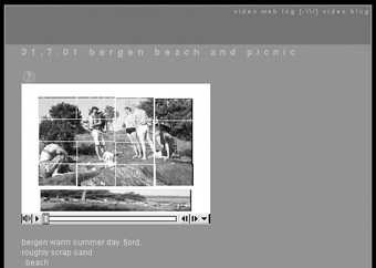
More radically, Miles is attempting an interactive research poetics, using the model of blogs (web-logs) and essayistic structures but using “vogs”: low bit-rate networked videos that assume and anticipate interactivity within the video stream/s, using Quicktime. With a Scandanavian straight face, he’s also set out a praxis manifesto. The goal is to take the torsion between text and multimedia and instead of limiting their relationship to one of illustration, explanation, formatting, digression or scaffolding, to make it genuinely synaesthesic, unpickable. It’s ‘writing’ towards an interactive desktop video vernacular, the written, verbal, visual, sonic cinematic, multipath and narrative elements in flux: personal, experimental, performative, self-aware in all senses.
Again, the logistical design is familiar, intuitively modular and simple, but the relational layerings, the densely-allusive and cumulative diaristic associations, the competing timelines and analogic (I made that up: argument by concretised analogy) powered by an intriguing verbal-visual interactivity…these are both complex and addictive. It’s capable of sustaining voyeuristic narrative and Oprah confessional pleasures as well as the mise-en-abyme meta-critique, close-focus film analysis and essayistic forms of his Glenn Ford Searching project.
Process, and in process.
PS: For a productively focused list dealing with net.wurk art/writing, complete with international guests and scaffolded discussion topics, join empyre, set up by Melinda Rackham
RealTime issue #47 Feb-March 2002 pg. 23


